


The Data
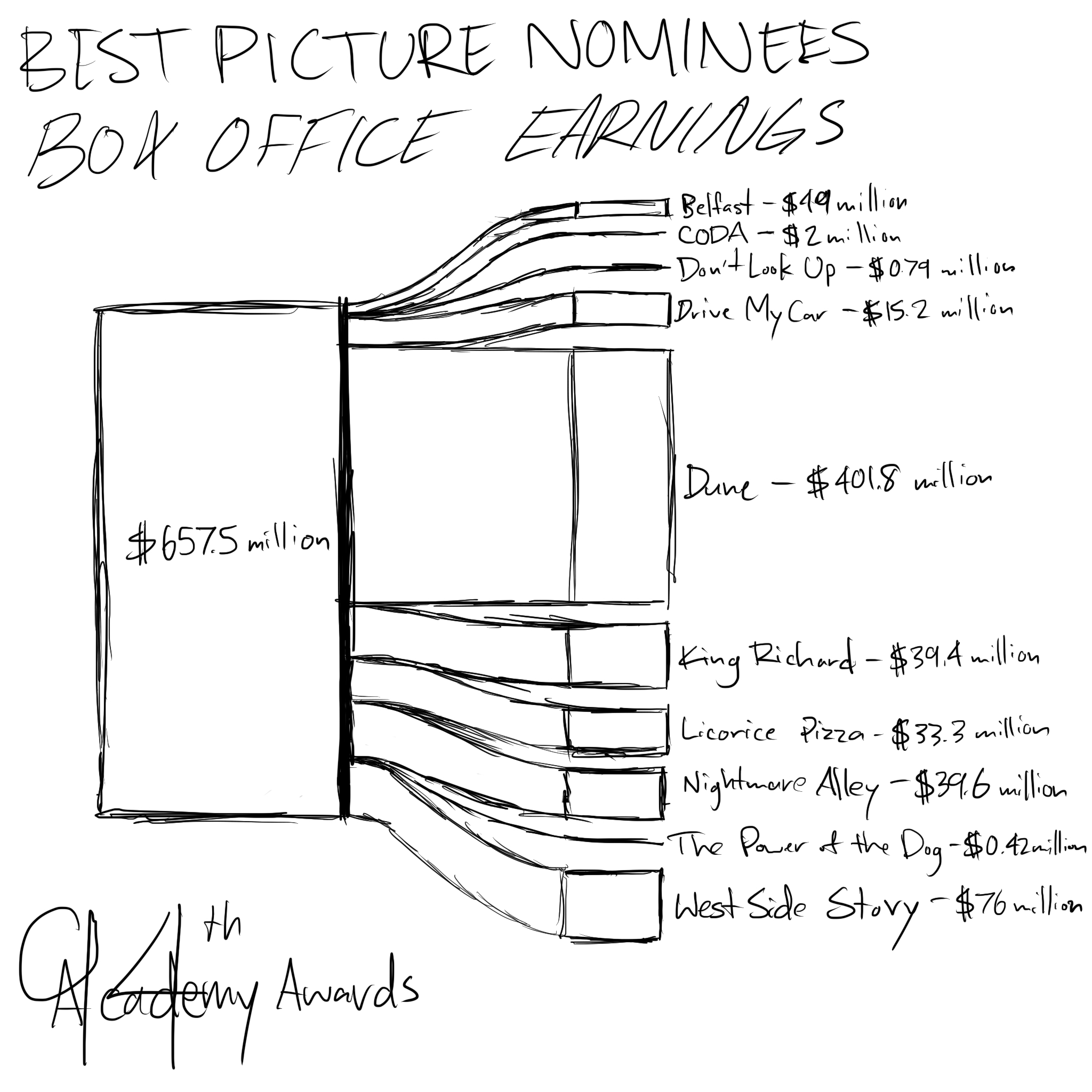
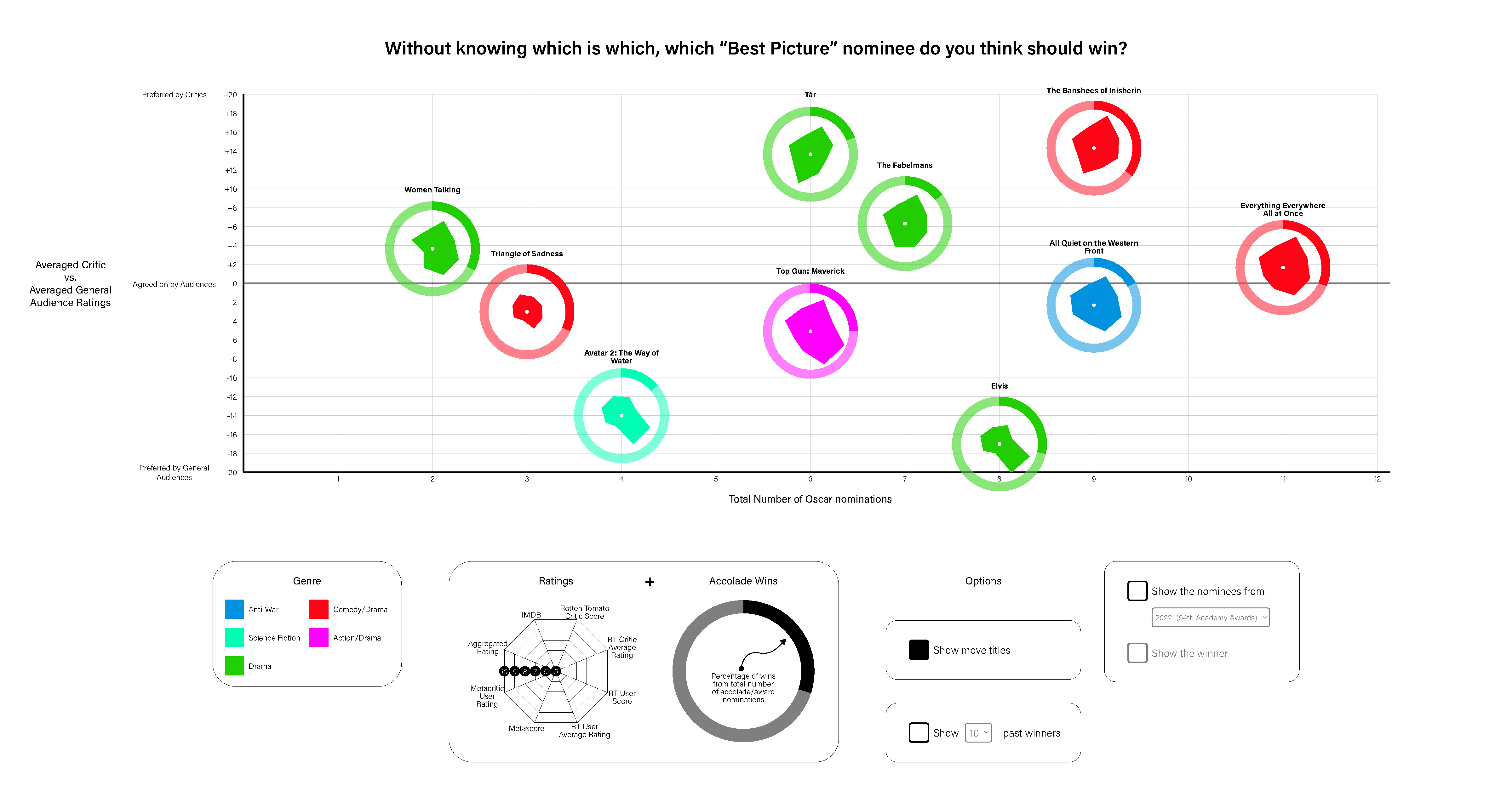
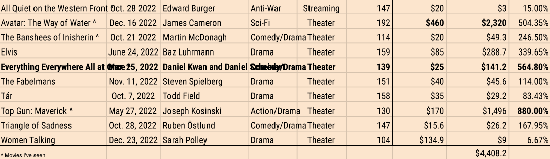
I started by collecting data about the nominees for Best Picture for the 95th Academy Awards (the event happening in 2023) since they're supposed to be the best movies of the year. I started with baseline information in case it was relevant later, like the duration, budget, genre, and director. Then I got into the really tedious part: collecting the various ratings from different ratings services: IMDB, Rotten Tomatoes, and Metacritic. Each one uses a different rating system so I felt like I needed to aggregate them all. (A little ironic, I know, since Metacritic claims to be a rating aggregator.)
Once I had the data for the 2023 nominees I started to move back in time. You can't find patterns if you only have one, incomplete dataset. Before I knew it, I had 10 years-worth of data for Best Picture nominees and winners and started to notice some interesting factoids, even if I couldn't discern a pattern. For instance, it's rare for movies heavily preferred by general audiences, compared to critics, to even be nominated but the most notable such discrepancy, "Bohemian Rhapsody" (which was preferred by general audiences to critics with a difference of 25.33 out of 100 points), happened to be nominated in the same year that a similarly general audience-preferred film, "Green Book" (which was preferred by general audiences by 13 points), happened to win Best Picture. "Bohemian Rhapsody", in fact, has such a low overall aggregated rating that the only movie with a lower aggregated rating over the last 10 years, "Don't Look Up", only scores 4 points (out of 100) lower.
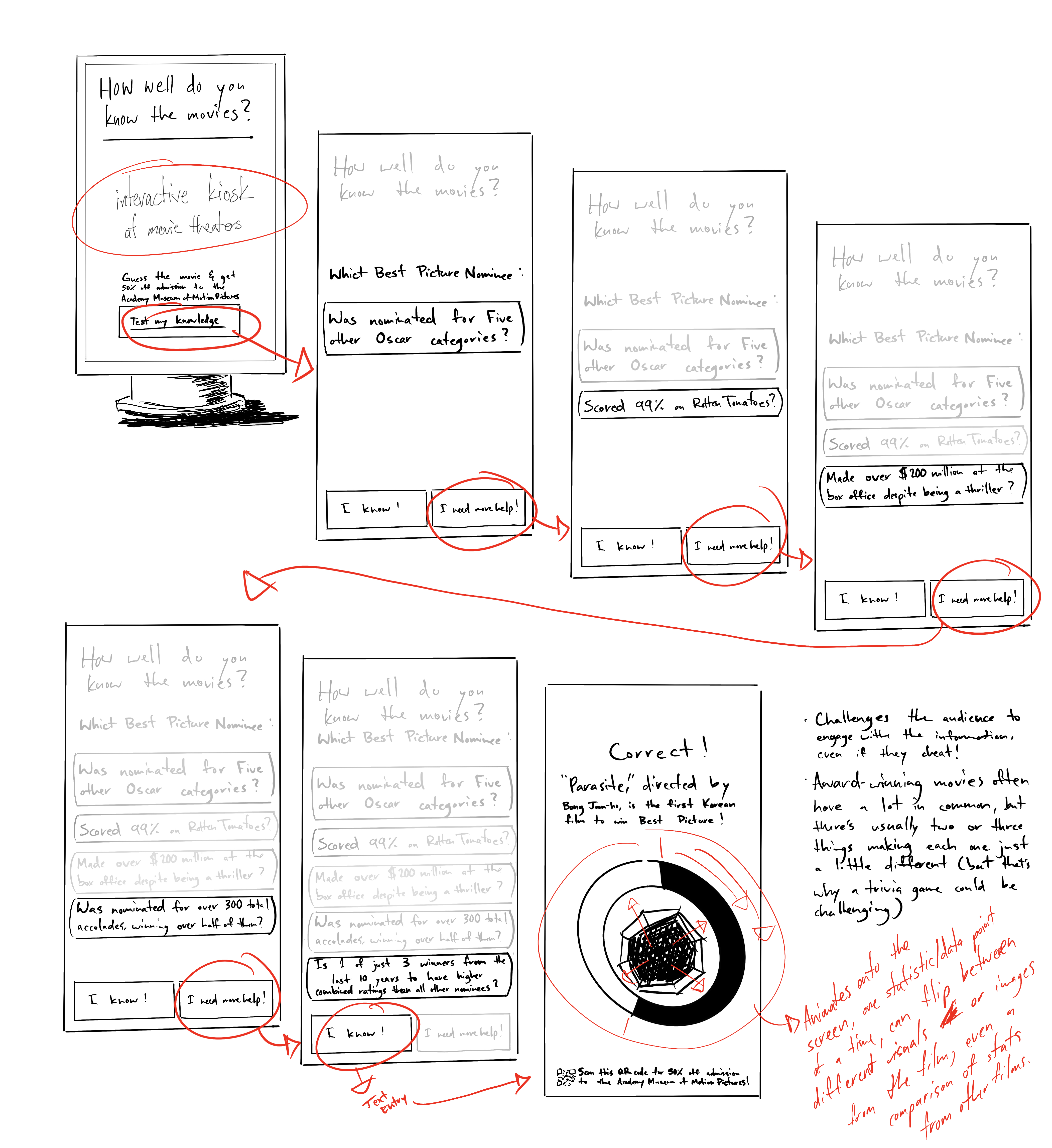
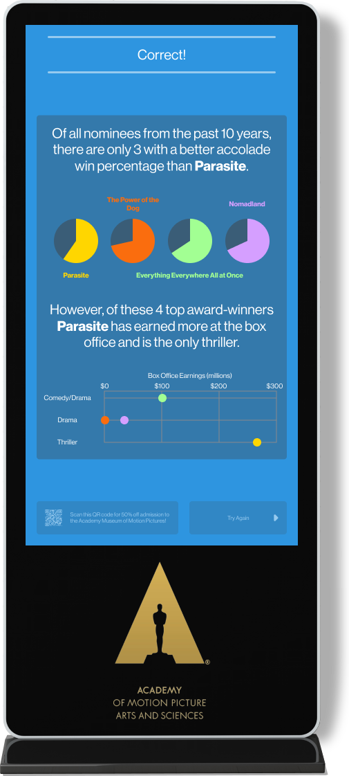
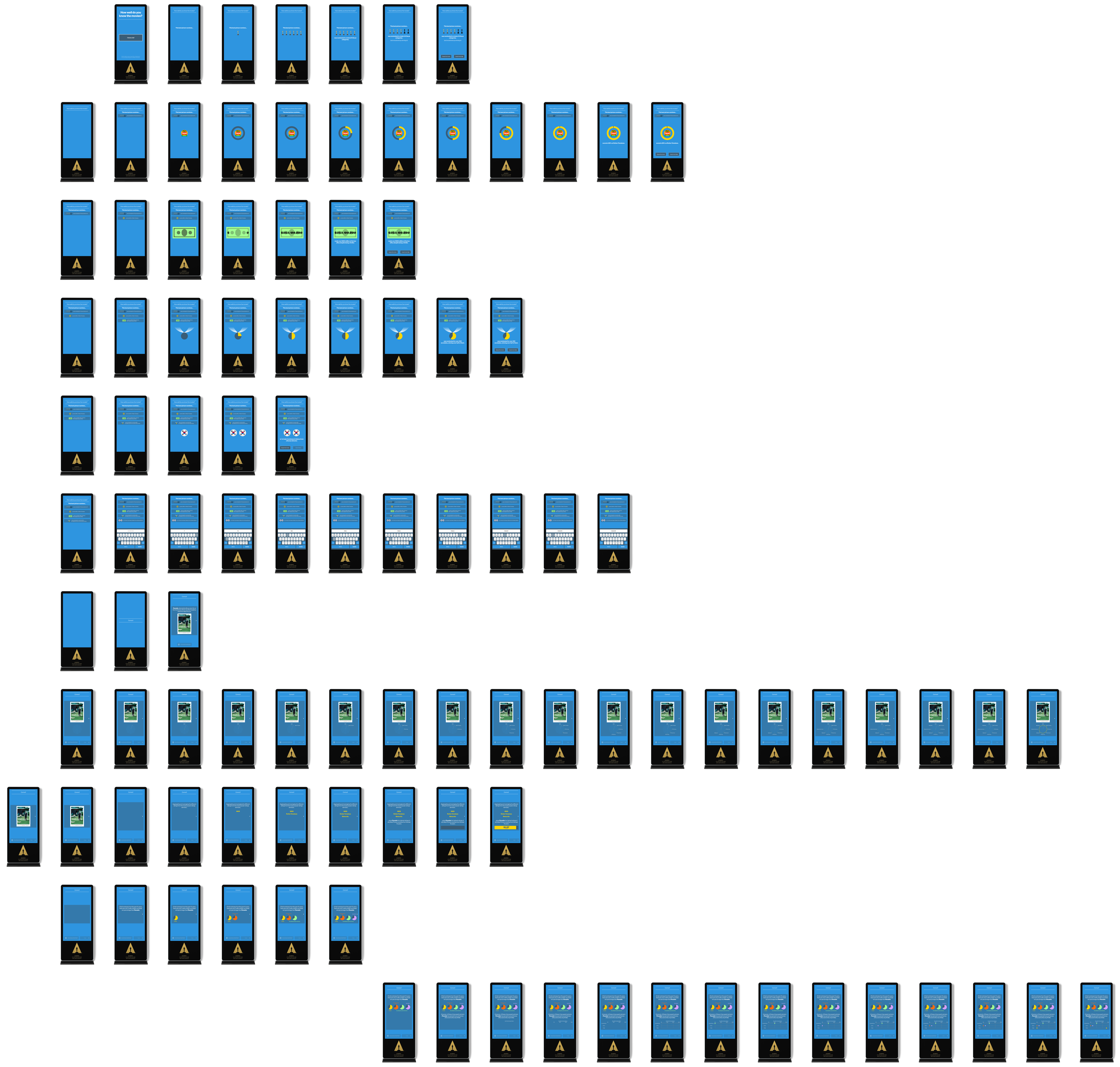
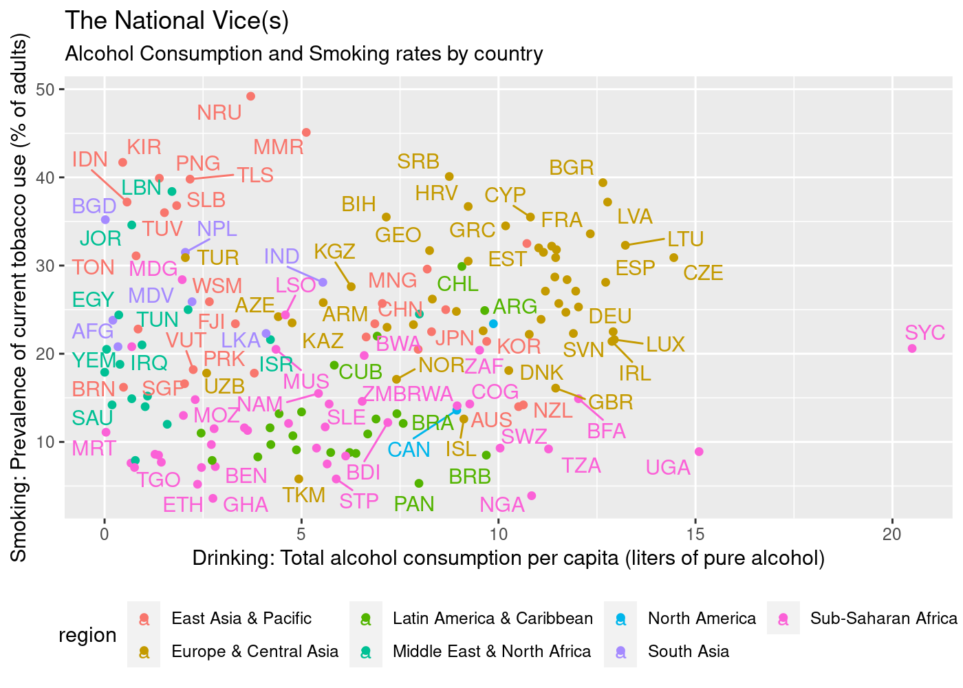
To be fair, I actually started by almost obsessively looking up data visualizations. I don't recall having worked on a project specifically for data visualization, so I needed to understand the dos and don'ts, the good and bad, and get a feel for how other people deal with their data, and also look at the context in which people might interact with that data. Here you can see a remarkably poor visualization I found in my searches. It apparently tries to make the claim that there's a relationship between smoking and drinking, a dubious claim at best, while also making it extremely difficult to decipher the chart.
When I started collecting data for the 95th Academy Awards, the winner hadn't been decided yet, which made the collection of data for previous years so interesting. The 10 Best Picture nominees for 2023 are as follows:
- All Quiet on the Western Front
- Avatar: The Way of Water
- The Banshees of Inisherin
- Elvis
- Everything Everywhere All at Once
- The Fabelmans
- Tár
- Top Gun: Maverick
- Triangle of Sadness
- Women Talking
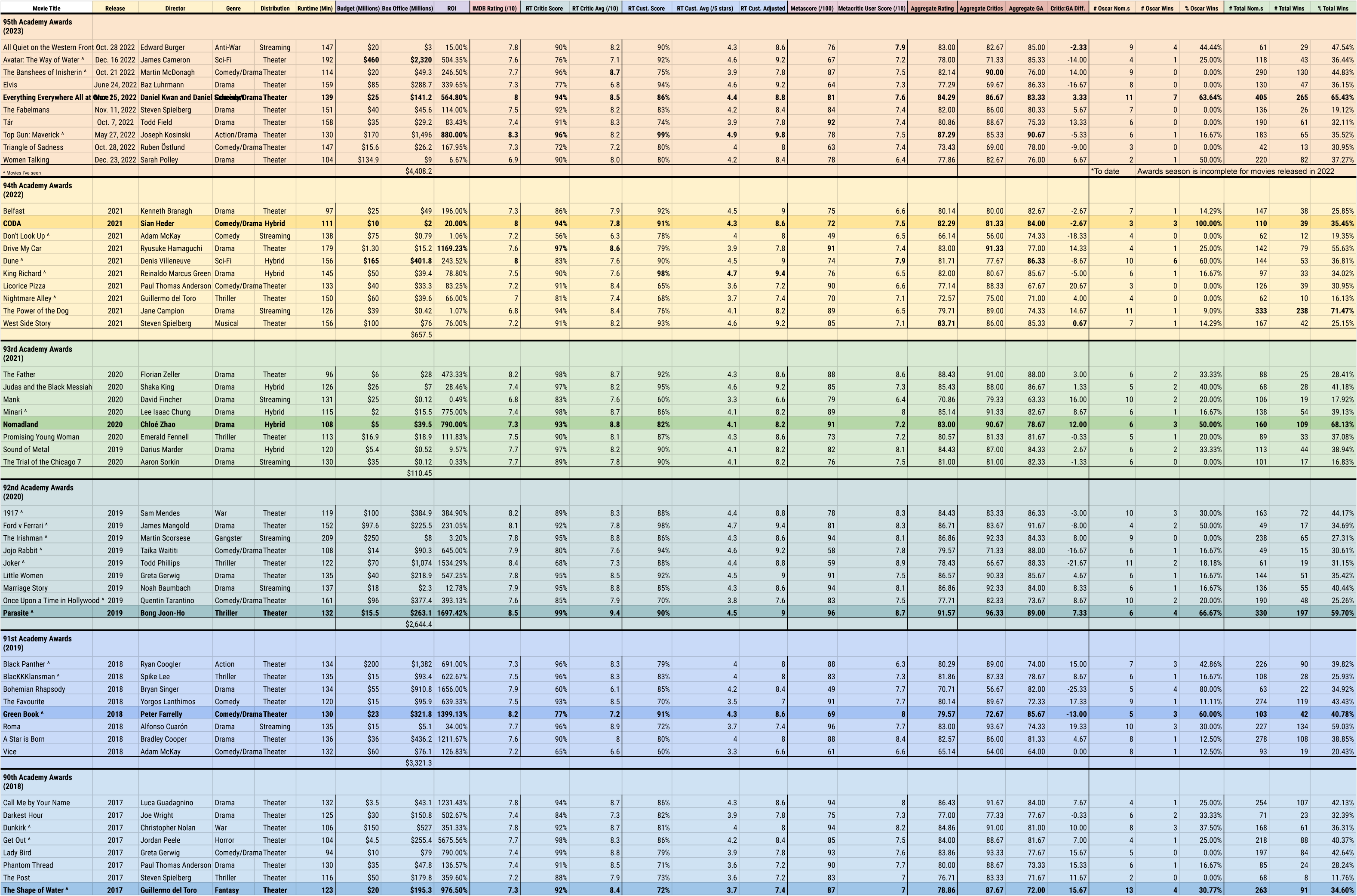
I wasn't expecting to get so sucked into the data, but there's a kind of peace in the numbers. Once the data's there, you can start trying to find meaning. Now that the award's been given I know who's won, but at the time I was collecting this data it was new and exciting to try and figure out a pattern and guess who'd win. While collecting the data, I was struck by how differently each platform portrays their ratings.
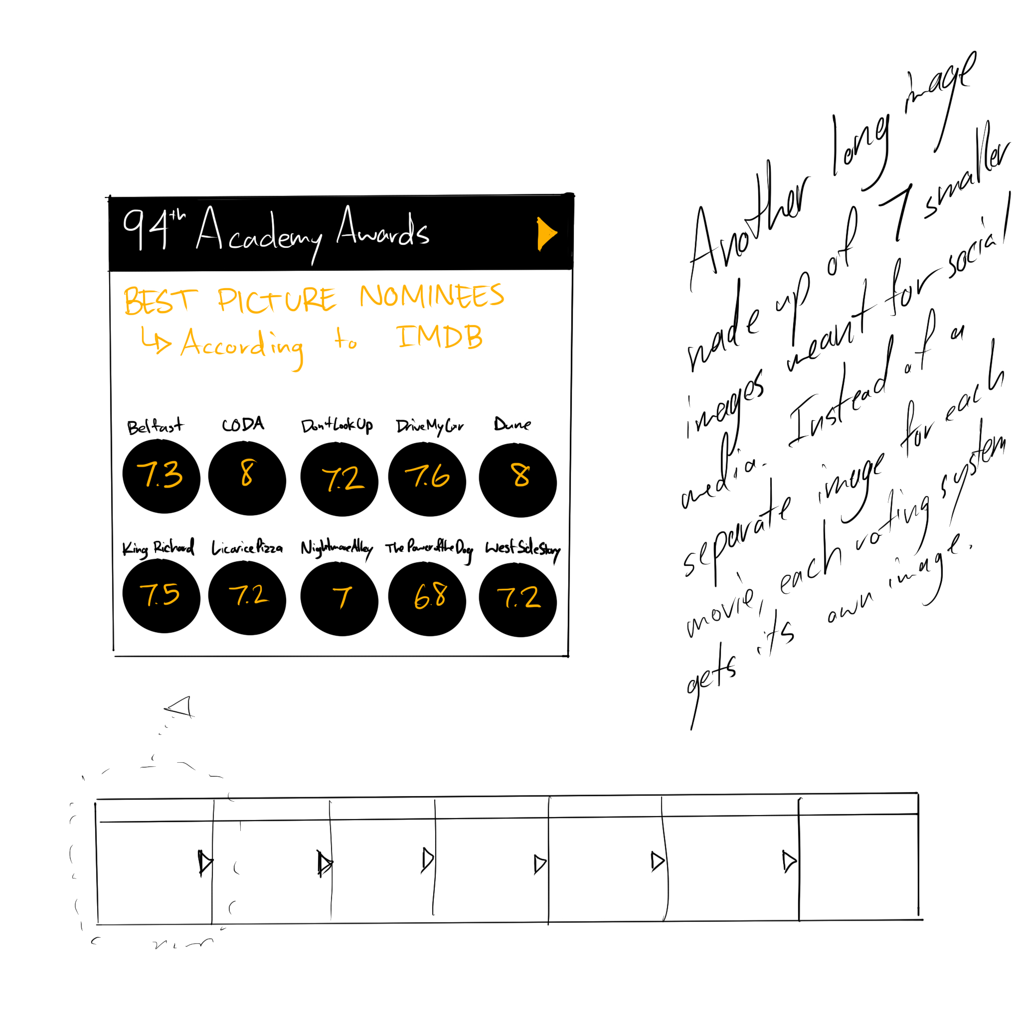
- IMDB uses a score out of 10.0
- Rotten Tomatoes' verified critics are rated as a percentage, plus an average out of 10.0
- Rotten Tomatoes' users are rated as a percentage as well, plus an average star rating out of 5.0
- Metacritic aggregates critics' reviews into a score out of 100
- Metacritic user scores are averaged out of 10.0
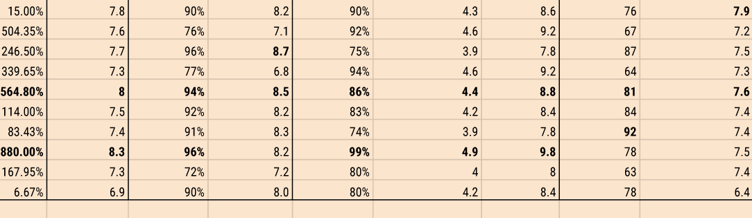
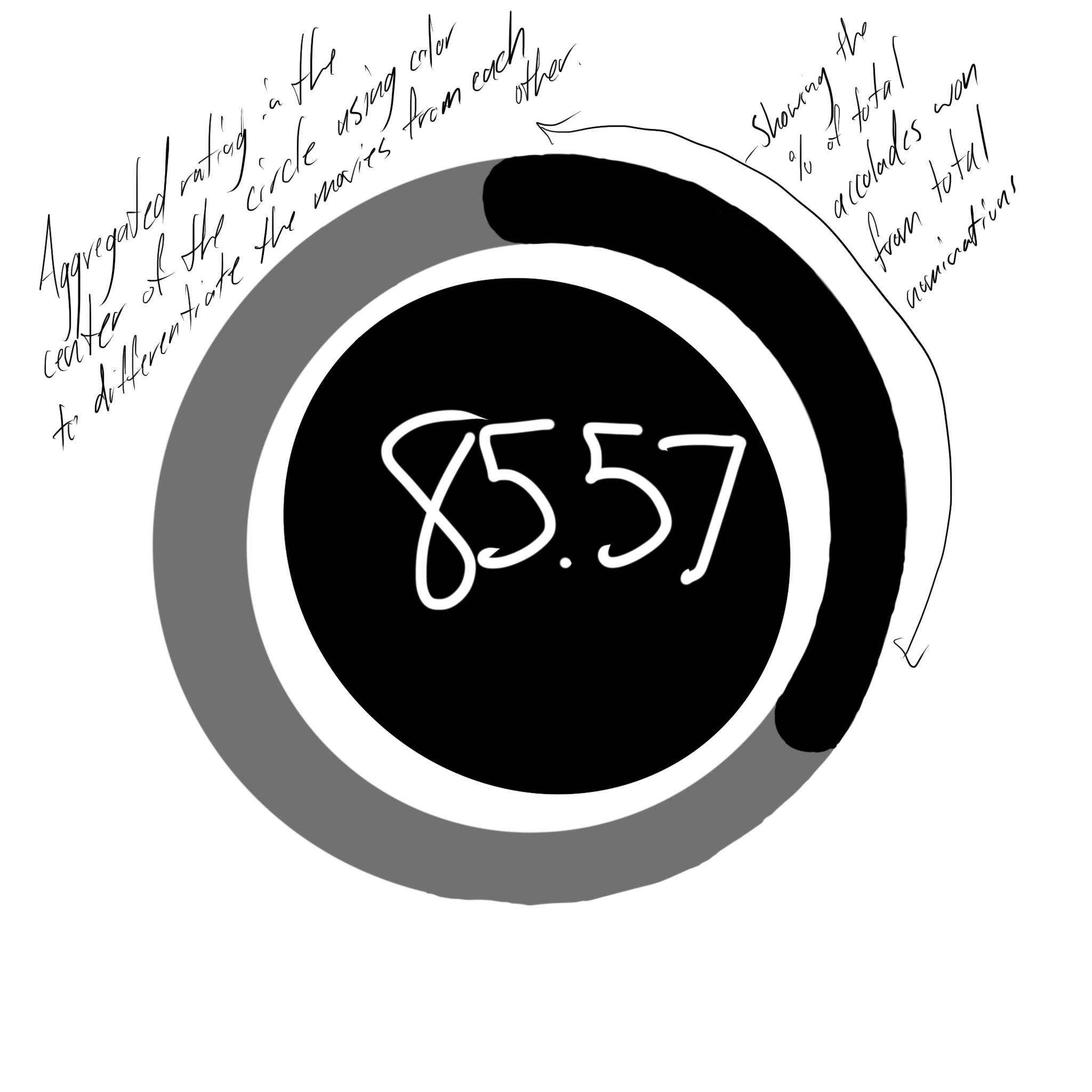
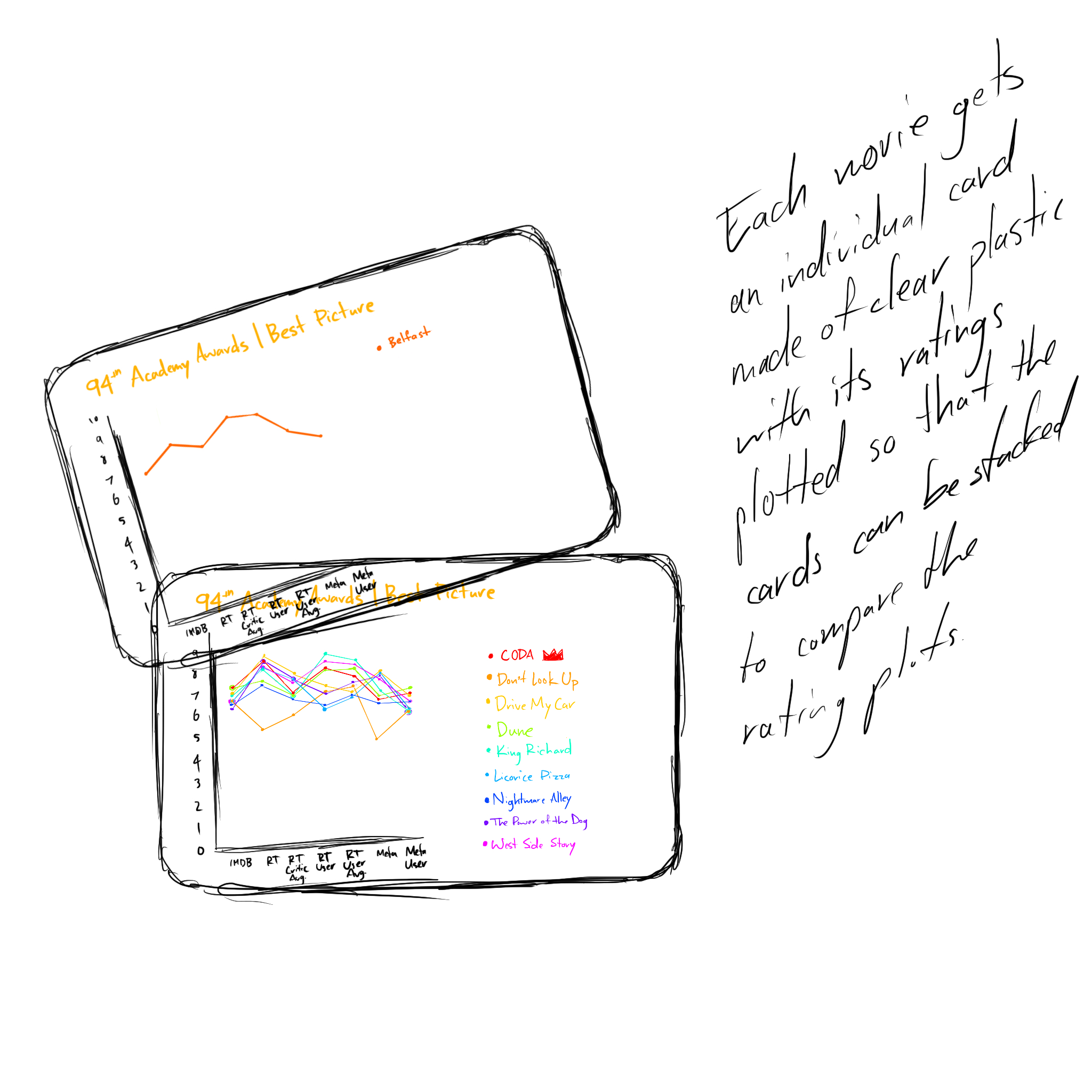
With all of these scores, there's 7 numbers to keep an eye one. That makes it confusing, so I realized I'd need to make it simpler. The easiest way to normalize all of these systems is to get them all to a score out of 100. Therefore, a 7.6/10 on IMDB becomes a 76/100, a Rotten Tomatoes critic percentage of 84% with an average score of 7.9/10 becomes an 84/100 and a 79/100, respectively, etc.
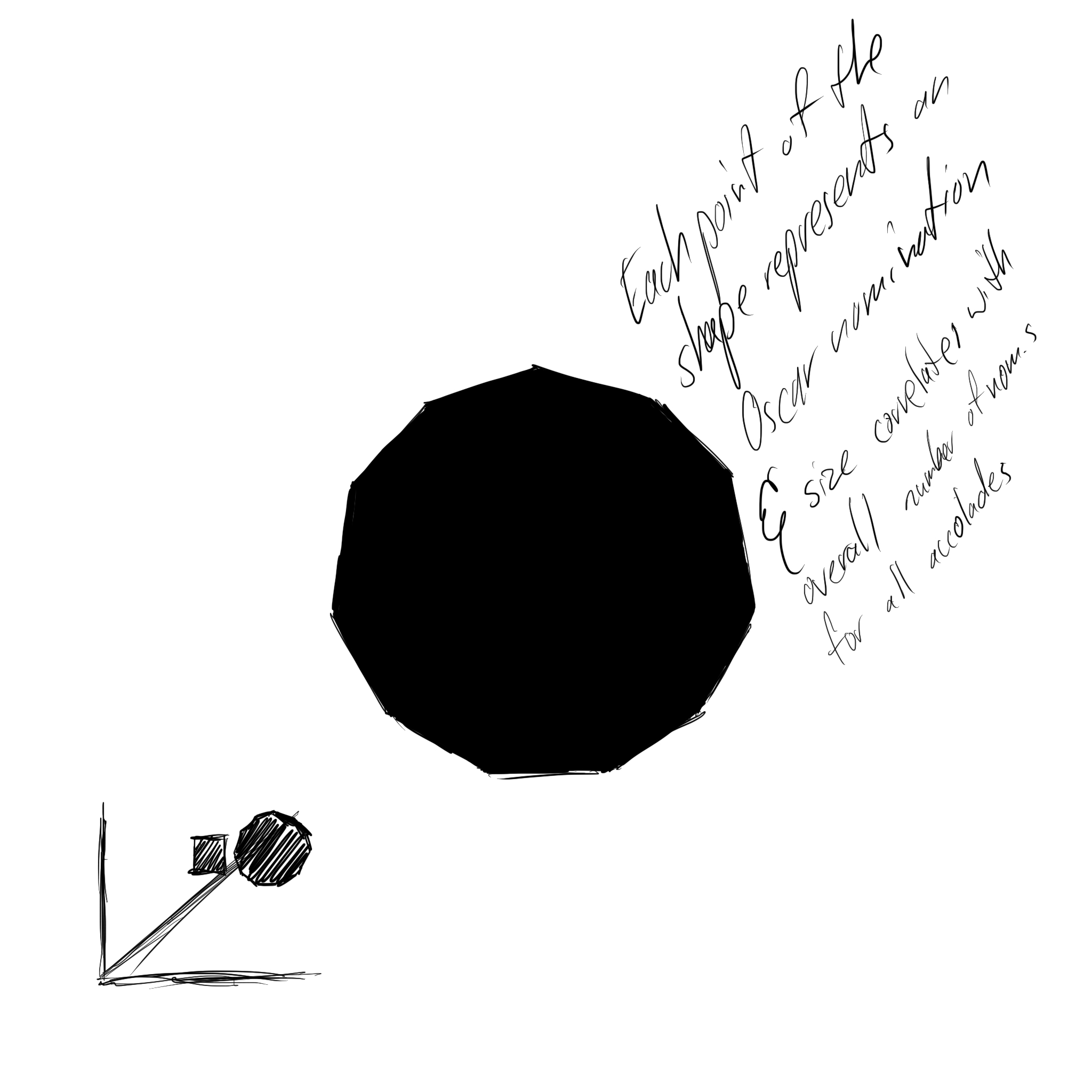
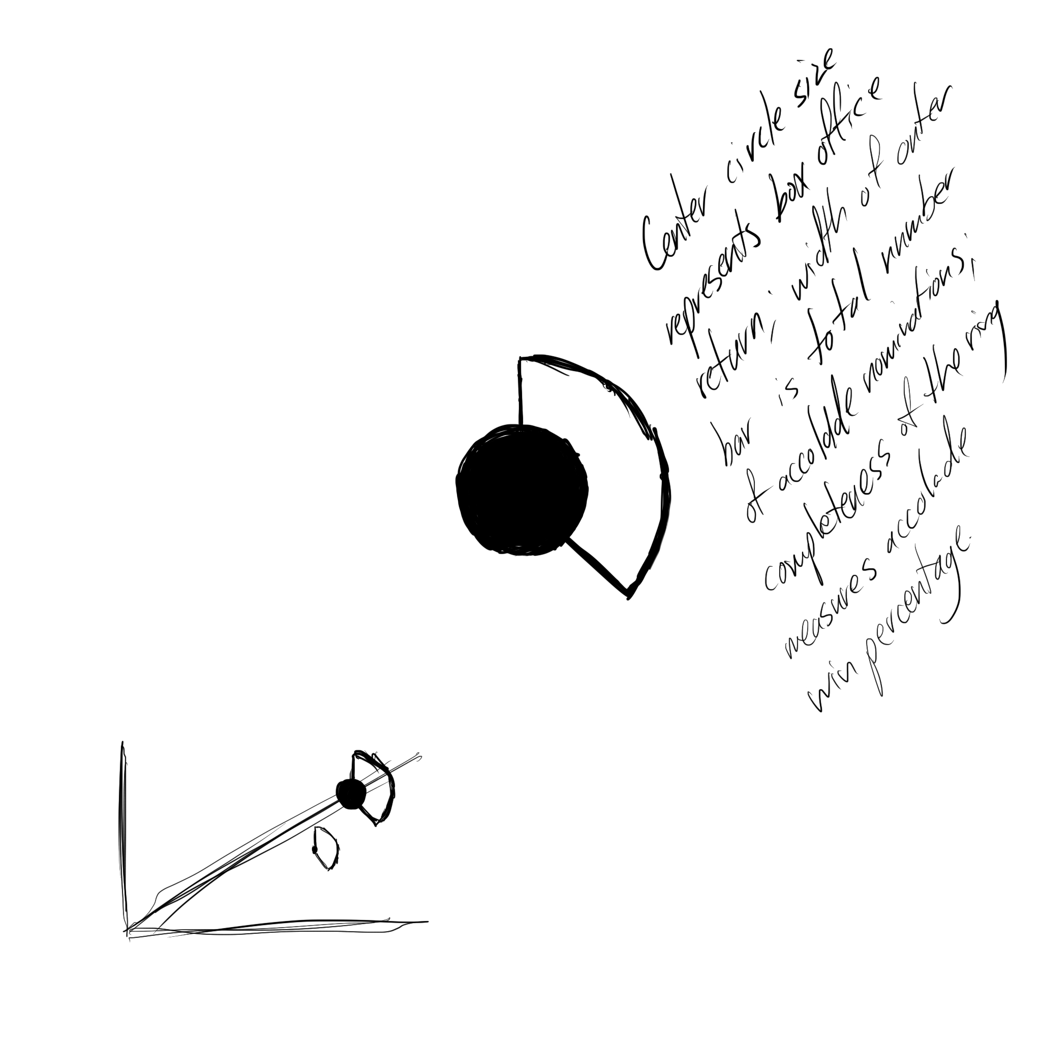
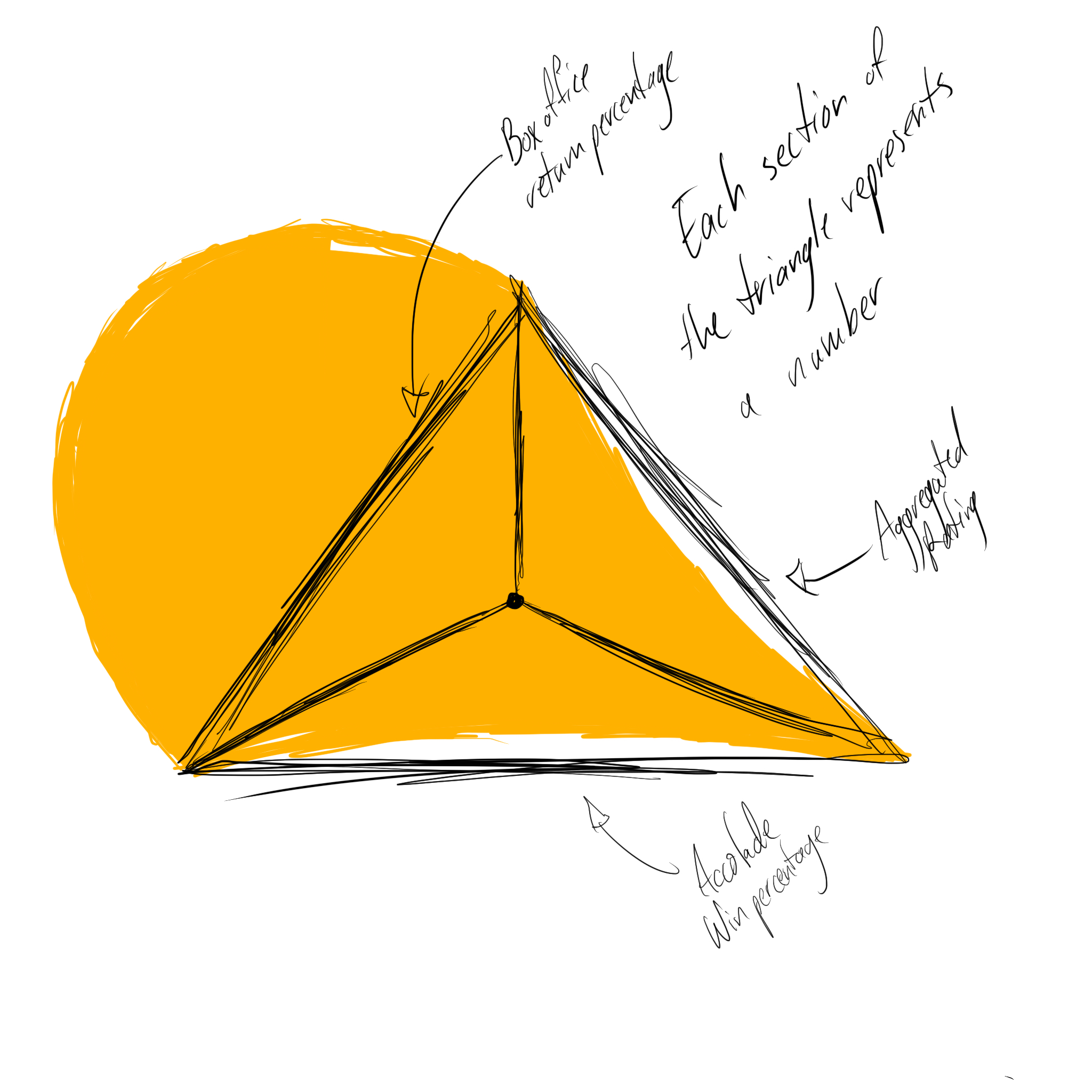
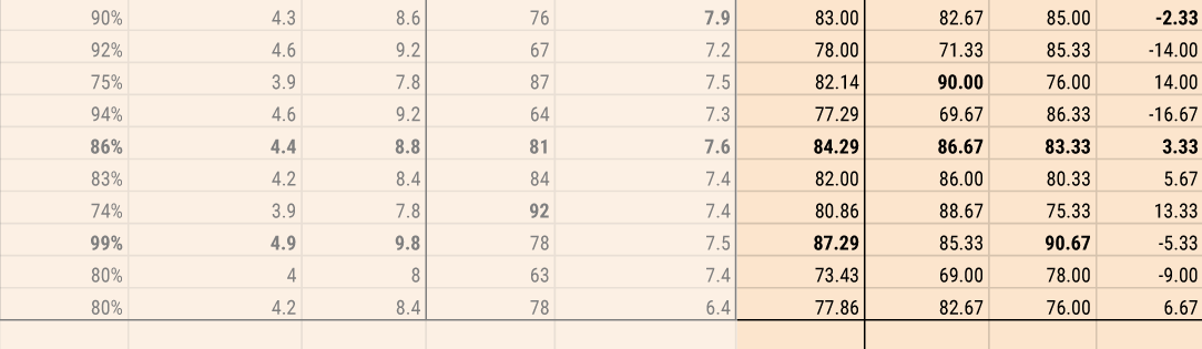
With normalized scores, I can easily aggregate them all. Adding them together and dividing by 7 gives a nominee a single, aggregated score which makes it easier to compare. Additionally, if I aggregate the critic scores and the general audience scores separately I can check for the difference between them, to see if the movie was preferred by critics or general audiences and how heavily it was preferred.
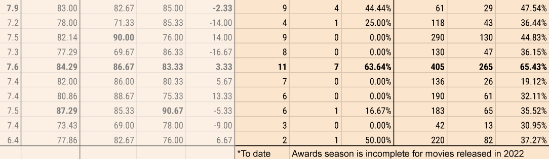
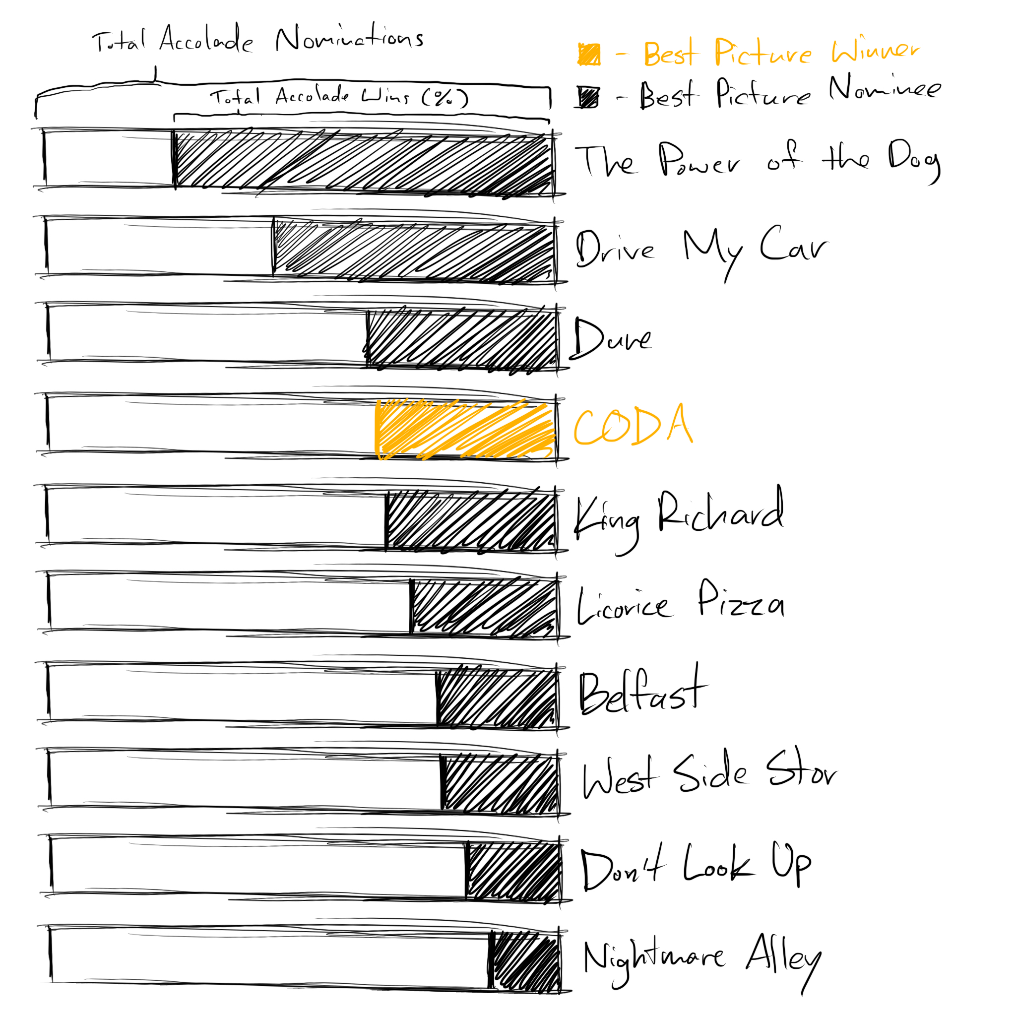
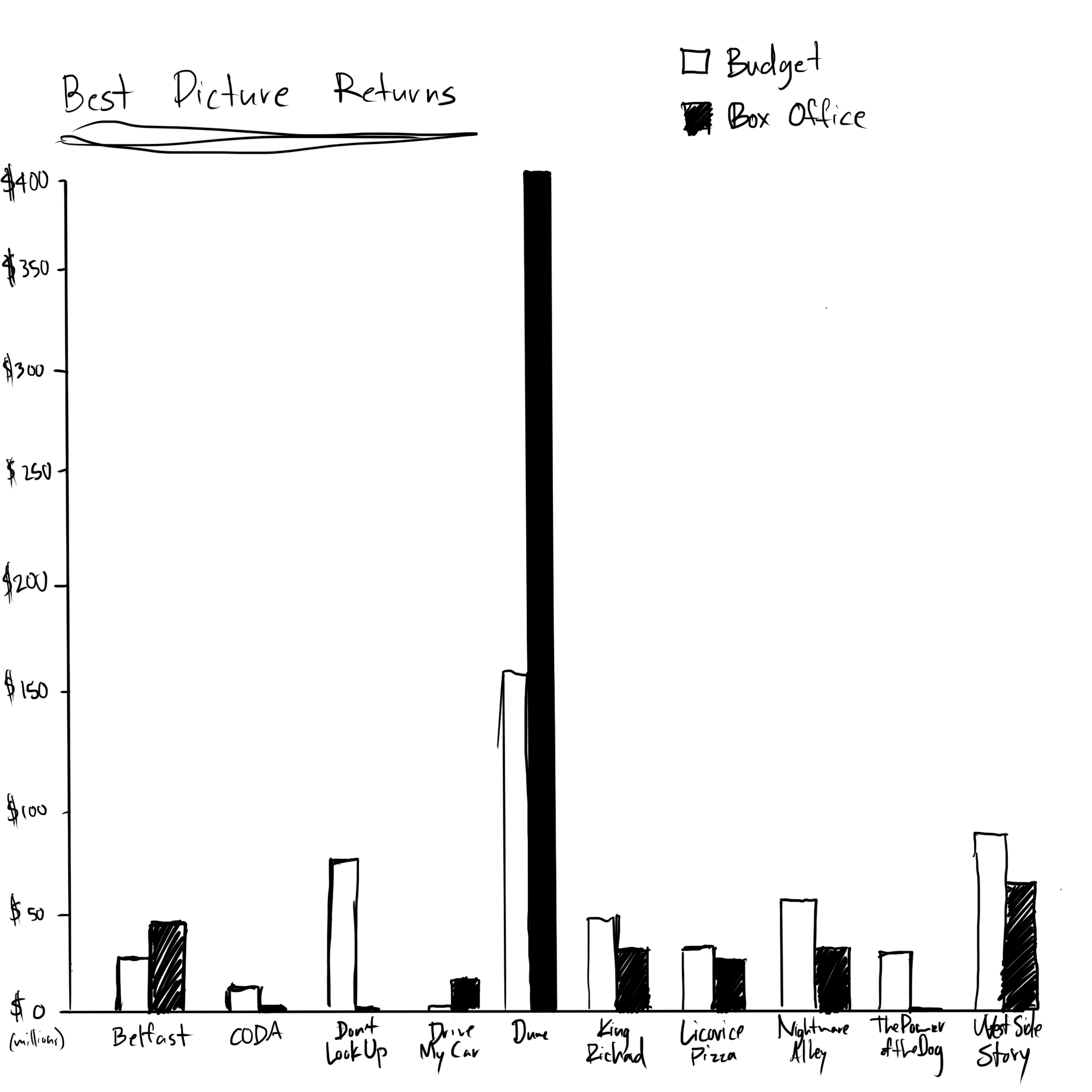
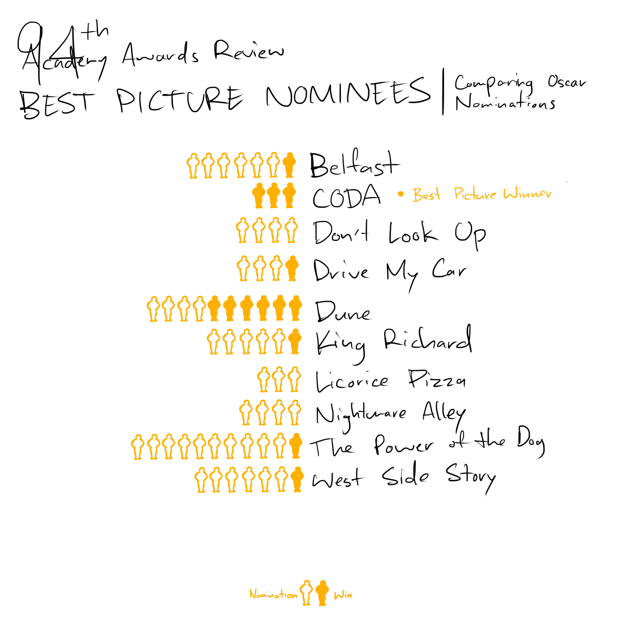
To round out my data I got the total number of Oscar nominations, including the Best Picture nomination, and the number they'd won. I also got the number of accolade nominations, in total, and the number of wins. After looking at all of this data, in the process of collecting it, I started to see some interesting patterns about the movies, but nothing like an idea of how to guess a winner.