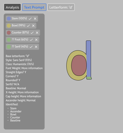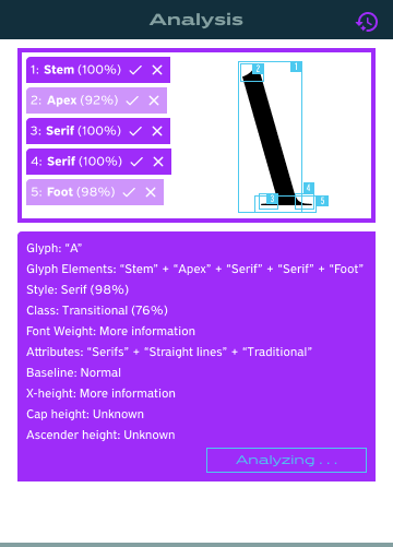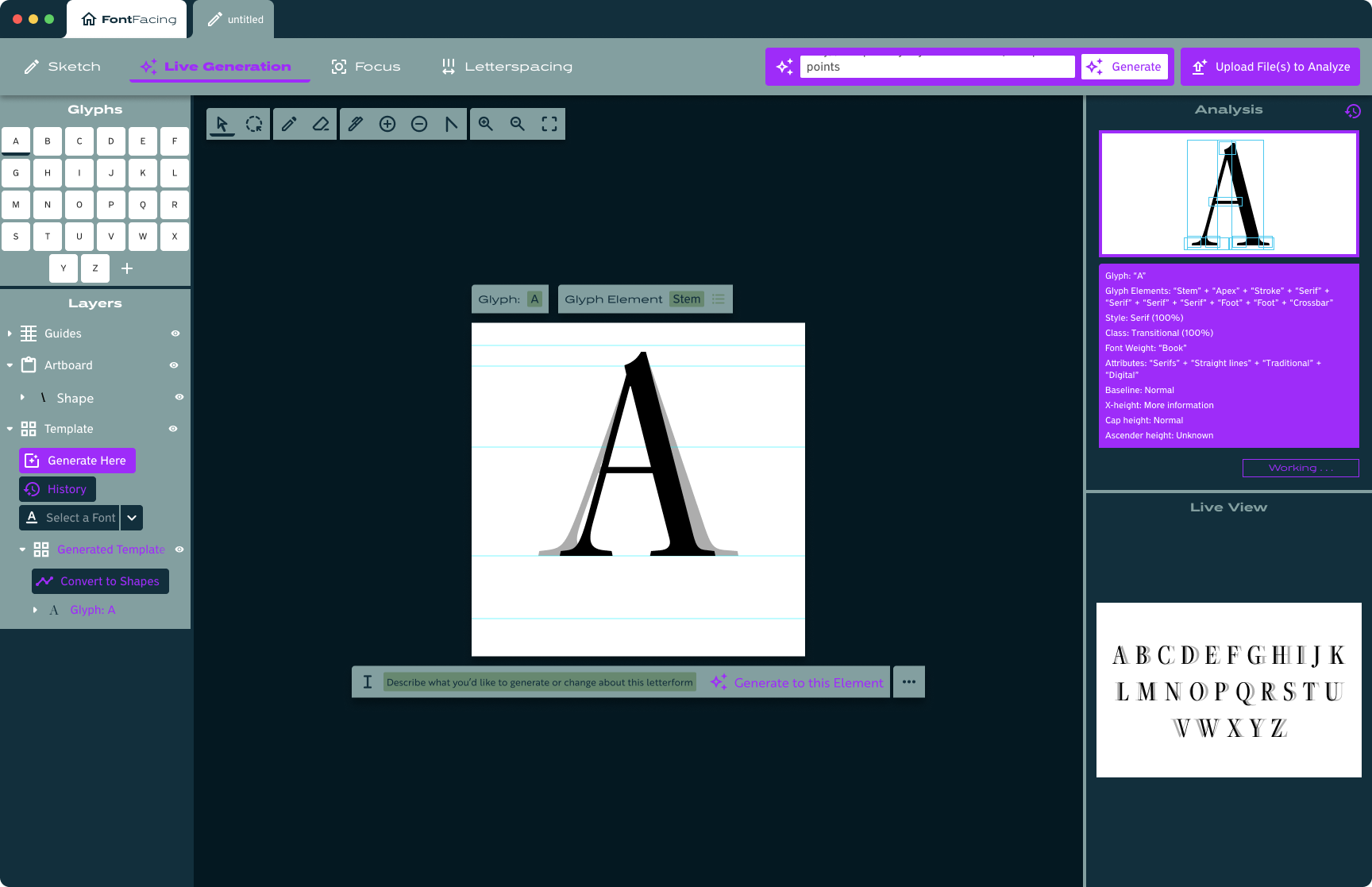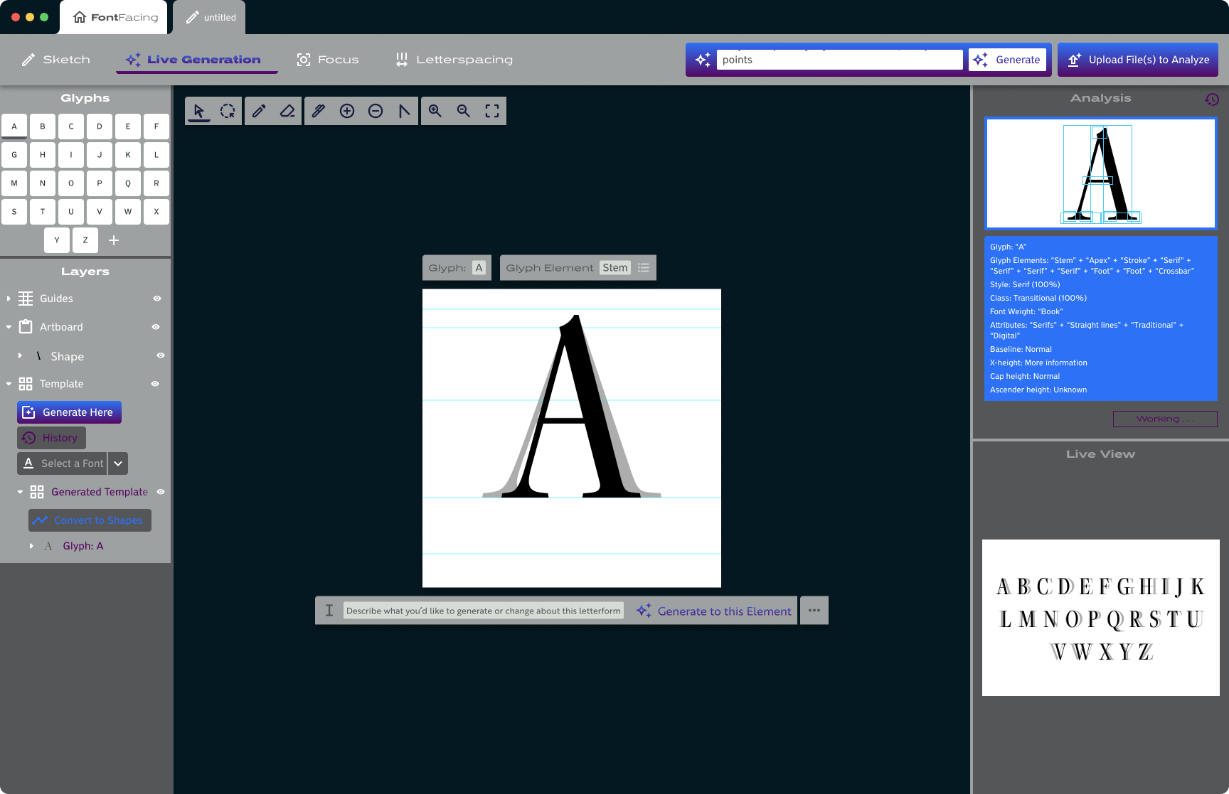


Research & Background
I started this project by researching how training models are made and making a couple myself. By using the available tools at RunwayML I was able to train image generating models in order to see, firsthand, how an AI system analyzes the material its given and, thereafter, what it can produce.
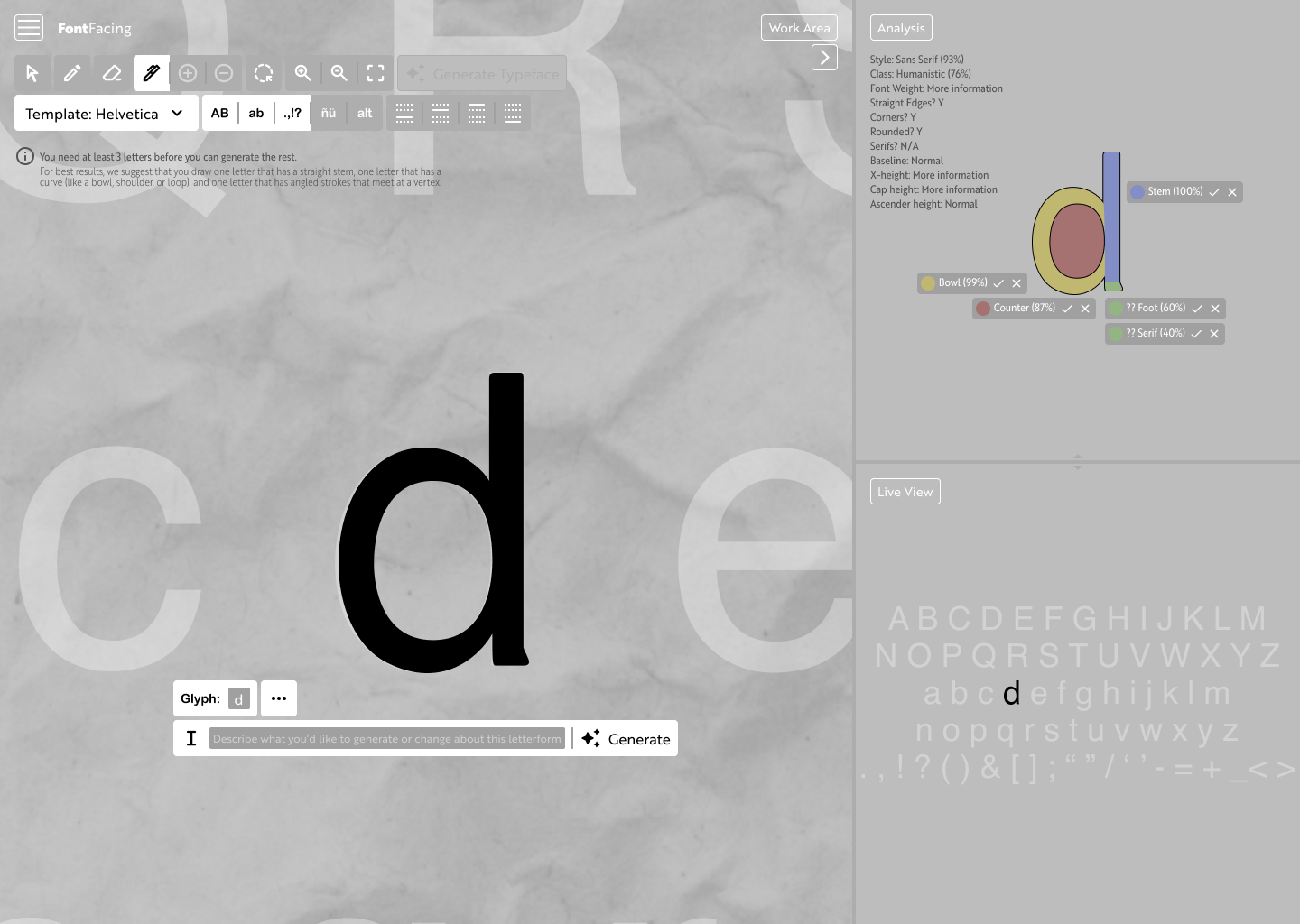
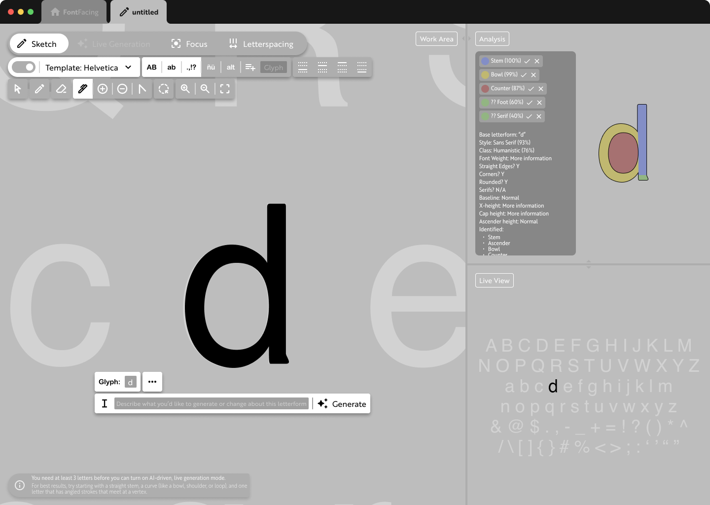
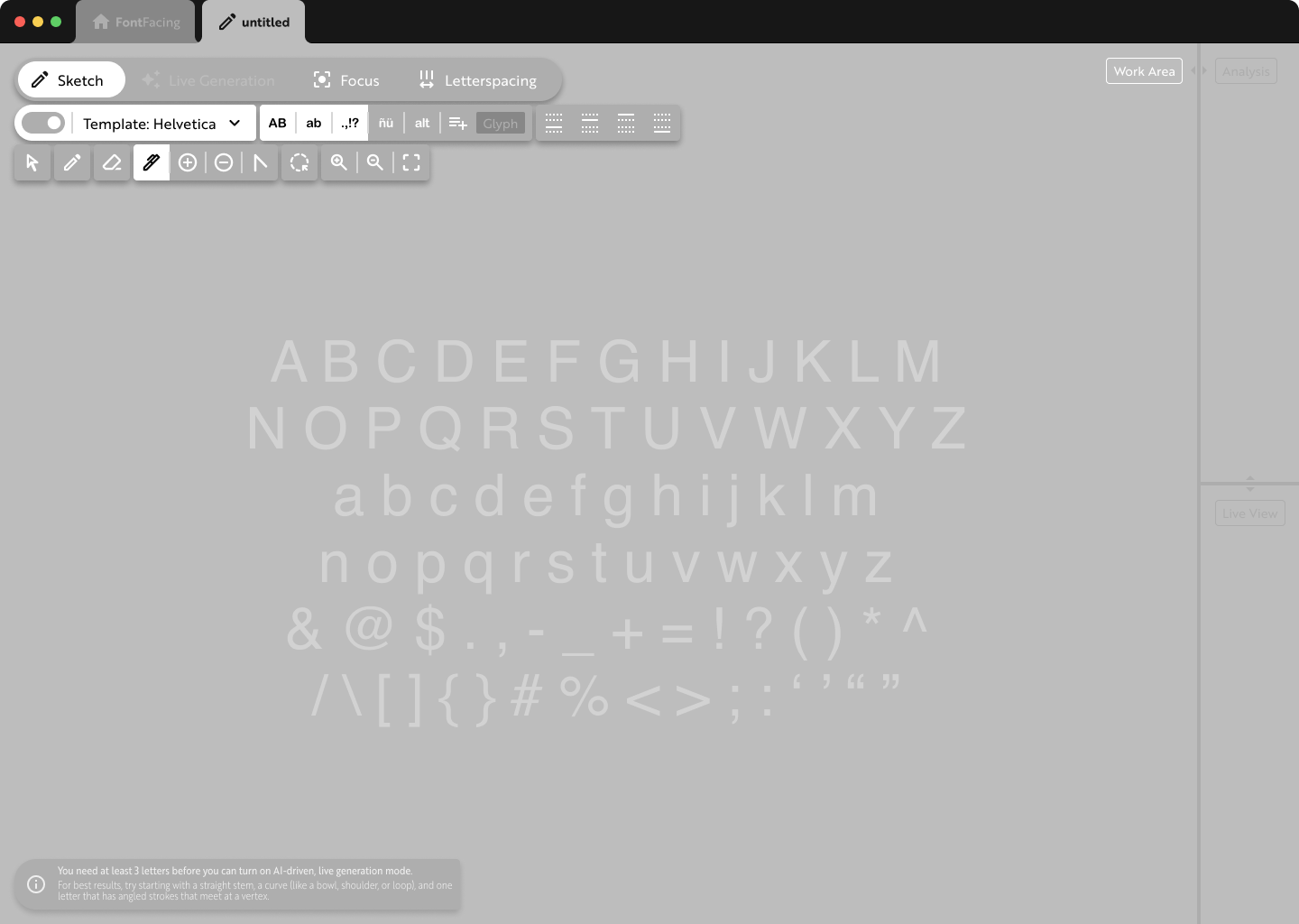
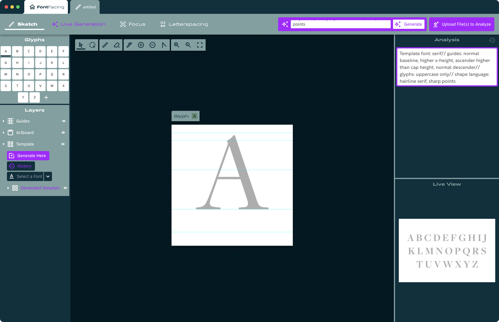
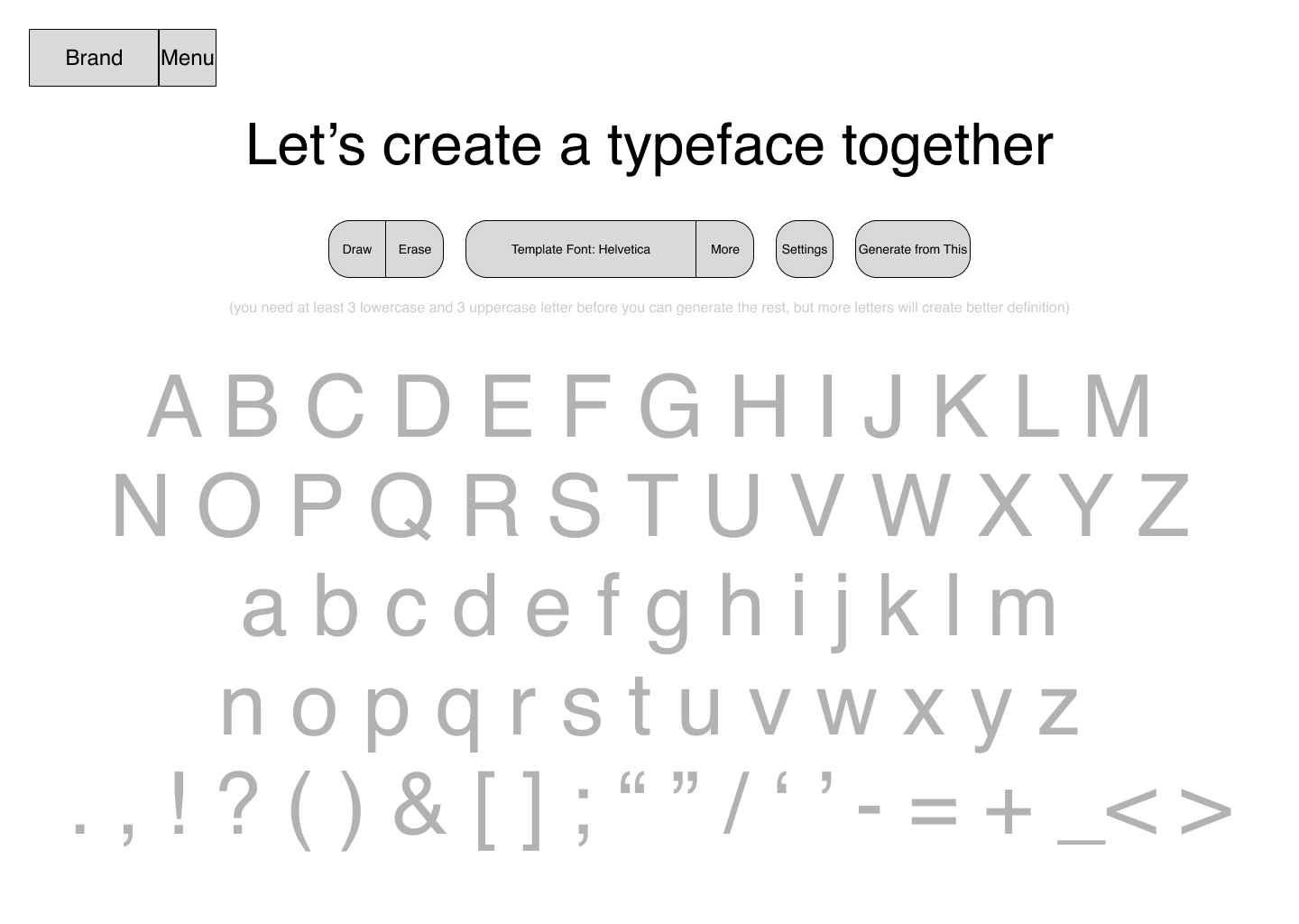
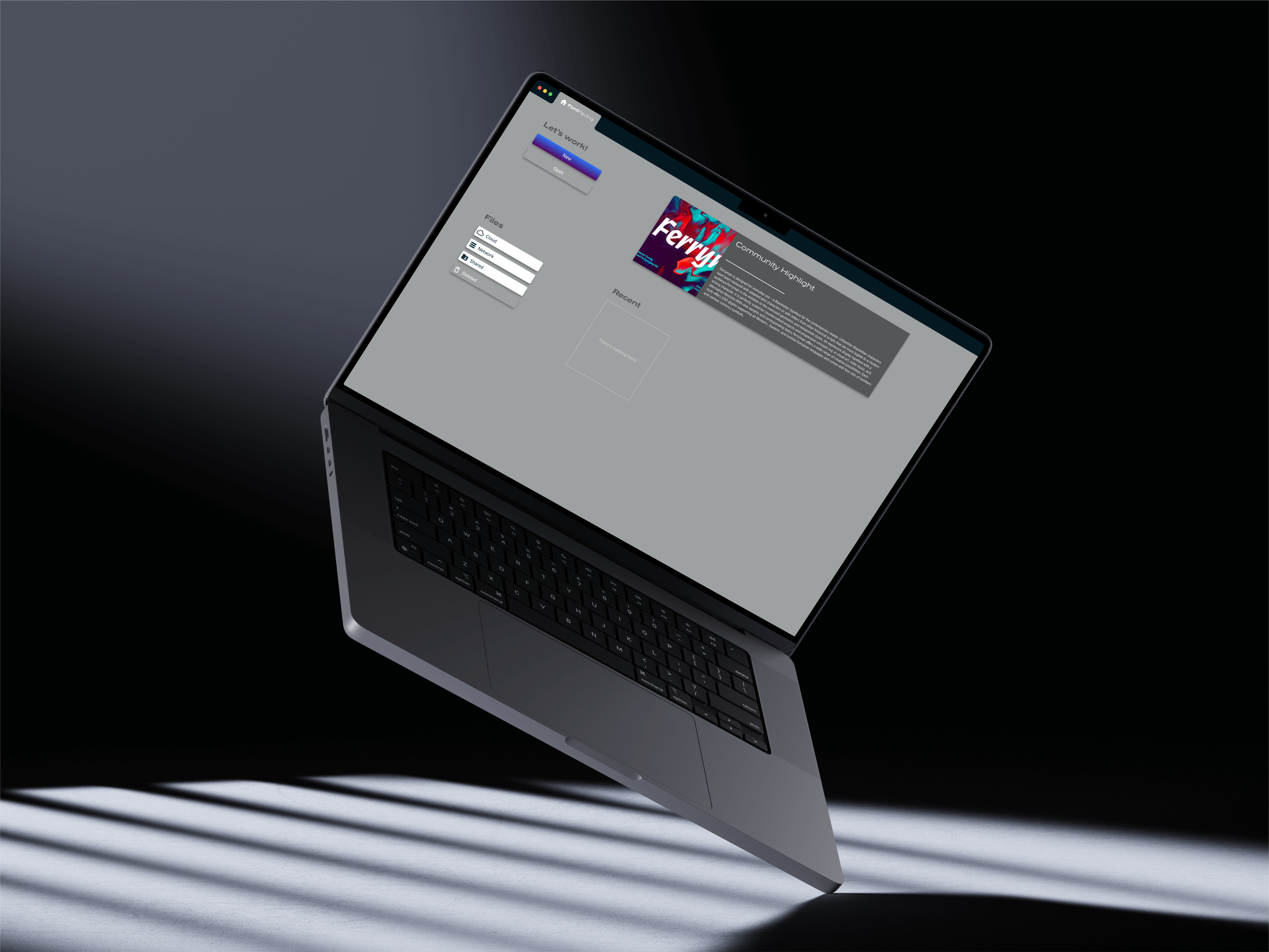
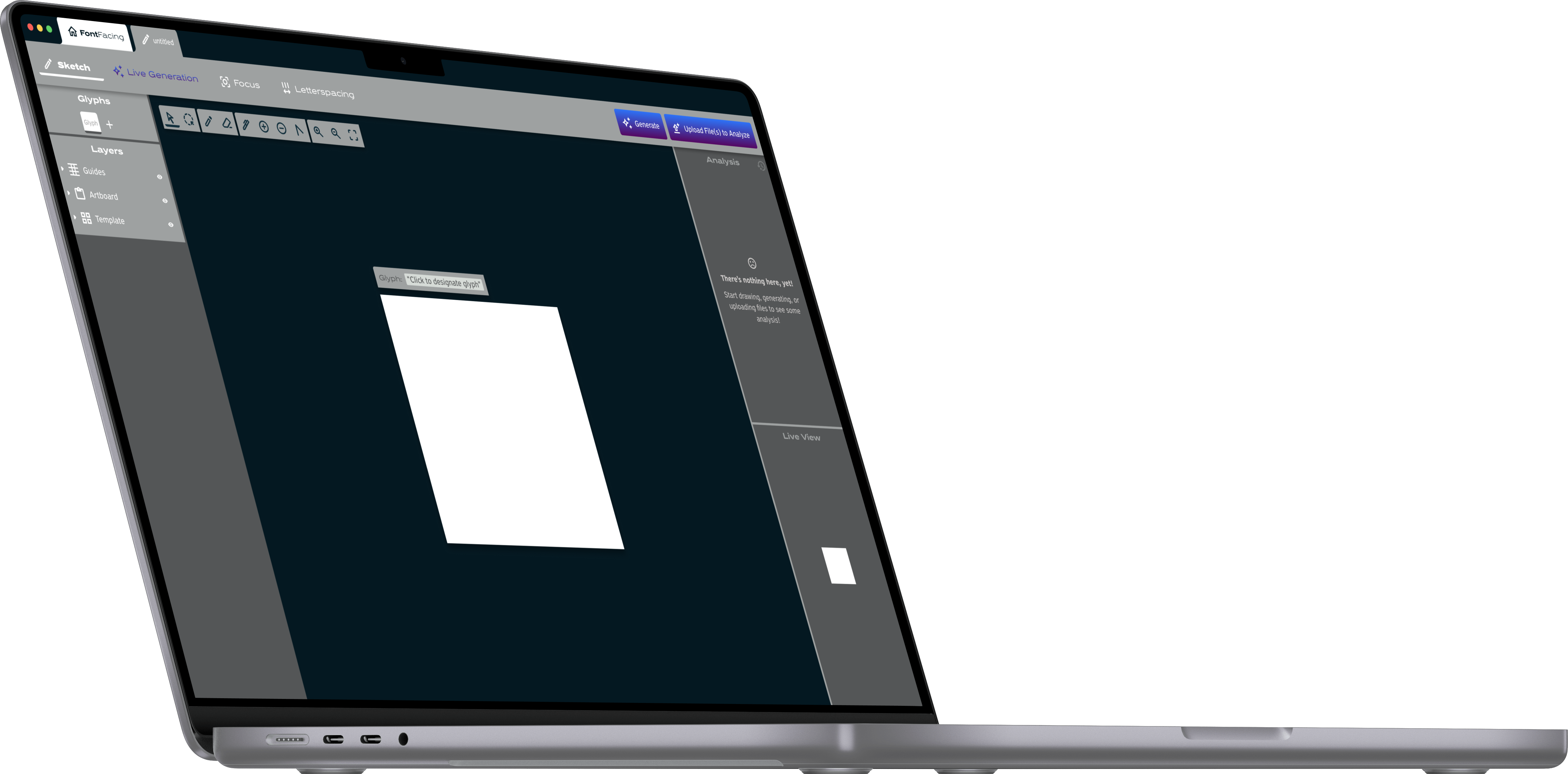
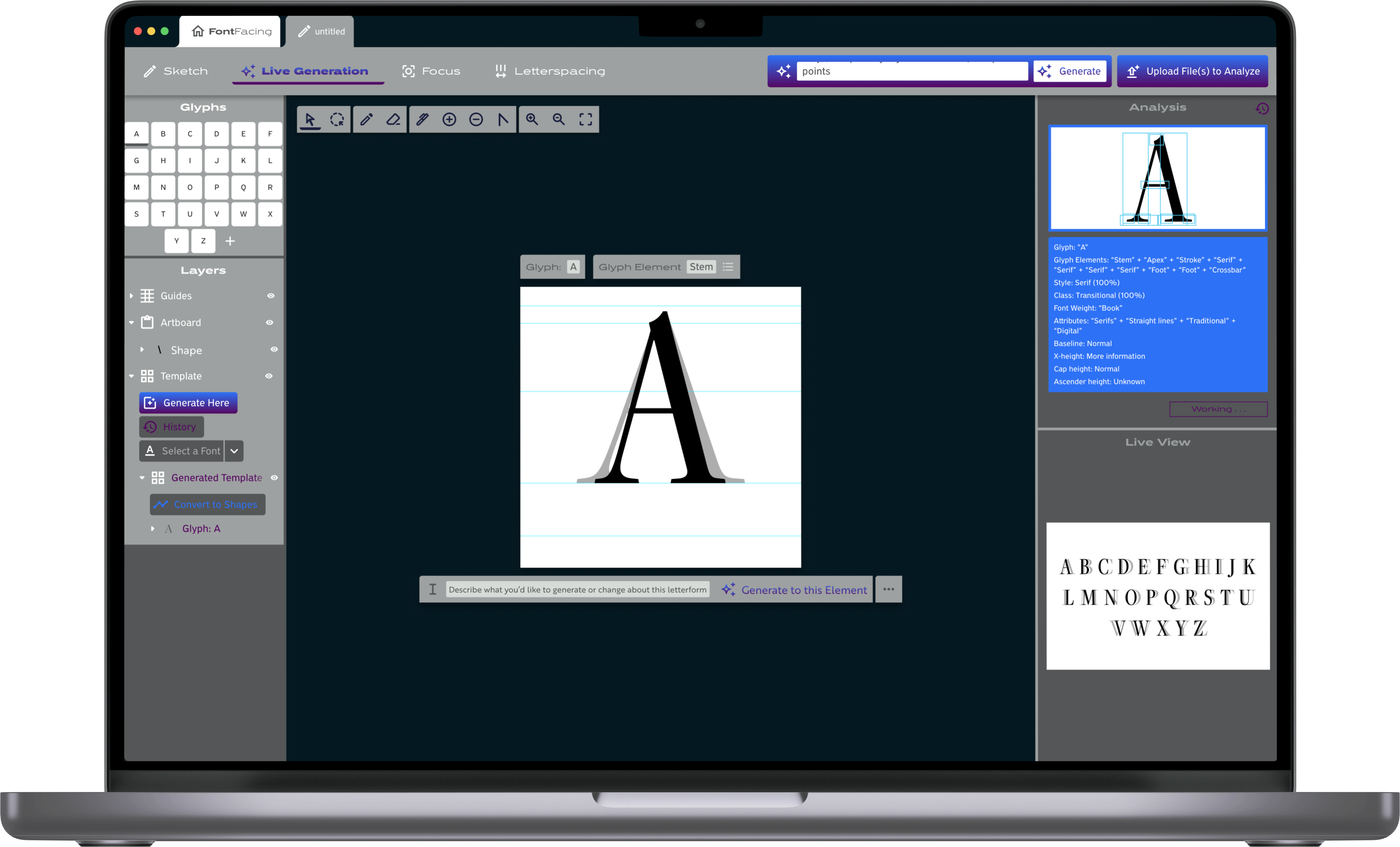
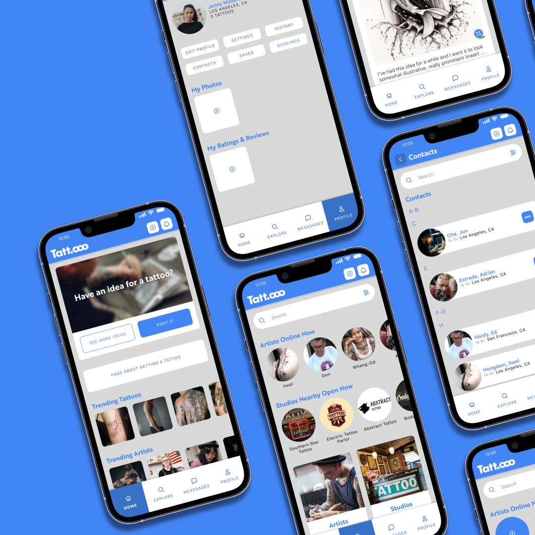
After also doing some research into AI platforms working with vector graphics, I solidified the concept I had in mind: a design and editing platform working with SVGs, supported and driven by AI to make it faster and easier for designers to build out the entirety of a typeface.
When I started this project, I had to create a training model to understand how AI analyzes the content that it's trained on in order to form the training model that will then be used.
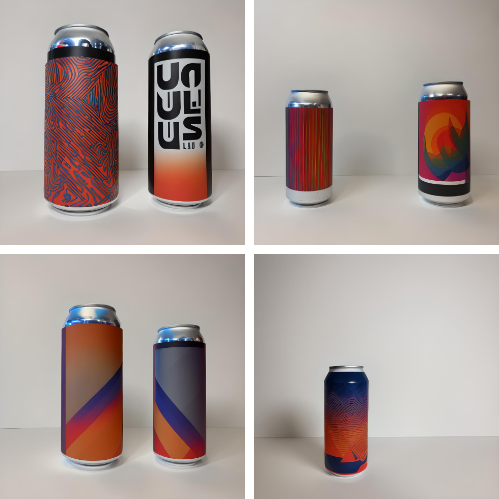
At the time, I had hundreds of photos of beers that I've taken over a few years just sitting around waiting to be used for something, so I made the first training model using around 1,000 of these photos. Some contain things in the background, like a bar, living room, and even people, and some are on a white background. Some show one, two, or three cans or bottles in various sizes. Most of them show a glass that's been filled with beer, and some show multiple glasses that have been filled with beer.
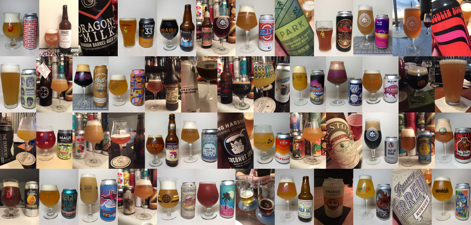
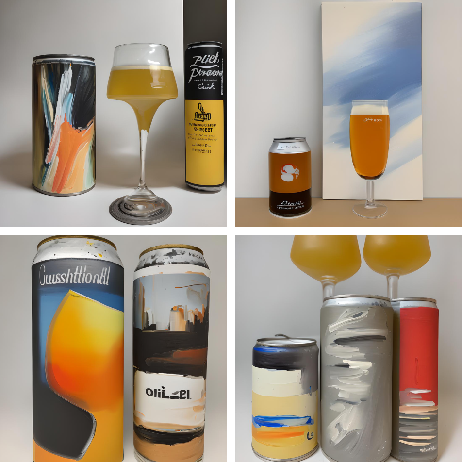
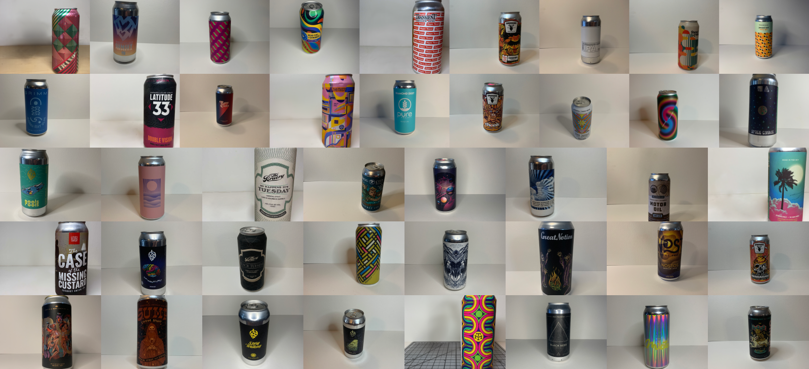
This training model was interesting. I didn't know what to expect. The resulting images that were generated from it are actually a pretty good showing, but the photos I used for the model weren't selected or taken with AI training in mind (they weren't vetted and I didn't take a look at any of them prior to building the model). I wanted to make another model where the images were very specifically created with the purpose of being put into a training model in order to see how that would affect the generated images compared to the first model. I gathered 30 beers (all 16-ounce cans) and took new photos with each can against a white backdrop, although I staggered the angles and composition of the photos. This training model was different, but provided much more insight as to how the system was analyzing the given photos.
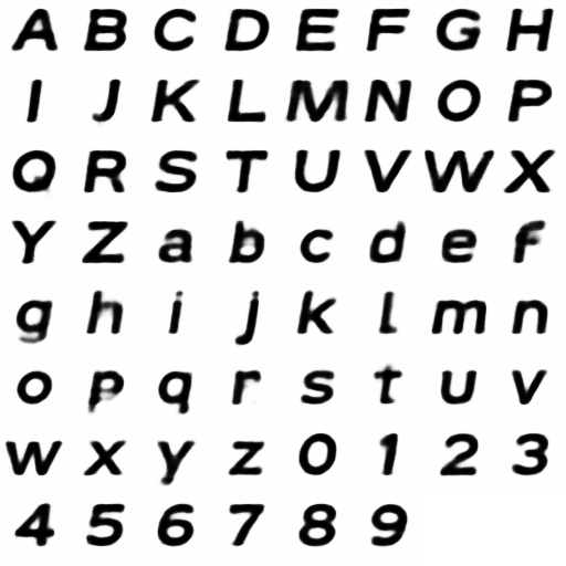
For the hands-on research, I made one last model with very simple images, 30 different versions of a capital 'A', each one black on a white background. The output from this (seen to the right) may seem like a poor result but, to the contrary, I believe that it serves as concrete proof that I'm thinking about the concept correctly: an AI training model is perfectly capable of finding patterns, consistent details, and unique attributes and then recreating those aspects... as long as it's given an appropriate context.
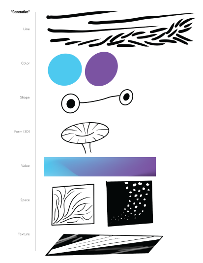
I did additional research regarding AI systems working on vector images, as well as the current prevalence of AI in the creation, recreation, and/or expansion of typographic systems. There's currently a lot of work put into text (copy) generation, but not a lot of work put into typeface or letterform generation.
In particular, I was inspired by the work of Erik Bern, Jean Böhm, and Måns Grebäck. These 3 designers (writing about their experiments in 2016, 2020, and 2022, respectively) have all worked in the space of typeface generation. Erik Bern used 50,000 fonts to train a neural network; Jean Böhm experimented with a workflow of AI abilities to generate SVG paths and anchor points to create letterforms; Måns Grebäck experimented with machine learning in the use of Stable Diffusion to generate new or stylistically similar typefaces to those he provided. All of their work served as proof that my concept could work, I just had to design an interface for it.
Aggregated letter generations from Erik Bern.
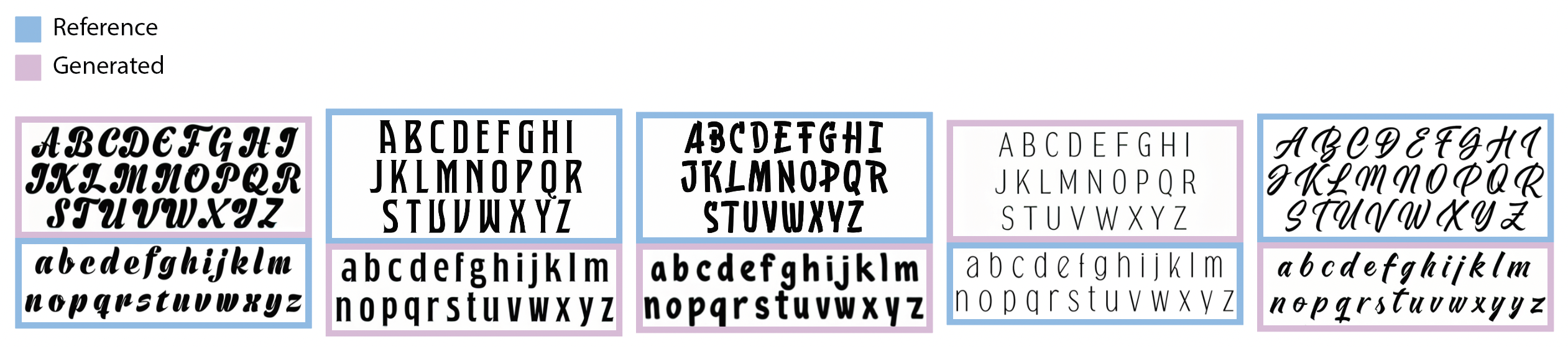
Typeface inputs (either lowercase or uppercase) alongside the AI-generated accompaniment (lowercase used to generate uppercase and vice versa) from Måns Grebäck.
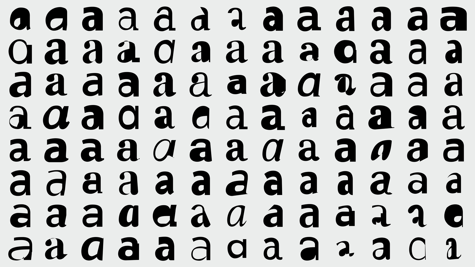
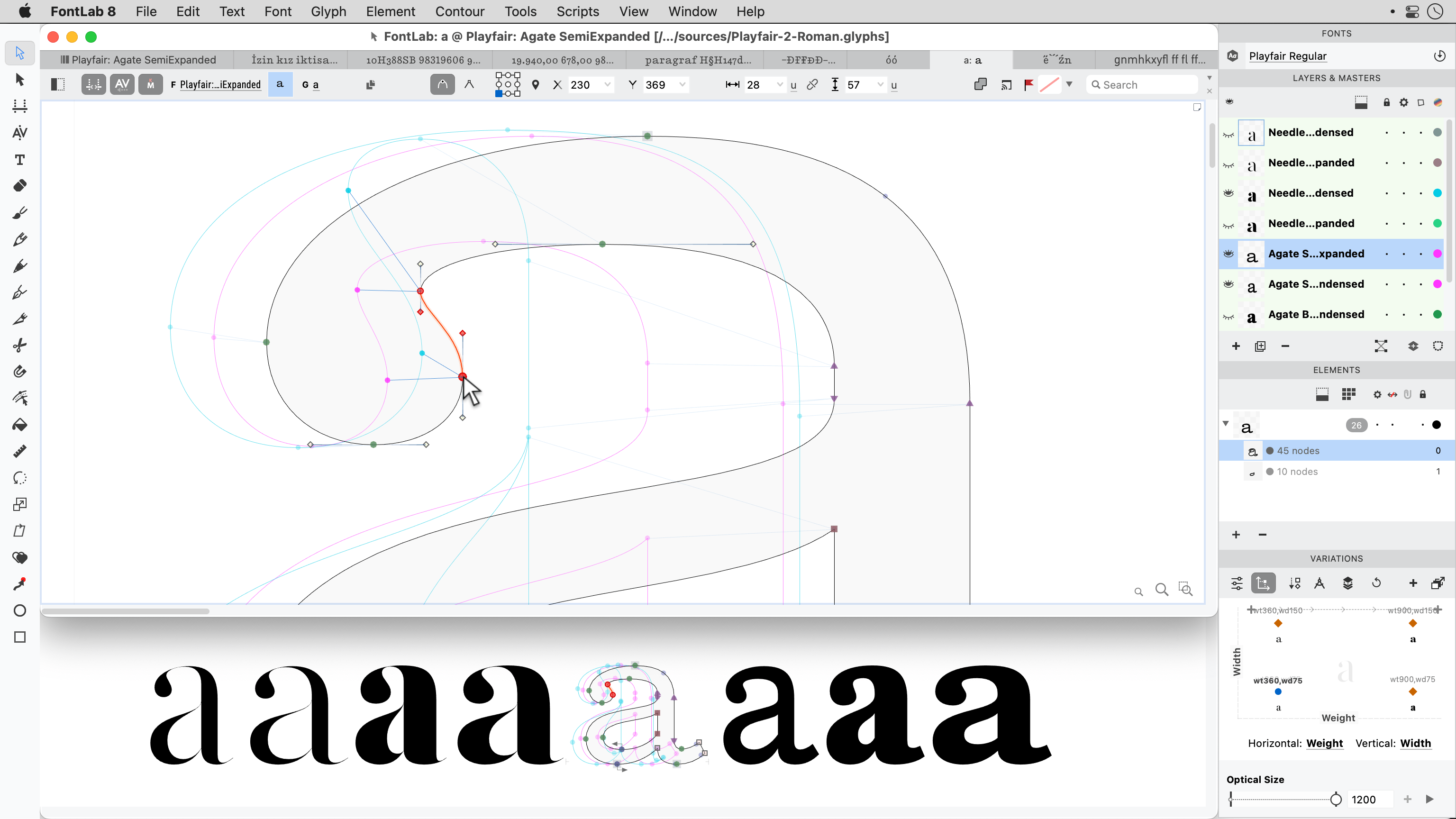
Extensive experiments using AI to generate svg paths for a lowercase letter 'a' from Jean Böhm.