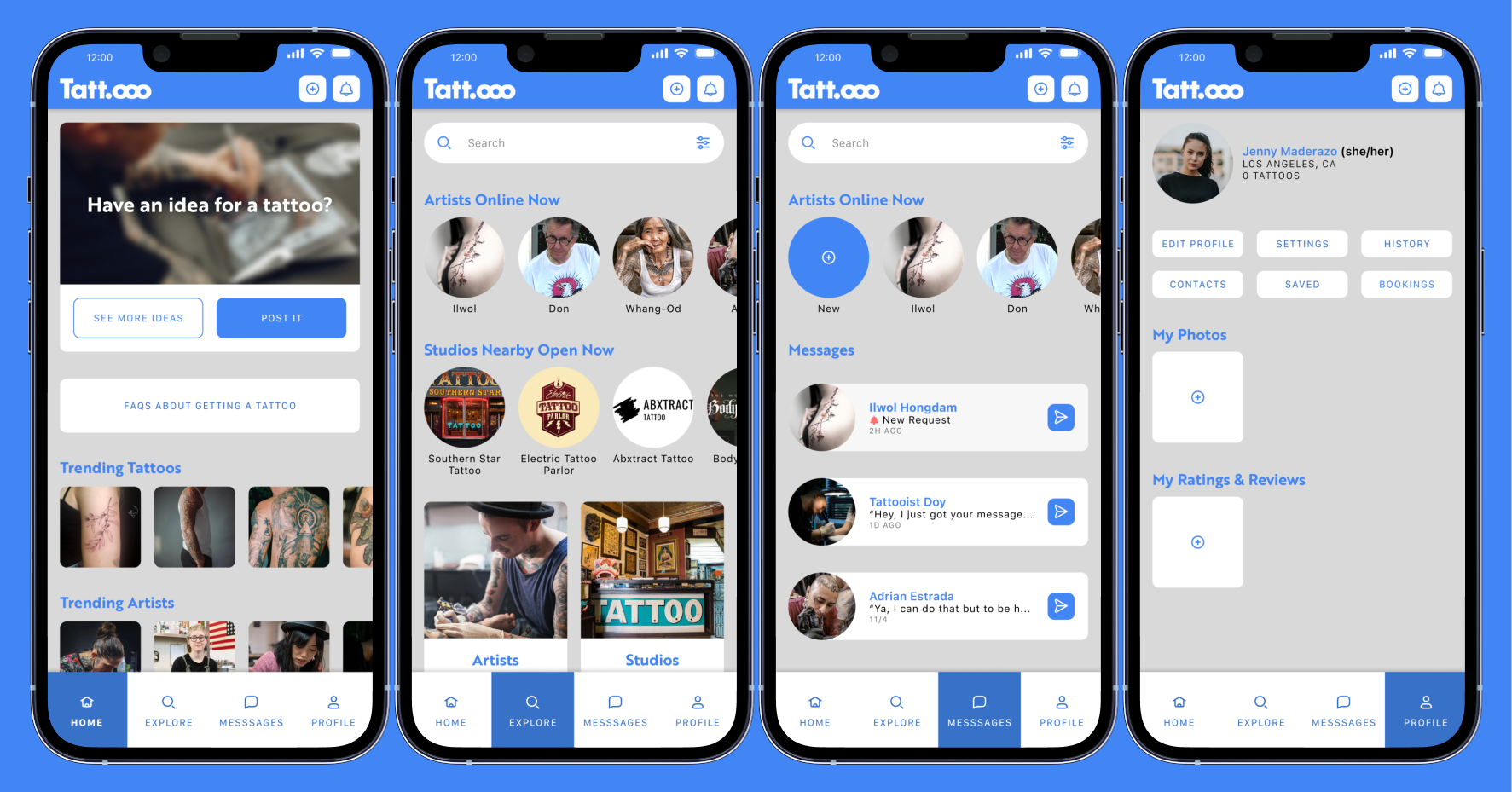
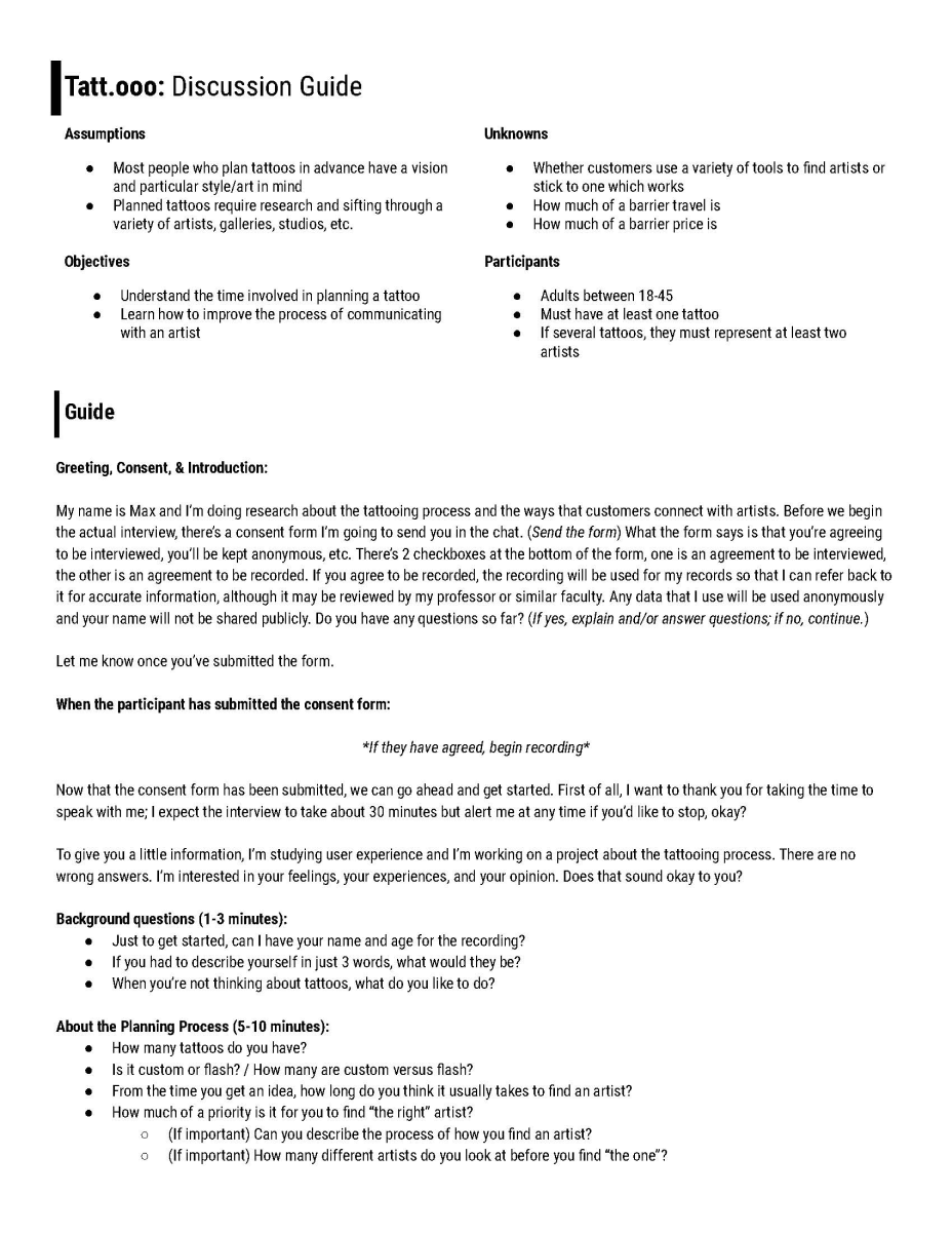
Crafting a Seamless Tattoo Experience for Clients and Artists

Mockup showing an iPhone with the prototype for Tatt.ooo's home screen

Overview

Tatt.ooo is a mobile app (with related collateral, like dedicated iPads) designed to help tattoo enthusiasts and hopefuls find, connect with, and start building trusting and accountable relationships with tattoo artists.

Some of the features for customers include a system to post your tattoo idea (with a description and inspiration), an accountable messaging system, the ability to easily ask for artwork edits, and a simple scheduling system. For artists, the Tatt.ooo platform can help centralize and simplify all of their public profiles and messaging systems, and can even give them a place to post available flash artwork.

Details

Mobile App High Fidelity Prototype 2022 14 Weeks Solo Project

What's the problem?

Choosing to get a tattoo can be deeply personal and complex. Simply finding a tattoo artist can be incredibly difficult; there are so many different touchpoints and places to look, and reaching out to an artist can be intimidating. Many begin a collaborative process with an artist but are unsure of how to express their vision or needs, and its all too common to show up for your tattoo session without having seen the artwork beforehand.

Interviews

A memoji representing an interview participant A memoji representing an interview participant A memoji representing an interview participant

Of course, going into this project I only had my own tattoo experiences to go off of so I started the process by formally interviewing people with tattoos. I also had several informal conversations with some additional people regarding their tattoo experiences.

This project needed to move pretty quickly, so I only had one week to get interviews done. Unfortunately, that means that I could only get 3 interviews. I would have preferred at least twice that many, and if the scope of the project had allowed I would have also interviewed tattoo artists. That's definitely a major fault, here. Without the input of artists themselves, this project is largely speculative as it can only account for the customer's perspective.

Read more

description

1Pain Points

Lack of strong communication
Too much information about tattooing from too many different sources
Not seeing artwork until late in the process, often not until you show up for the tattoo
The artwork isn’t always what was expected

2Opportunities

Improve and streamline the communication process
Hold customers and artists responsible for the speed of their communication
Help customers see the artwork early and the artists to get feedback
Provide helpful information and resources in a centralized platform
A persona representing the synthesis of the previously done research. This persona is a 22-year-old named Jenny and she has a tumultuous relationship with her parents which, in part, motivates her.

Who I'm Designing For

After my interviews, and synthesizing the information, I was able to really nail down the type of user I should have in mind while designing. I made a series of journey maps then looked at the different positions of social media and competitive platforms within the space. Finally, I was able to build a persona as a stand-in for my compiled information.

Next, I built out the expected information architecture and fleshed out the user flows for tasks I felt would be integral to the customer experience. This was an interesting exercise since I'd previously ideated on how notifications could lead to interactions, but I'd never used them as an expected (or hoped-for, at least) starting point for a user flow.

Read more

description

Information Architecture & Example User Flows

A large sitemap showing the information architecture of the mobile app.
A large diagram showing the expected flow that a user will take through the sitemap to accomplish a certain task.

Branding

Creating a name for this project, let alone a logo, was a difficult prospect. It was taking quite a while and I ended up working on logotype drafts, sketches, and name options all together because there are so many variables. If the name/logo aren't specific enough to tattooing then it could feel like a random social media platform or a generalized art app. It took 5 weeks just to cut the bullshit and say, "You know what, the best thing for this platform is to just call it Tatt.ooo and leave it at that." Then it took one more week to realize that I didn't need an ineffective, abstract logomark and that the name, by itself, as logotype, would be perfect.

Finalizing a color system and typography was much simpler than the name. It took me 1 week to explore some style options and then cut them into what I would end up taking all the way to the final prototype.

Read more

description
The final logotype with examples showing its use in different contexts, such as icons.
High fidelity screens of the 4, main pages as accessed by the tab bar

Visual Design Language

The overall layout and structure of the app was never an issue, with one exception. The primary form to post a tattoo idea proved to be a little troublesome. Or, maybe a better way to put it is, I may have not given it enough thought at the start. I treated it with the normal thought that its a form and should be quick and easy to complete. However, a tattoo is a lifelong commitment and, if much of our audience is first-time customers, perhaps it deserves a little more effort than a one-page form of text fields and dropdowns.

Creating a consistent visual design language went pretty easily, insofar as it was a continuous process of making small adjustments to color choice and hierarchy. There were a lot of small details that required fine-tuning but everything really came together once I was able to nail down consistent elements and usage across multiple screens.

Read more

description
A series of posters that takes the branding elements and reuses them to market the app with the slogan, 'Bring your ideas to life'.

User scenario video showing how the persona, Jenny, would use the Tatt.ooo app to accomplish tasks.

Some Parting Thoughts

Every graphic designer has to learn logo design. It's never been something I've been particularly great at, but I like typography so I'm pretty good when it comes to logotypes. Making a brand symbol is often something that escapes me. This was a nice chance to spend several weeks focused on the topic. There were several times I thought a certain graphic would work great but in combination with the name, or any name, it would suddenly fall apart. I would work so closely with the shapes and images that I would be convinced I'd made a good brand symbol, only to find out that it wasn't working for many reasons I couldn't see. This was a nice reminder that I need to take a step back from my work.

You would think that in interaction design you get to spend a lot of time on microinteractions and that can be true, sometimes. However, a lot of the time you have to focus on the experience as a whole rather than the intimate details of every microinteraction. The tattoo idea form isn't quite a microinteraction in the way that a button's click animation is, since each page lasts for as long as the user needs it to, but I like to think of it as microinteraction, as a microcosm to the macrocosm of the overall platform. The difference between my first form version and the final version is extreme, and I like to think that where I ended up is a much more thoughtful way to present the form the users.

Primary Research

close

Of course, going into this project I only had my own tattoo experiences to go off of so I started the process by formally interviewing people with tattoos. I also had several informal conversations with some additional people regarding their tattoo experiences.

This project needed to move pretty quickly, so I only had one week to get interviews done. Unfortunately, that means that I could only get 3 interviews. I would have preferred at least twice that many, and if the scope of the project had allowed I would have also interviewed tattoo artists. That's definitely a major fault, here. Without the input of artists themselves, this project is largely speculative as it can only account for the customer's perspective.

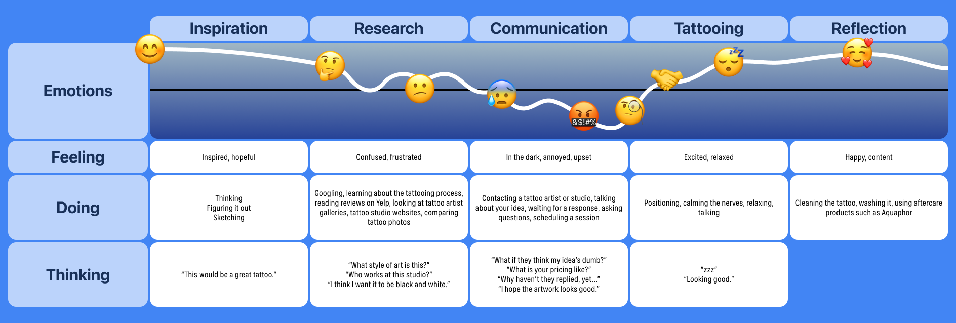
My experiences getting tattoos have been varied. One experience was very in-depth and communicative, I felt taken care of but, at the same time, didn't see my artwork until the day I showed up for my appointment. However, my first tattoo went quickly: I walked in, showed the artist my reference photo, he gave me the tattoo (painfully), and I was out in about half an hour; I found out later that he'd done the tattooing part poorly. Another experience was also poor: the artist was charismatic but his tattoo abilities were lackluster and I ended up having to get the tattoo covered. My other tattoos have fallen somewhere in between where the tattoos came out good but the process felt like a business transaction: impersonal.

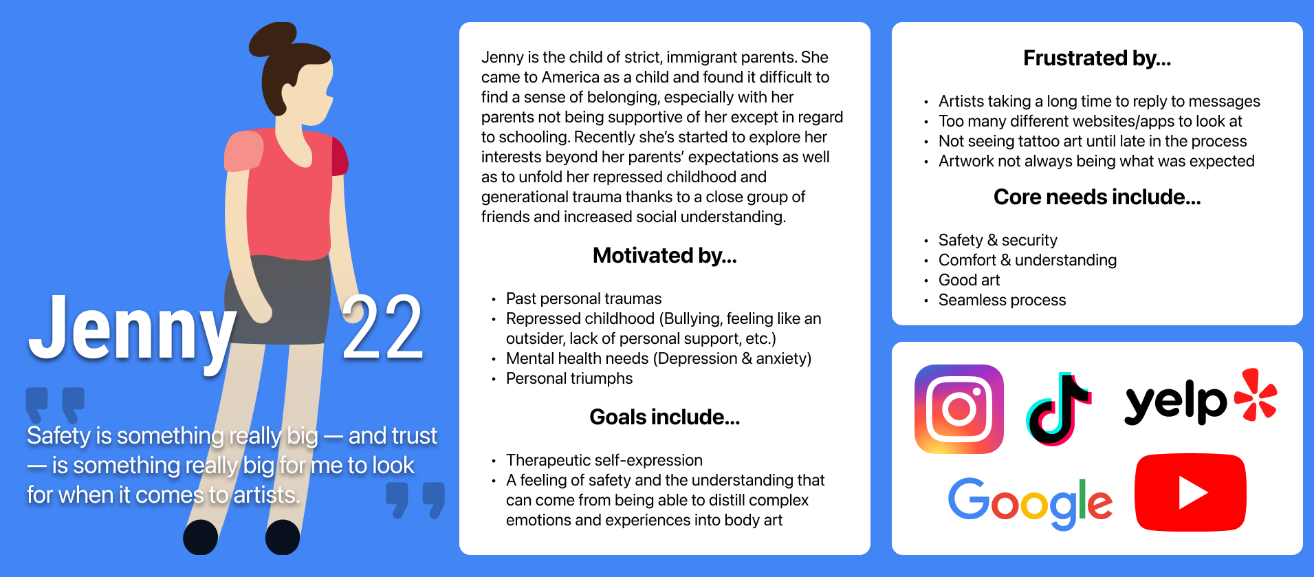
Of course, I would need some more information than simply my own experiences. I wanted to speak with a younger audience: 18-35. I also decided I would speak with both women and men, and felt that if I could speak with people with many tattoos, people with only one or two, and preferably people with relatively recent tattoo experiences then the forthcoming conversations would be much more informative.

Page 1 of an interview guide used for this project Page 2 of an interview guide used for this project

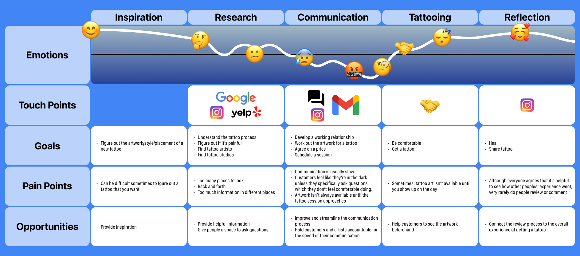
My interviews gave me a lot of usable information. First, I was able to confirm some of my assumptions:

  • The “problems” typically end once the tattooing process starts (with obvious exceptions)
  • The experience overall is very personal, from the meaningfulness of the artwork to the aftercare routine which follows
  • Approaching an artist for the first time is a source of anxiety
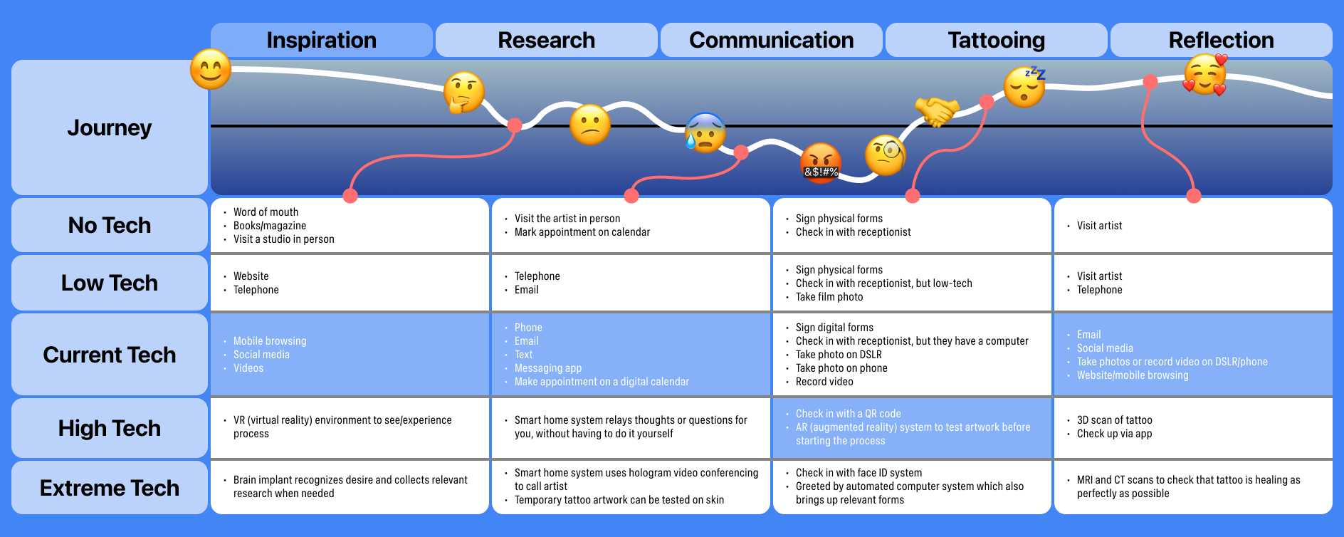
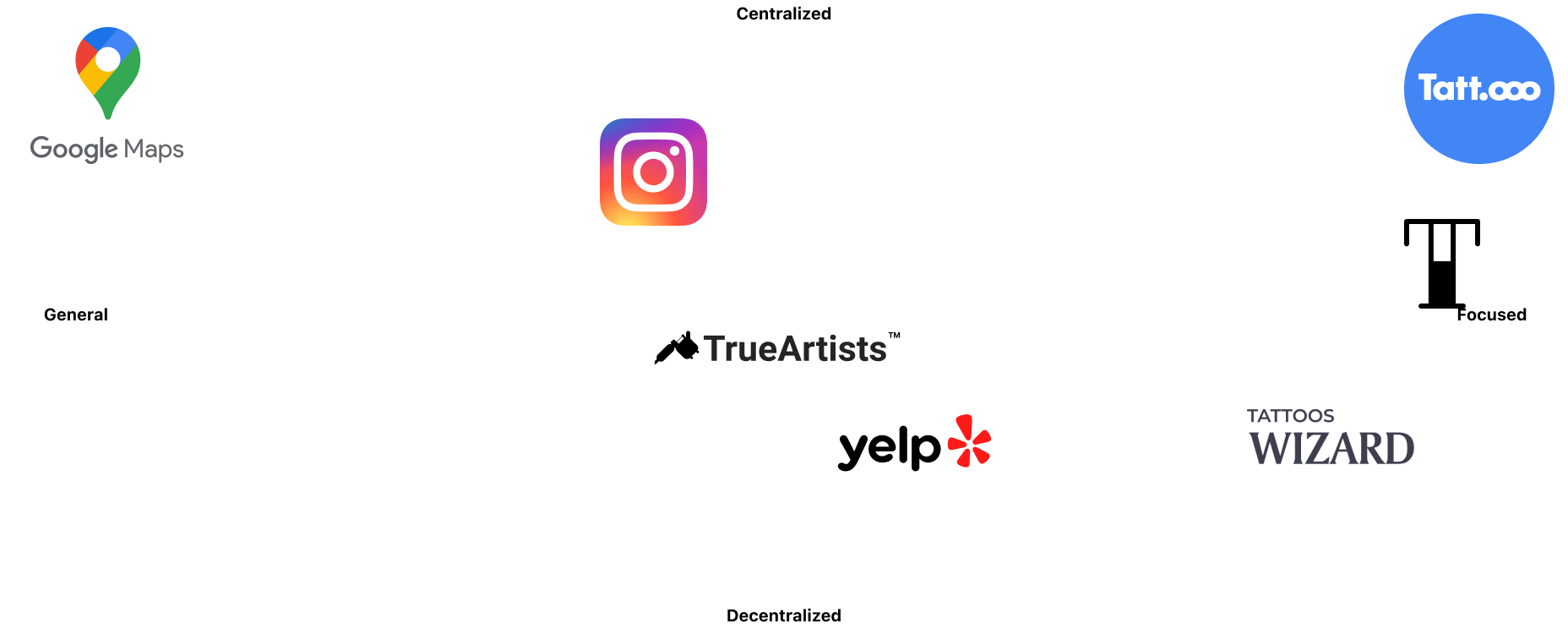
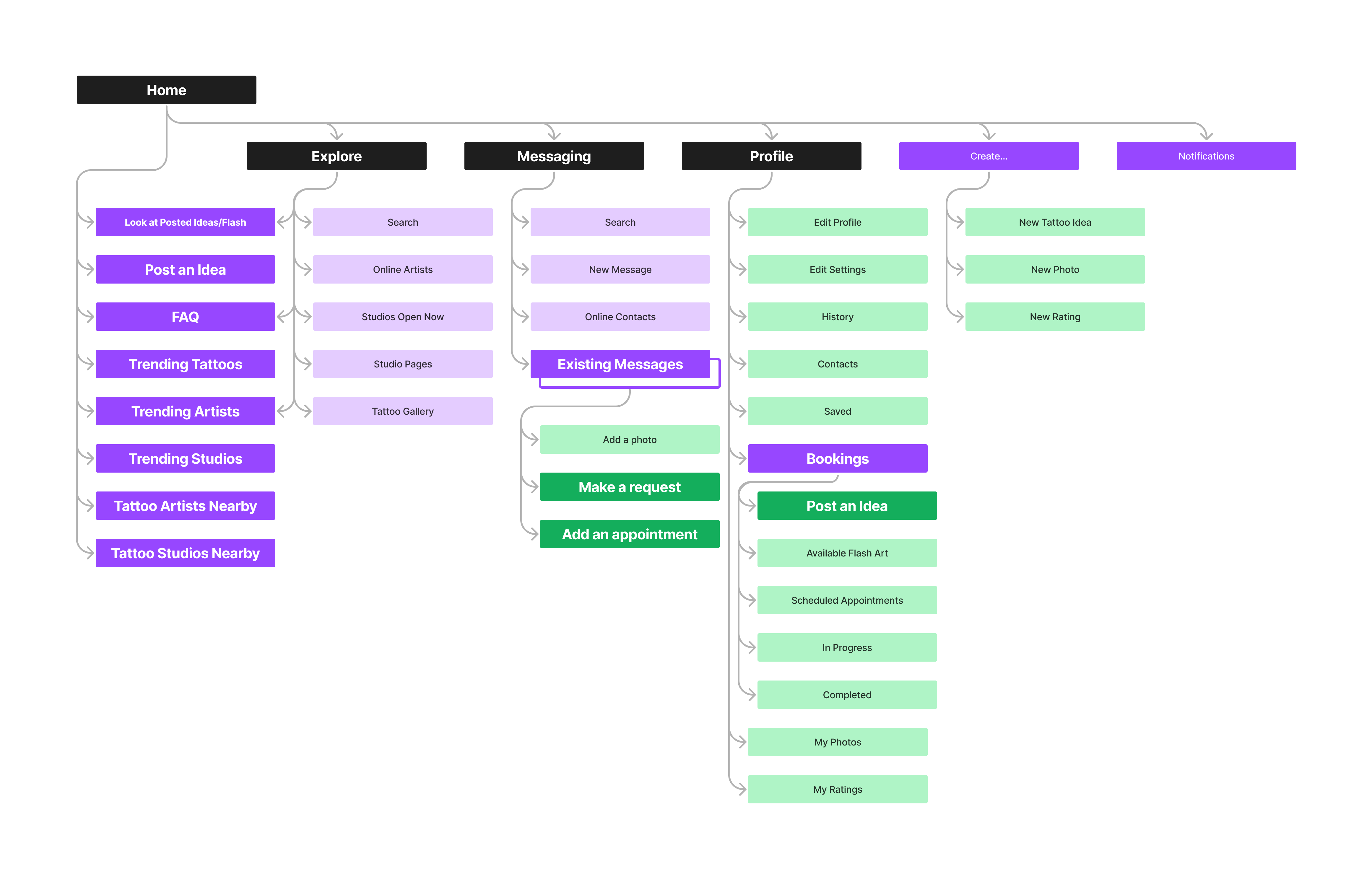
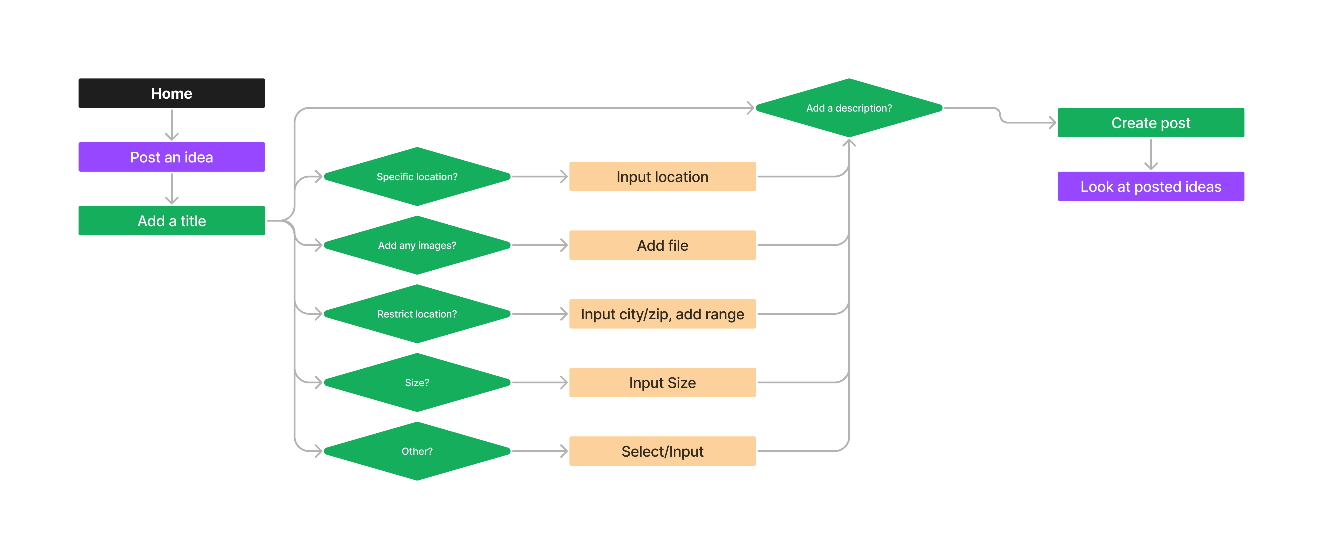
  • Too many different websites

I also quickly found some common paint points across all of my interviews:

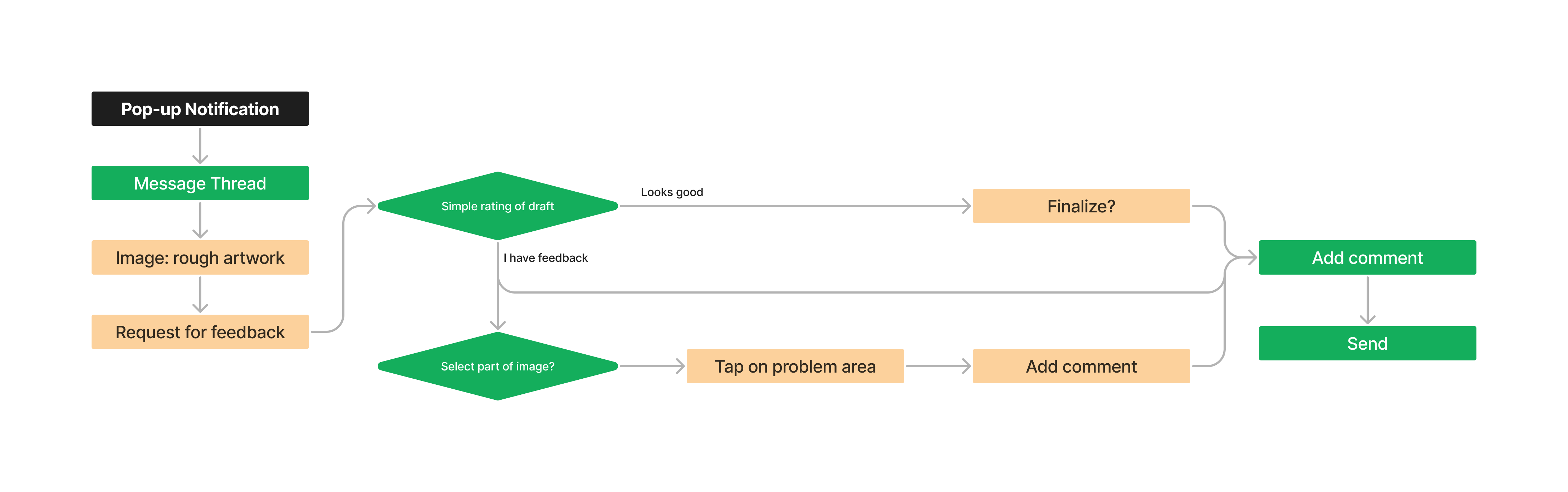
  • Lack of timely communication
  • Too much information about tattooing from different sources
  • Not seeing artwork until late in the process
  • Artwork isn’t always as expected

Finally, some of my new discovery included:

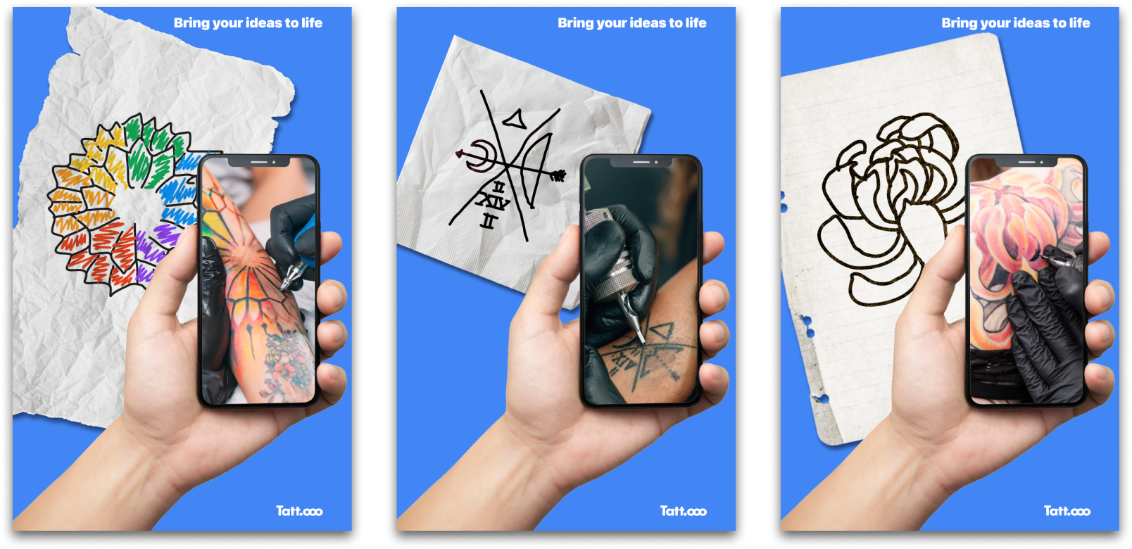
  • The most important parts of getting a tattoo are: an artist who communicates, answers questions, asks questions, and welcomes feedback, feeling comfortable with the artist and in the space in which they work
  • The first tattoo is the most important, a “make or break” situation
  • Being tattooed is very meditative; although there may be pain it isn’t necessarily a painful experience
  • Very rarely do people leave a review or go out of their way to comment on their experience
  • There’s always an understanding that quality tattoos come with a certain cost so this isn’t usually a concern

Who I'm Designing For

close

After my interviews, and synthesizing the information, I was able to really nail down the type of user I should have in mind while designing. I made a series of journey maps then looked at the different positions of social media and competitive platforms within the space. Finally, I was able to build a persona as a stand-in for my compiled information.

Next, I built out the expected information architecture and fleshed out the user flows for tasks I felt would be integral to the customer experience. This was an interesting exercise since I'd previously ideated on how notifications could lead to interactions, but I'd never used them as an expected (or hoped-for, at least) starting point for a user flow.

Synthesizing research into a journey map is a pretty typical aspect within the design process. You have to be able to see and understand where and when a customer interacts with, or is likely to interact with, your product. Building out the map based on their thoughts, actions, touchpoints, emotions, etc. is all commonplace. Something I'd never done, until this project was to think about the variances in technology between the different points along the journey and then to think about opportunities based on that information as well. I built out 3 charts based on the same customer journey (one shows feelings, thoughts, and actions; one shows touchpoints, goals, pain points, and opportunities; the last one shows variances in levels of technology across the journey) so I won't explain all of them, but that last one, you can see below, is pretty interesting.

A customer journey map, of the process to get a tattoo, highlighting the feelings, actions, and thoughts at different stages. A customer journey map, of the process to get a tattoo, highlighting the touchpoints, pain points, goals, and opportunities at different stages. A customer journey map, of the process to get a tattoo, highlighting the different levels of technology (no technology through extremely advanced technology) at use or that could be used at different stages.

When it comes to digital product design, I think we default to this thinking where a touchpoint is a digital touchpoint, so that's the only realm we think about. But there are other levels of technology out there and they're all trying to achieve similar goals.

I had to think about the positioning opportunity as well. I'd made mention, quite a bit, about how social media was making this process more difficult in some ways and easier in other ways. The truth is, social media is a great tool for tattoo artists, but it's not a focused tool designed for things like scheduling and can make it more confusing to show things like hours and rates and can be a one-sided experience since artists will only show their very best work, so you don't get to see much of their customer's perspective. Tattoo-focused platforms, on the other hand, might be better at messaging and scheduling and showing hours and rates but aren't nearly as good for showcasing art or even being discovered. Based on the positioning matrix below, the solution is to bring those different positives into one place.

A competitive positioning matrix showing how different, competing platforms fare in terms of being a focused or centralized platform for tattoo enthusiasts and artists.

As the last piece of this puzzle (as with many UX puzzles) I made a persona to compile all of the most important information into one place. If I had more time to do my interviews then I'm sure this persona would be quite different, but as it stands the persona is a 22-year-old named Jenny who has a a tumultuous relationship with her family.

A persona representing the synthesis of the previously done research. This persona is a 22-year-old named Jenny and she has a tumultuous relationship with her parents which, in part, motivates her.

Branding

close

Creating a name for this project, let alone a logo, was a difficult prospect. It was taking quite a while and I ended up working on logotype drafts, sketches, and name options all together because there are so many variables. If the name/logo aren't specific enough to tattooing then it could feel like a random social media platform or a generalized art app. It took 5 weeks just to cut the bullshit and say, "You know what, the best thing for this platform is to just call it Tatt.ooo and leave it at that." Then it took one more week to realize that I didn't need an ineffective, abstract logomark and that the name, by itself, as logotype, would be perfect.

Finalizing a color system and typography was much simpler than the name. It took me 1 week to explore some style options and then cut them into what I would end up taking all the way to the final prototype.

From the moment I decided to make a tattoo-focused app I started to sketch, just random icons and shapes referencing connection, unity, security, and a couple things referencing tattoos but trying to keep it more generalized. I'd also been researching URLs and Top-Level Domains for a separate project and realized early on that the Top-Level Domain ".ooo" exists and could be used as part of "tattoo" as a name. (More on that later...) I also made a kind of word cloud to connect the dots between different aspects of the platform I was building to see and explore the different name possibilities.

A page of rough sketches. A page of rough sketches. A page of a word cloud.

I was able to think of more than 50 different name options. Some were clever, some were literal, some were foreign words, some were abstract concepts... I was able to narrow it down to the 4 which I think best spoke to the platform as I imagined it:

  • Tatt.ooo — over 3 weeks or so this had become a working name, anyway; its short, sweet, to the point, and easy to conceptualize
  • Ink Different — a clever name that ties tattooing to something very concretely in the technology space (Apple's old slogan, "Think Different") while encouraging you to go about the centuries-old practice differently than normal
  • Cwtch — a Welsh word for an embrace that brings with it a feeling of warmth and safety, which sounded like the right feeling I wanted my app to provide
  • Conversate — a name that's less about the tattooing and more about the communication aspects
A grid showing successive experiments using the previously listed name ideas as logotypes.

There was some pushback, but in the end the name Tatt.ooo ended up being the most fitting. None of the other names I'd come up with (none of the 50+, not just those listed above) came close, either... I continued to work on an icon or brand symbol, though, since I felt I might need one. I explored a lot of abstract shapes as a way to contrast the particularly specific brand name.

A set of experimental icons I was using to explore different logo options.

With the form exploration I was able to better explore all of the different concepts that my name wasn't able to touch on. Things like community, unity, communication, togetherness, and more are all different abstract concepts that I tried to explore with a brand symbol. The circular explorations felt the most appropriate so I kept working on these.

More logo experiments, combining some circular explorations with the previously attempted logotypes.

In the end, none of the brand symbols felt quite right. At different stages they related to different things. By the end, some of them looked like icons for a municipal metro system or like animations that would play while a page loads. The best solution, at this point, was just to use the name itself as a logotype.

An example of the logotype I landed on, with explorations of how it could be used in other forms, like different kinds of icons.

To start thinking about the visual design system, I made 3 style tile explorations. On the left, I tried to create a "sterile" visual style which would let the artists be the centerpiece, featuring only slightly rounded buttons, humanistic and geometric sans serifs, and a sparse color palette of whites, grays, and a slightly desaturated red. In the middle is a calming and community-focused style, featuring a more friendly sans serif for titles but the device default font (in this case, SF Pro) for simple clarity with a slightly smaller and quite rounded icon set. On the right is a style designed to create a more accountable feeling, with a classic serif title face accented by a narrow sans serif in some places, and a color palette of primarily black with green accents. The left felt too plain; the right felt too judicial; the middle is almost right, but it needs some adjustments.

3 examples of style explorations. Each exploration features a different color palette, tile set, type hierarchy, and shape language.

By now, I had roughly 5 weeks to finish a high fidelity prototype and other collateral. I had used a rounded icon set I found on Figma (Xnix Icon Pack by Ankush Syal) for the style tiles. I knew that I wouldn't have time to build out the entire set of icons I would need so I decided to use the same tileset for my prototype.

A set of icons that fit my visual design quite well, with a rounded, friendly, approachable form language.

For the colors, I used the same white, blue and gray but opted to use white as the primary background color and the blue as the primary brand color. With blue for all of the backgrounds it was harder to distinguish levels of importance across content and the blue became overwhelming after a while. I added a coral red for notifications and highlights, and was also thinking about how the platform would interact on the web, such as when artists are editing their profile, so I added 2 purple colors for hover and click feedback. Those purples are never used in the prototype, as its a mobile app (there's no hover class on phones), but I liked to have them available just in case.

A color palette of organized squares of color, featuring the primary brand colors (blues), along with an alert color, background colors, and secondary brand colors (purples). Each color also lists the specific hex code and the use cases for each color.

Visual Design Language

close

The overall layout and structure of the app was never an issue, with one exception. The primary form to post a tattoo idea proved to be a little troublesome. Or, maybe a better way to put it is, I may have not given it enough thought at the start. I treated it with the normal thought that its a form and should be quick and easy to complete. However, a tattoo is a lifelong commitment and, if much of our audience is first-time customers, perhaps it deserves a little more effort than a one-page form of text fields.

Creating a consistent visual design language went pretty easily, insofar as it was a continuous process of making small adjustments to color choice and hierarchy. There were a lot of small details that required fine-tuning but everything really came together once I was able to nail down consistent elements and usage across multiple screens.

The original medium-fidelity wireframes I'd made for the mobile platform were pretty well-laid out. I used many of the design principles for iPhone-based apps, such as the navigation bar at the head of each page and the lower tab bar. I also put some extra thought into how I could organize the interface to refrain from having to use a hamburger menu, if at all possible.

First set of medium fidelity wireframes, blocking out the layout using gray boxes and filler text.

As mentioned above, however, the main form for posting tattoo ideas proved to be too simplistic. It was a singular page with a series of text fields and a file upload. It needed to be so much more than that. People who get tattoos are so varied, they cover every stretch of life and touch every demographic you could imagine. There's certainly a population of people whose first tattoo is sudden, maybe picked out of a selection of available art, or chosen for them by a friend, or even a simple idea they've already been sold on for a while; this form isn't for those users. The form is for the users who've put more thought and requirement into the tattoo they want to get. Maybe it's a concept they can't quite visualize but they can describe with words, maybe it's a distinct visual they've imagined for years, or maybe it's a complicated idea that requires some explanation. Whatever the case, this form shouldn't be so simple that a single page of text fields can cover it. When I realized all of this, I decided to separate each question into a separate step of the form and to also think of more interesting ways to answer each question that would create a better mental connection. (This form looks quite a bit longer and more complicated, and from a certain standpoint, it is. However, it's also quite thought out and leads the user through quite thorough steps, from left to right.)

A revised set of medium fidelity wireframes that goes through the entirety of the new form process for users to post their tattoo ideas.

Once I had the majority of the of the structure completed, I started applying my branding and styles to transition the prototype into high fidelity. First, there's a card system to help organize content.

High fidelity prototype designs showing consistent card elements used throughout the interface.

Next, there's the button styles. These took more time to get right. Since the full-width buttons lead to another page, I decided to place the descriptive arrow to make it clear you're moving forward to the relevant content (forward:to the right; the direction of forward progress in the West) as well as to act as a clear call to action for these elements.

High fidelity prototype designs showing consistent button styles used throughout the interface.

I was able to reuse the CTA from the full-width buttons as a similar CTA for the social button styles. In this case, the CTA is context-dependant. Depending on what page you're on it could be a "show more" button or a "message" button.

High fidelity prototype designs showing a contextual social button that builds upon the previous button design language.

Finally, the form itself contains a variety of elements that combine aspects from the rest of the app. There are longer text inputs (compared to a search bar) for a title and description, there are checkboxes depicted as cards, and the tab bar is completely replaced since the focus is on the form, not extra navigation options.

A set of high fidelity prototype screens showing the final design system applied to the revised form flow.