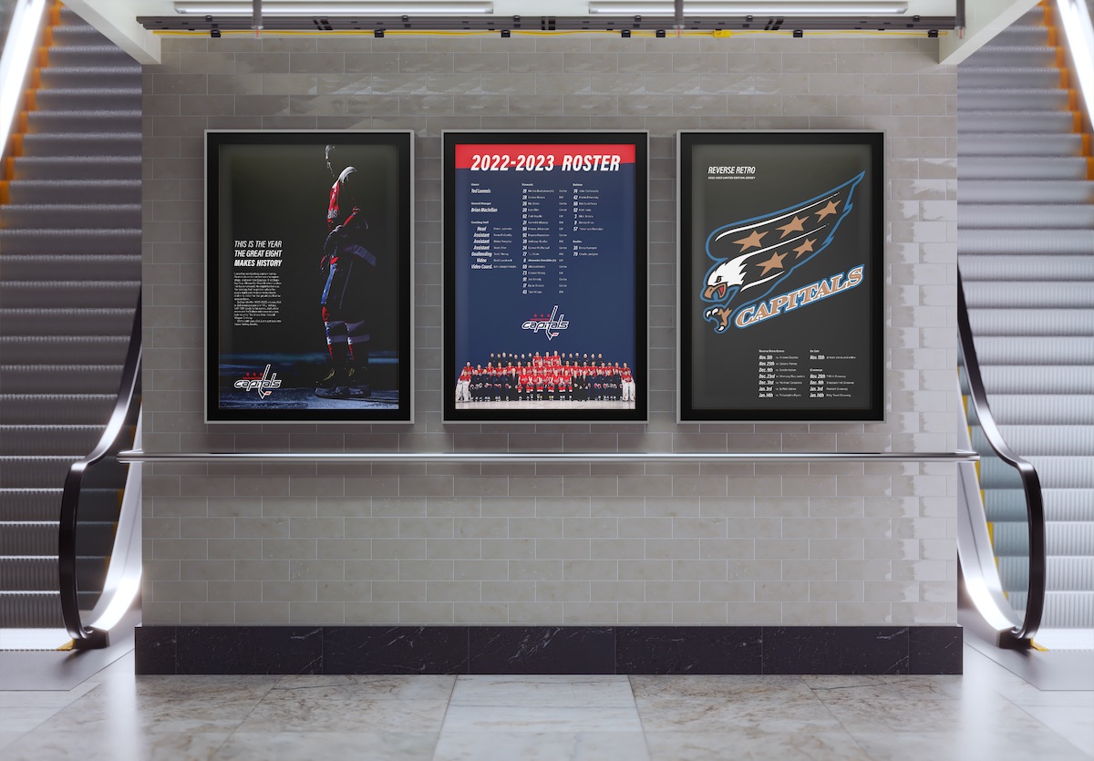
Speculative Typographic Branding for the Washington Capitals —
Info
- Typography
- Role: Graphic Designer
- 12 Weeks
- September - December 2022
- Solo Project
Tools
- Pencil Sketching
- Adobe Photoshop
- Adobe Illustrator
- Adobe InDesign
Overview
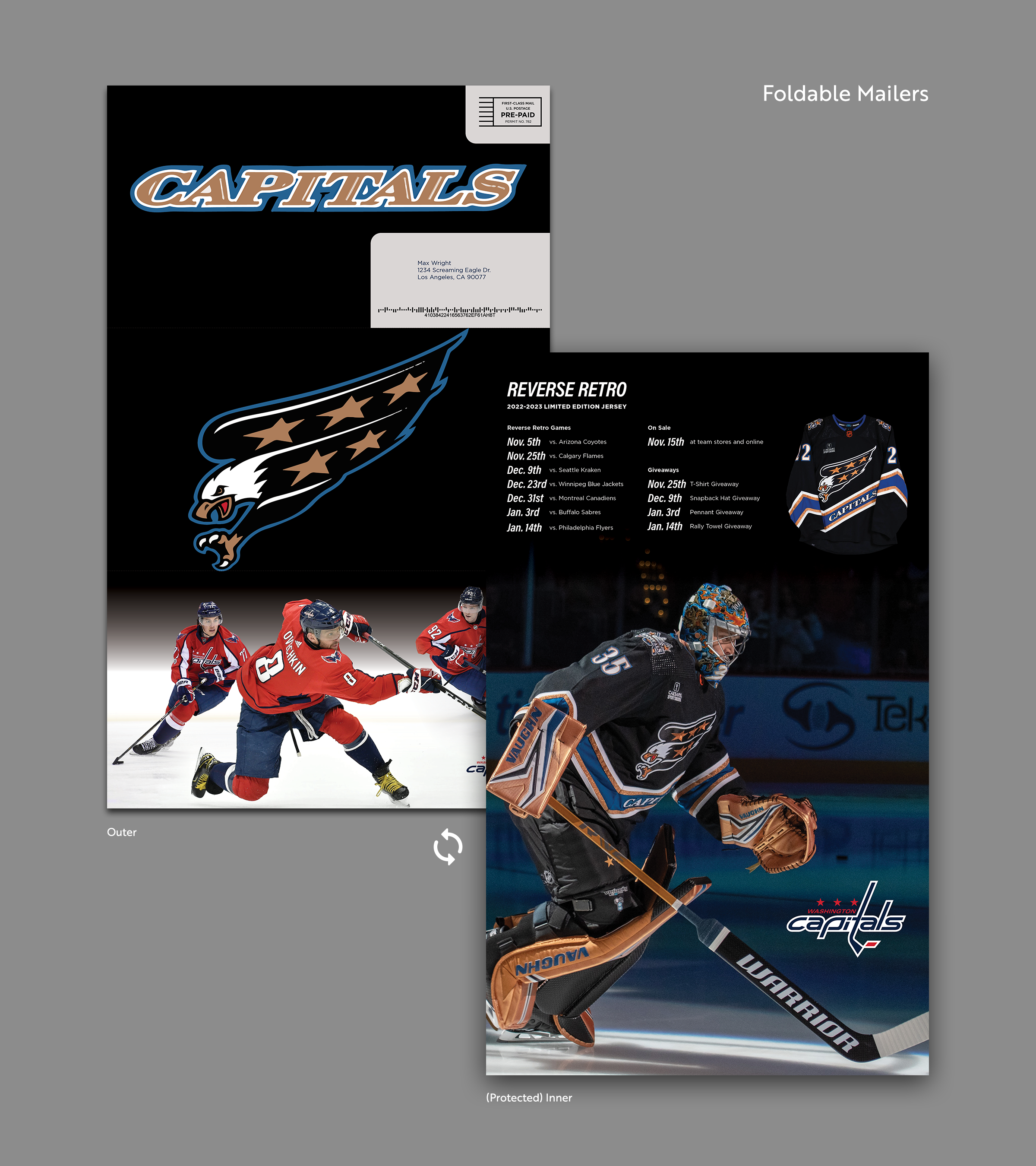
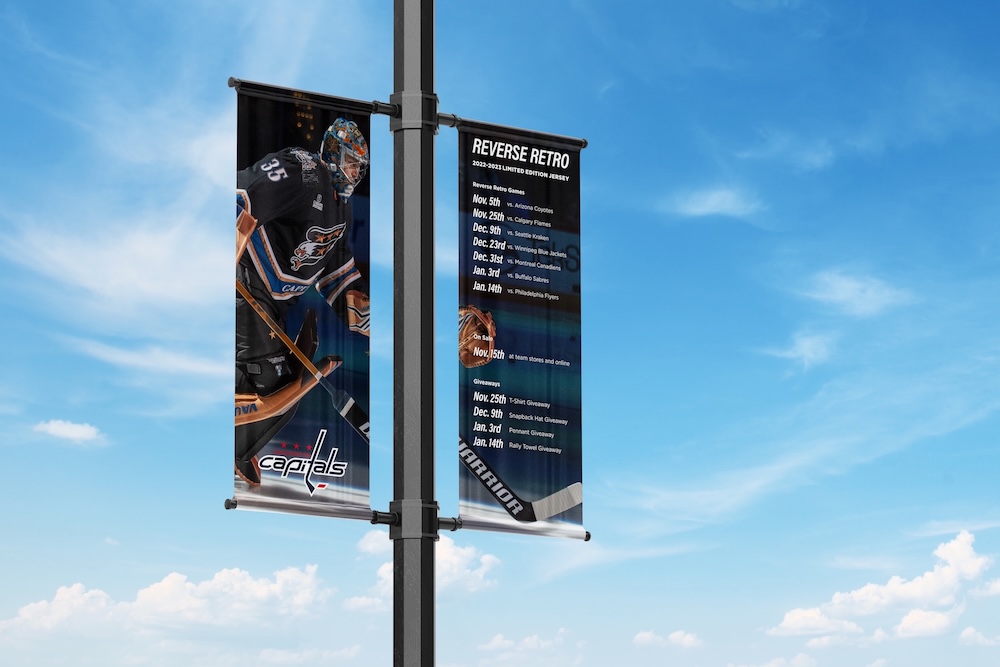
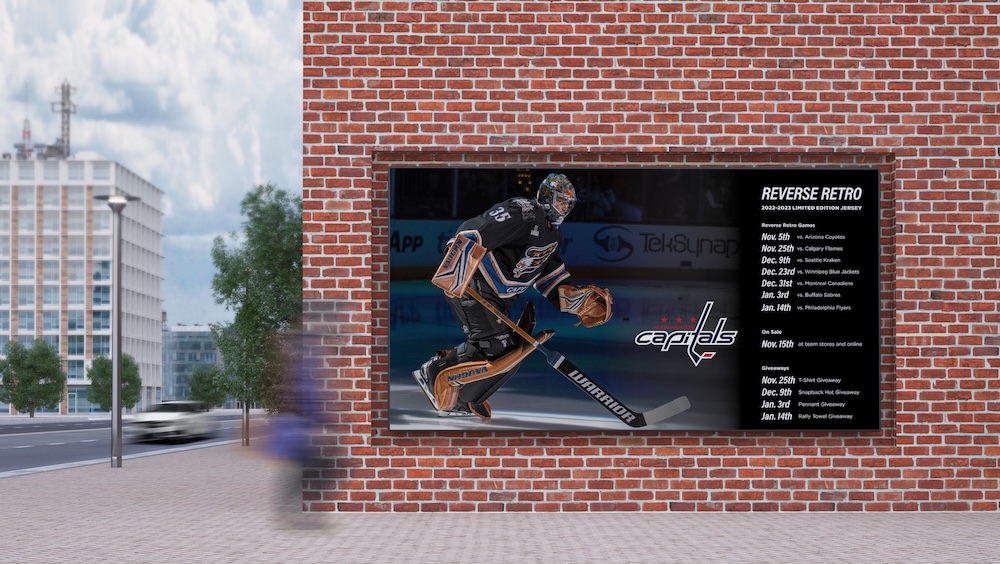
I created a typographic branding system for the Washington Capitals' print materials, specifically for use in the 2022-23 season as they brought back a retro styling for their 3rd (alternate) jersey. The system is intended to combine aspects of the current branding and the retro branding.
Disclaimer —
This project is a speculative, unpaid work and is not officially affiliated with or endorsed by the Washington Capitals or Monumental Sports & Entertainment. All logos, photos, and other copyrighted materials are the property of their respective owners and displayed for illustrative and/or research purposes.
Branding for Professional Sports
Professional sports teams exist in a strange place in the branding world. While a company might hold onto their brand styles for decades, updating once every now and then, a sports team might change their styling every 2-3 years. They won't change the name, but they could alter their colors, introduce alternate logos, and swap out fonts, textures, patterns, and more. Sometimes its planned far in advance. For instance, for the 2022-23 season, the NHL brought back a retro-styled jersey for every team as their 3rd/alternate jersey (home, away, alternate).
For the Washington Capitals, that means a 3rd jersey of black, white, blue, and a dash of copper. For a team usually associated with bright red, white, and blue its a big change. I wanted to create a unified typographic branding system to bring the retro a little more in line with the modern.
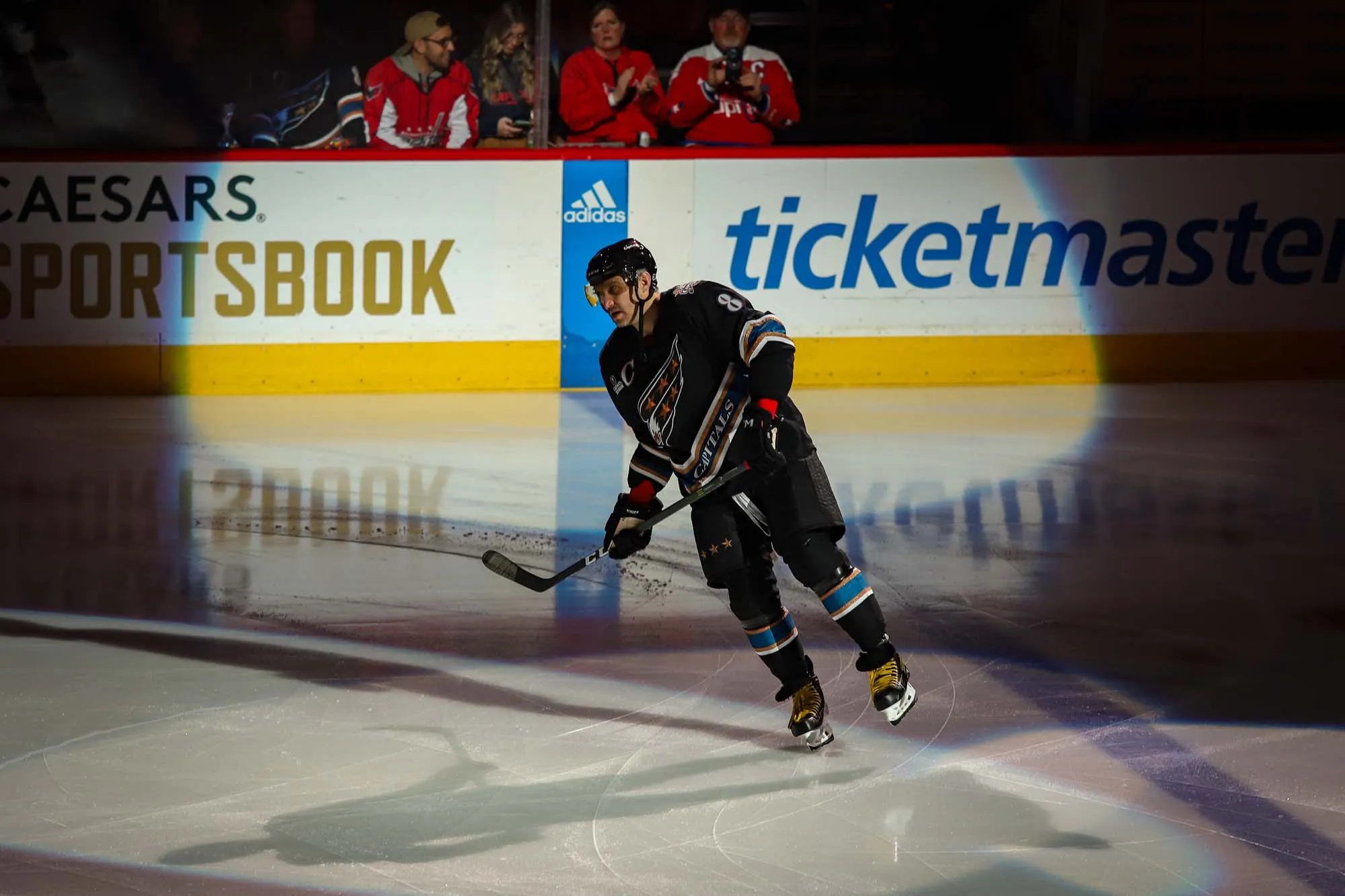
©Alan Dobbins * RMNB 2023
Goal: build a typographic branding system across print materials that combines the current and retro stylings.
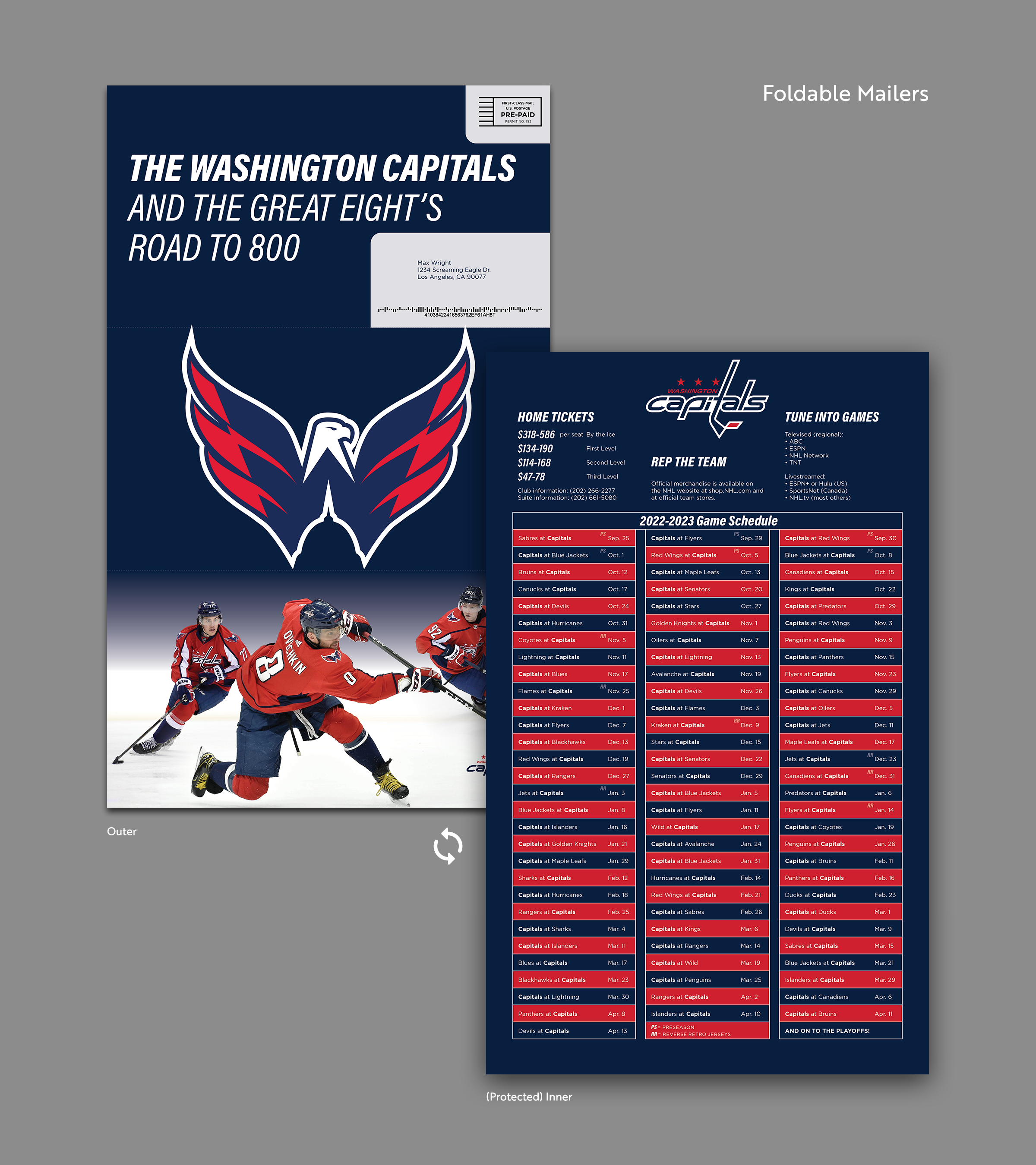
I decided to focus on print materials as the critical foundation for the brand, with fixed layouts and usage, that can inform digital uses later.
1/3
Research & Prep
Current vs Retro Stylings
The Washington Capitals are typically stylized, like many sports teams, as being hyper modern. They use bright, contrasting colors with wide sans serif fonts. The revived styling for the 2022-23 retro jersey is a a little at-odds with that modernity, complicated by the use of the old-style serif font for the team name. But that's kind of the point, right? The retro styling stands apart and feels different and special. But I think with a little work we can try and marry these 2 vibes, even if just a little.
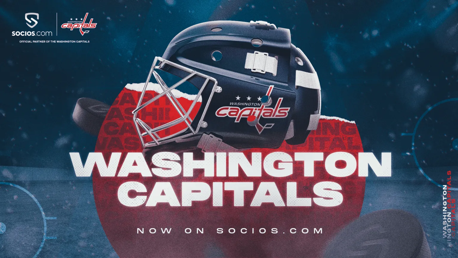
©Monumental Sports & Entertainment 2021
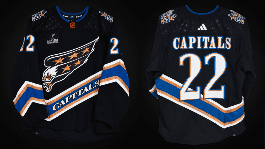
©Monumental Sports & Entertainment 2022
Current Brand Materials
There are a few things I won't be touching since this isn't supposed to be a full rebrand. All I'm tackling is typography, so we need to get the current logos and colors to use with whatever we design.
All logos ©Monumental Sports & Entertainment
Image Editing
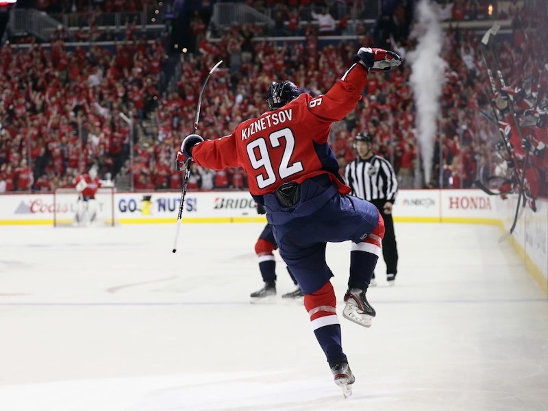
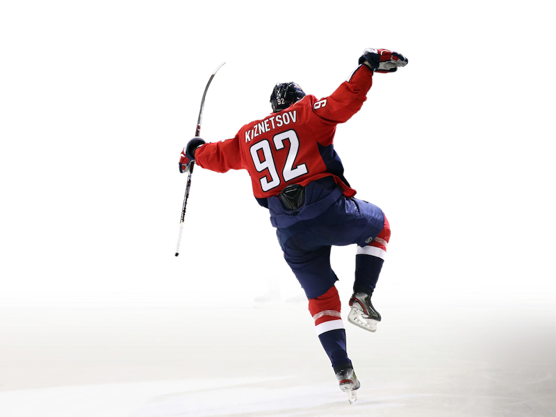
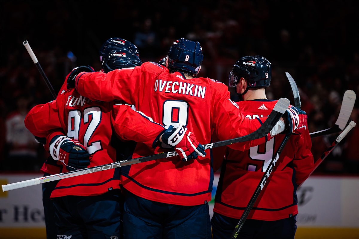
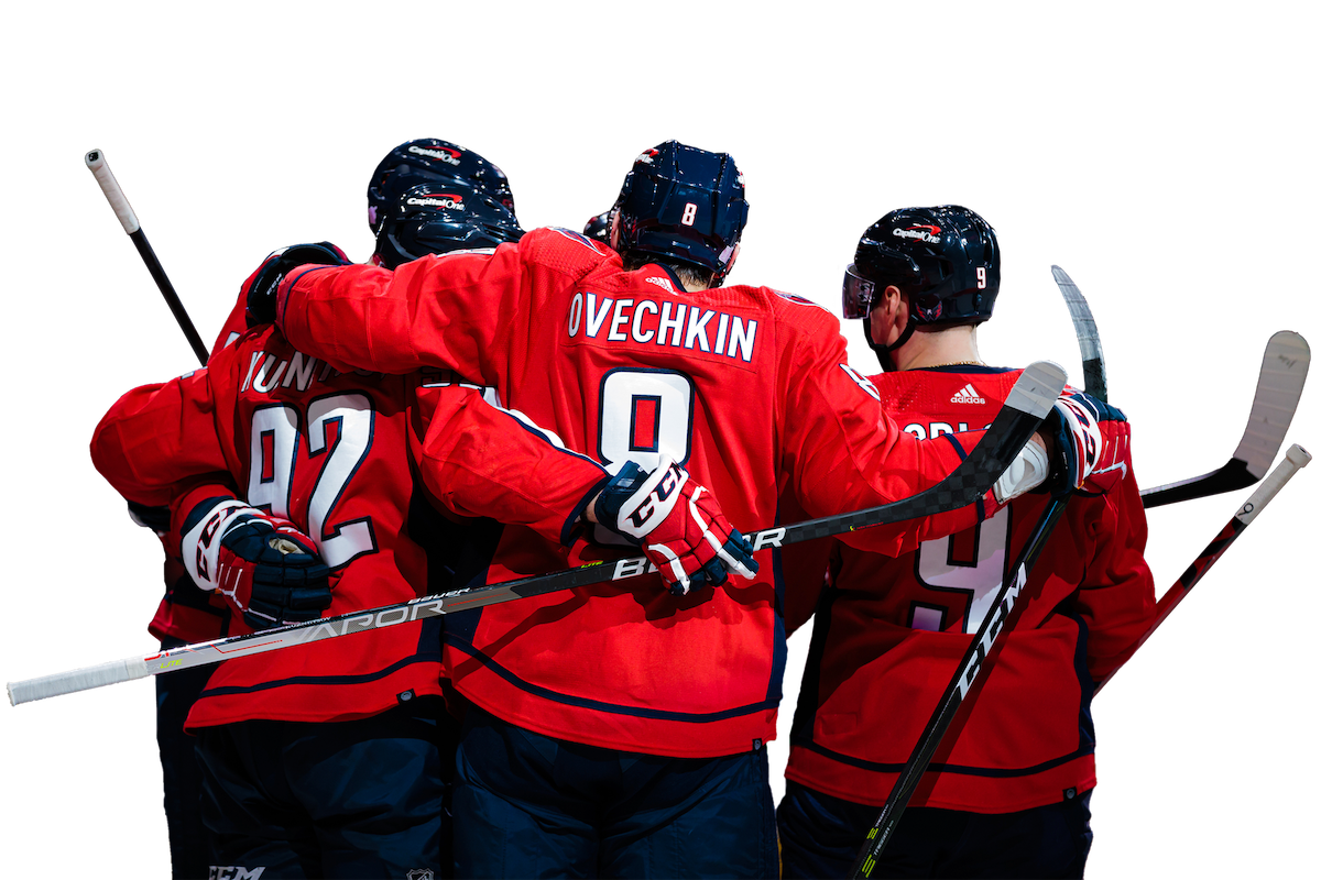
Since we're working with a sports team, photography is paramount and will be an important component of any material. We need to find some high quality photos and edit them alongside our layouts. There's a million ways to blend type with images, but we should start by cutting out the players from the background. InDesign then allows us to link a PSD file into our layout while we're still working and will keep the image updated whenever changes are saved.
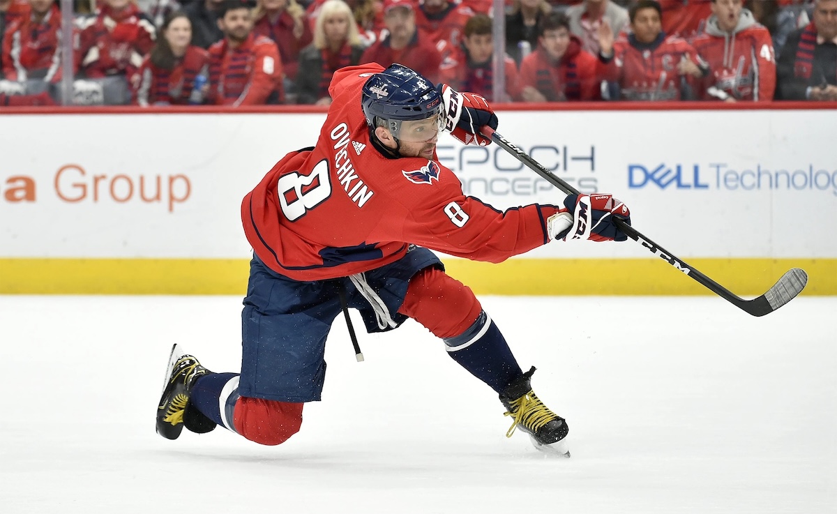
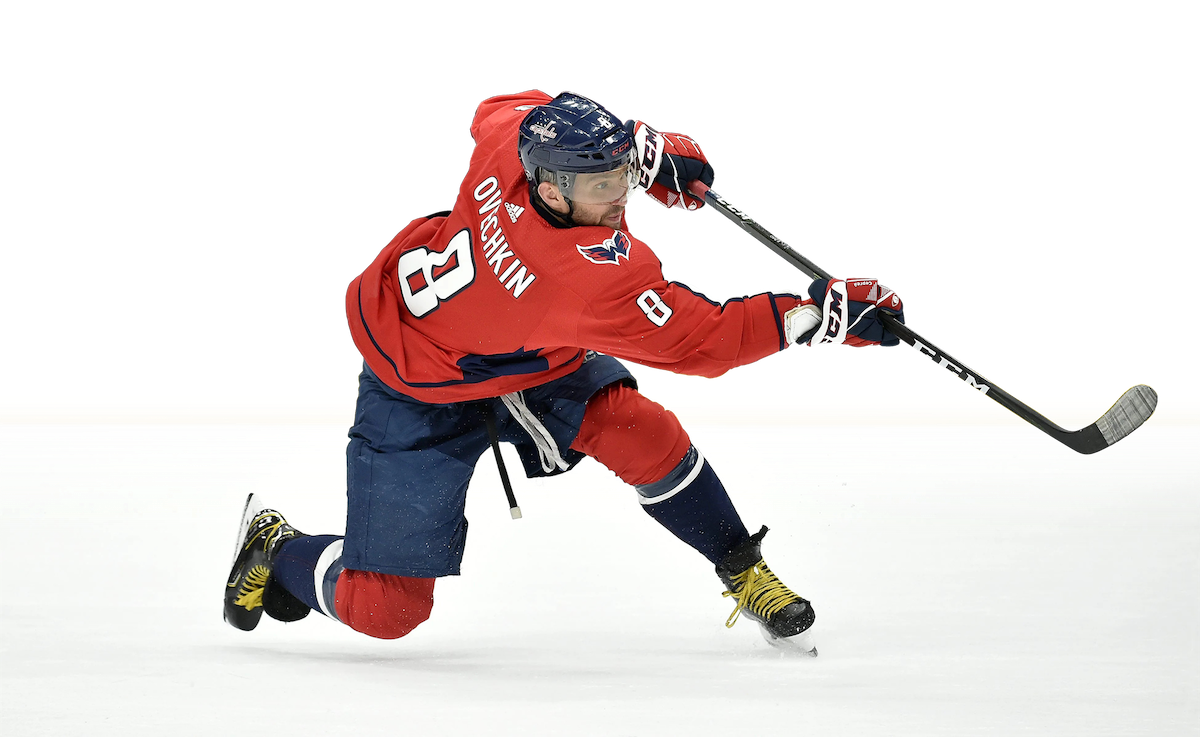
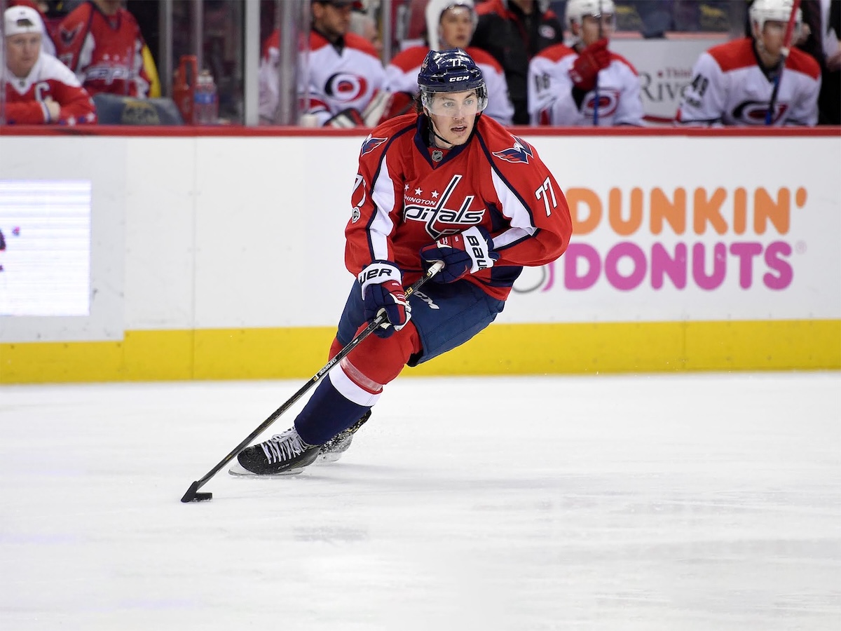
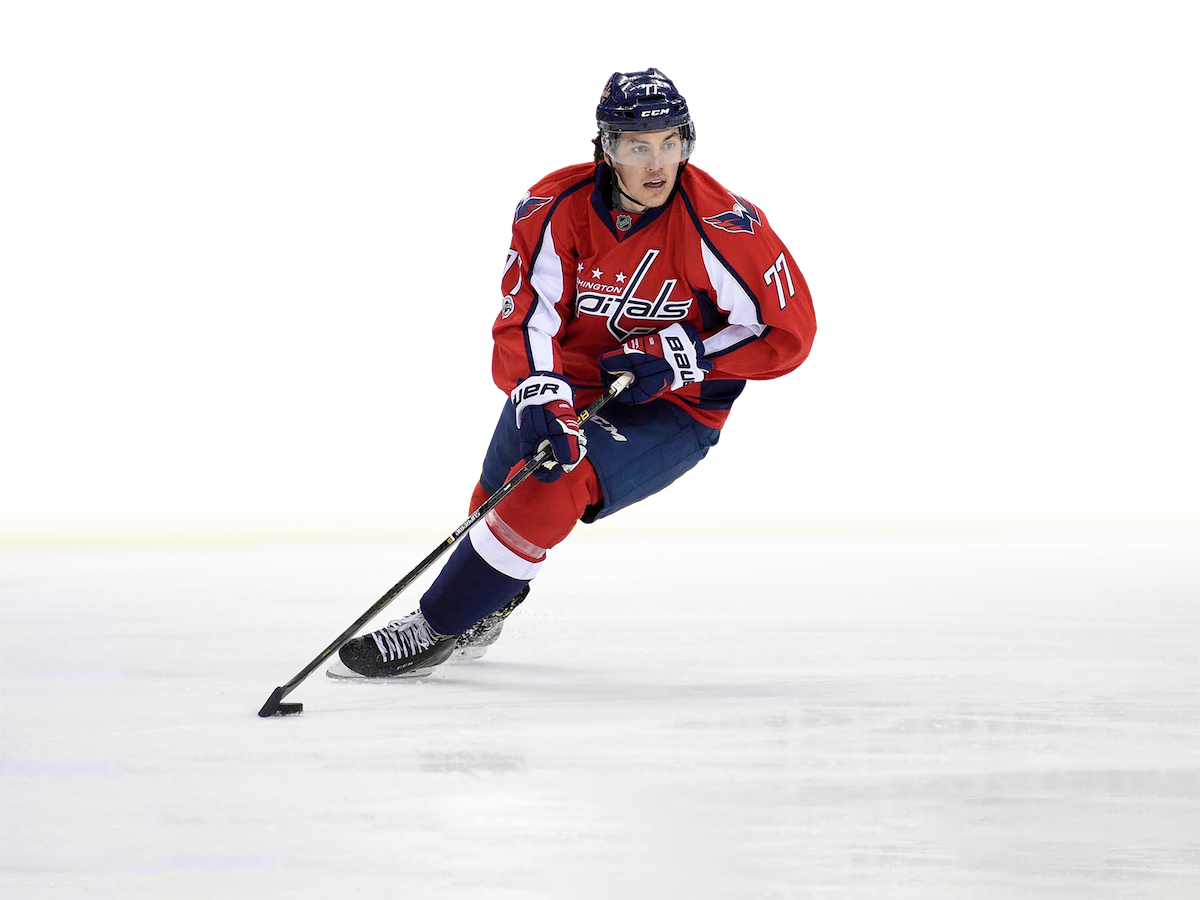
© All photos are the property of their respective owners.
2/3
Rough Work
Start Planning
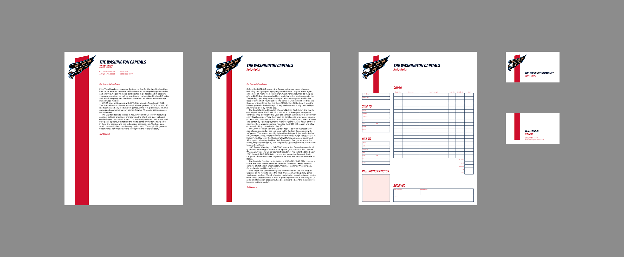
Nothing fancy, here, just wrapping my head around some asset placement. For something like posters there's a lot more leeway when it comes to things like full-bleed color. However, when you're designing letterhead you can save a lot of time and money by using a simple, no-bleed layout.
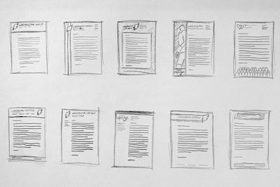
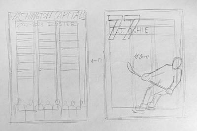
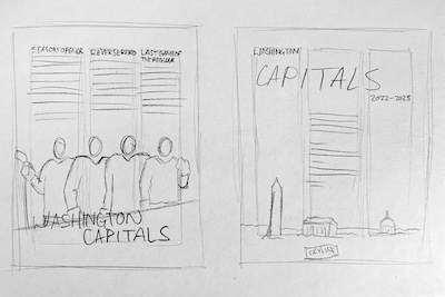
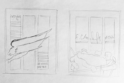
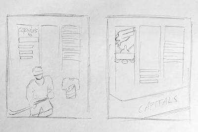
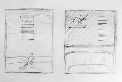
What follows is a selection of rough drafts and the finalized versions. I can't go into detail about every improvement because its a continuous process with dozens, if not hundreds, of tiny adjustments.
Front & Back Cover
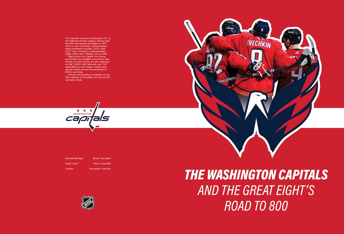
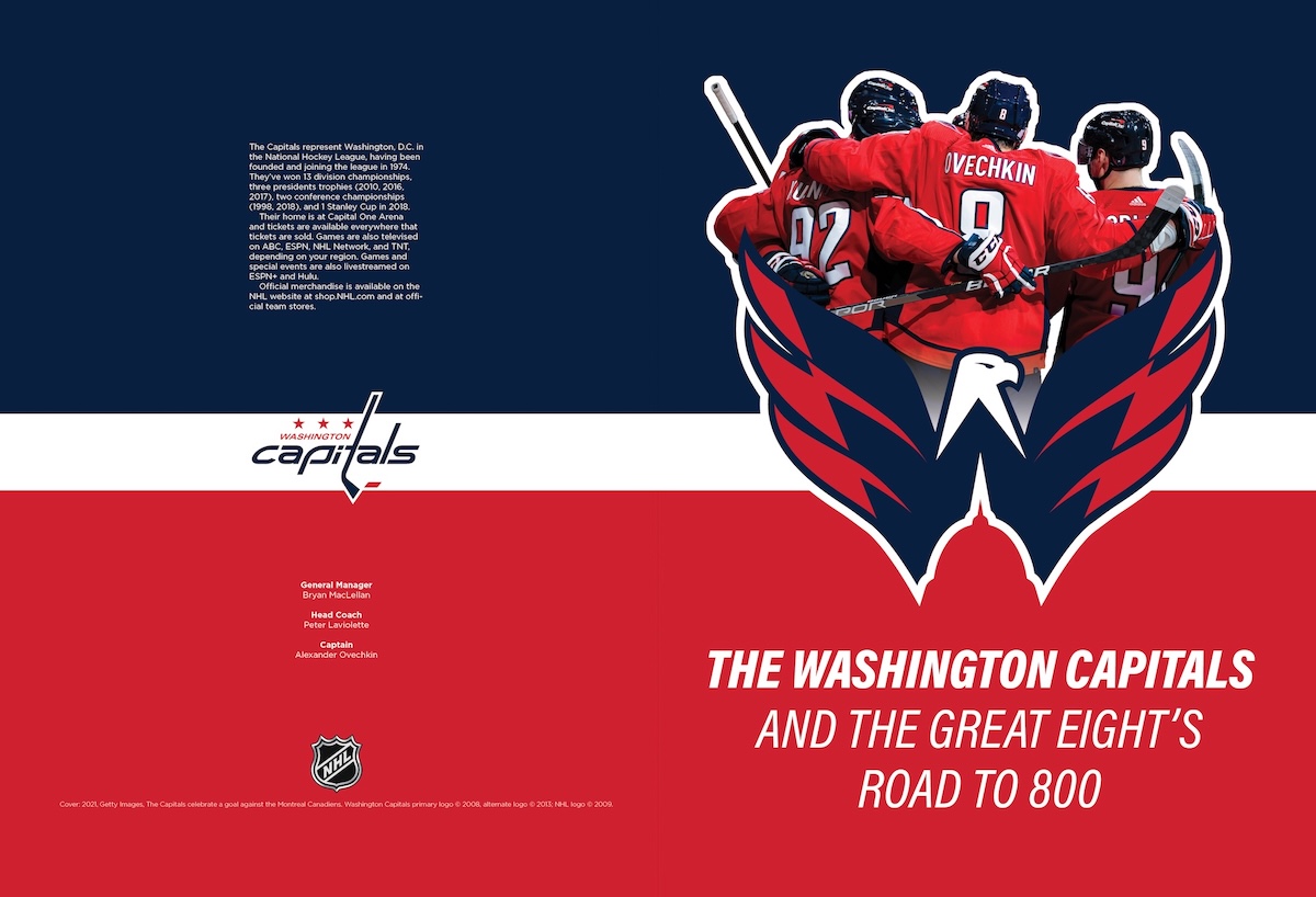
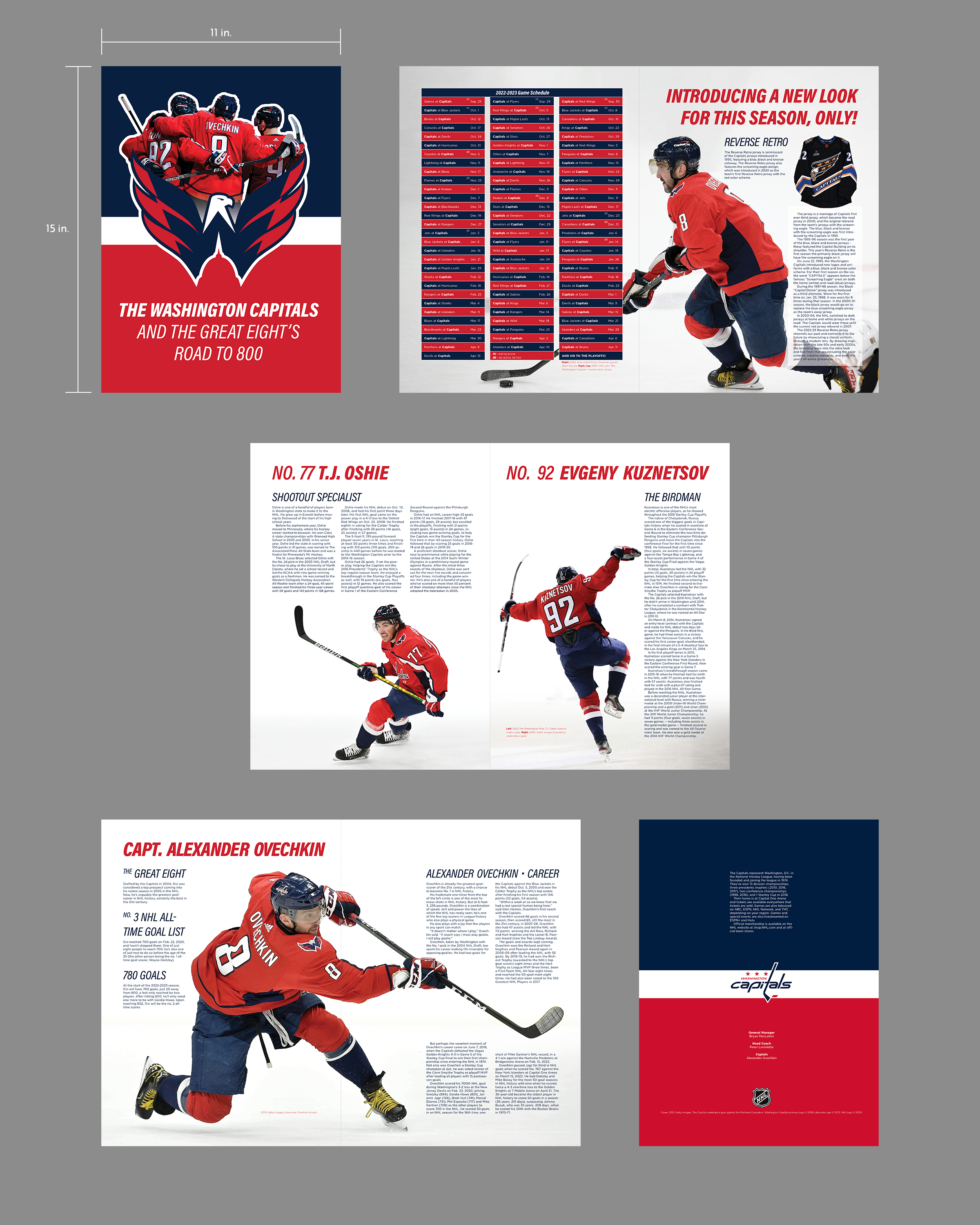
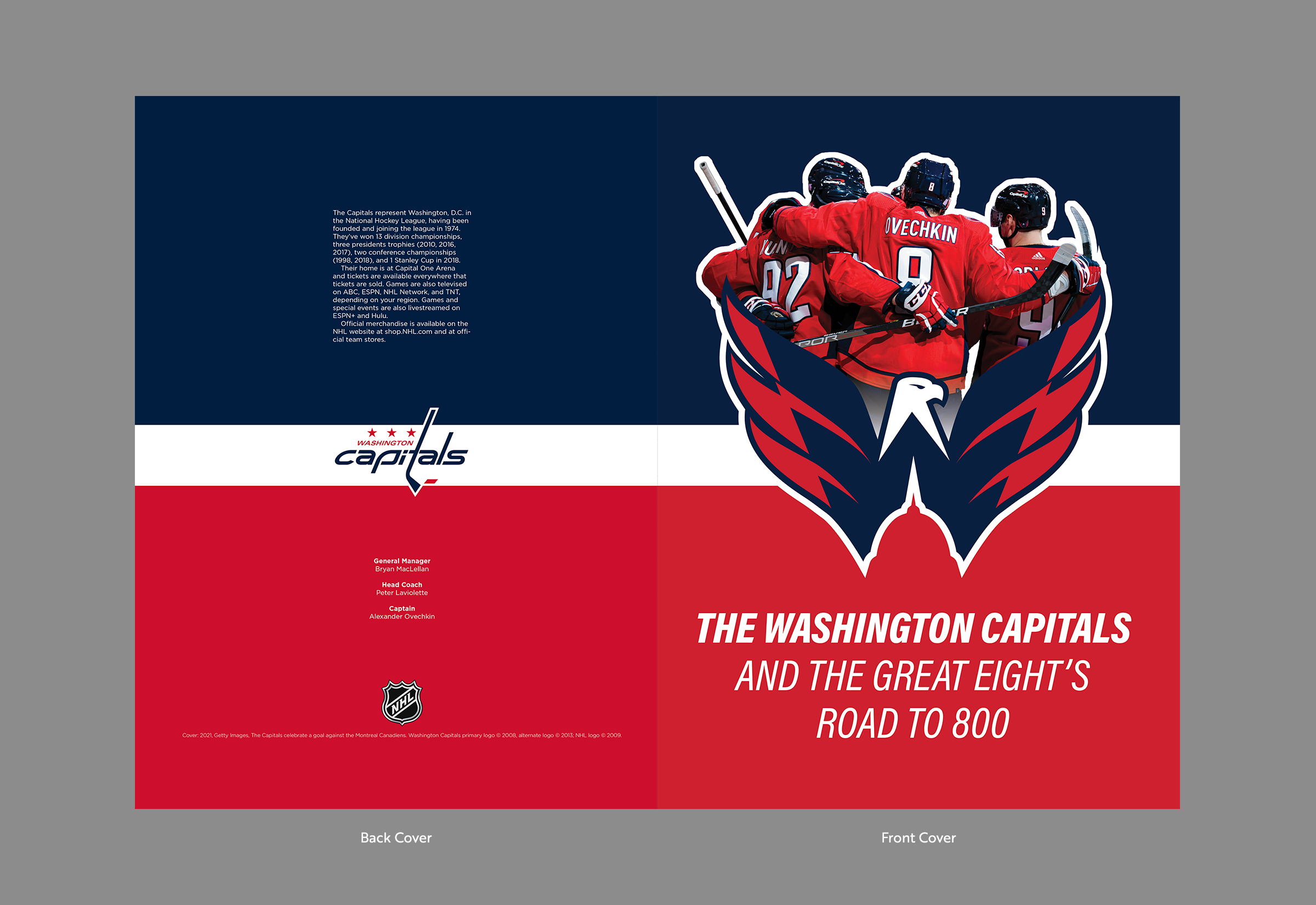
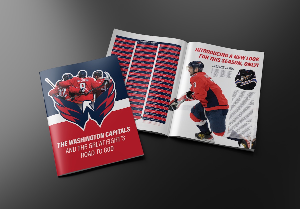
This is the cover to a 6-page newspaper insert that's 11x15 inches (or 22x15 inches for a spread).
- If we change the red on the top half for the team's blue, then the team-photo (in the red uniforms) will pop more. Knowing when to apply contrast is important.
- The credits are a little unclear. Putting the title and name on the same line can create inconsistent spacing because of different title/name lengths. There's also a slight issue with titles being closer to each other than to their corresponding name. Let's solve that by putting the title directly adjacent to the name and adding a line-break in between each pairing.
- Since this is using copyrighted material, we also need to add some copyright statements.
Collectible Posters
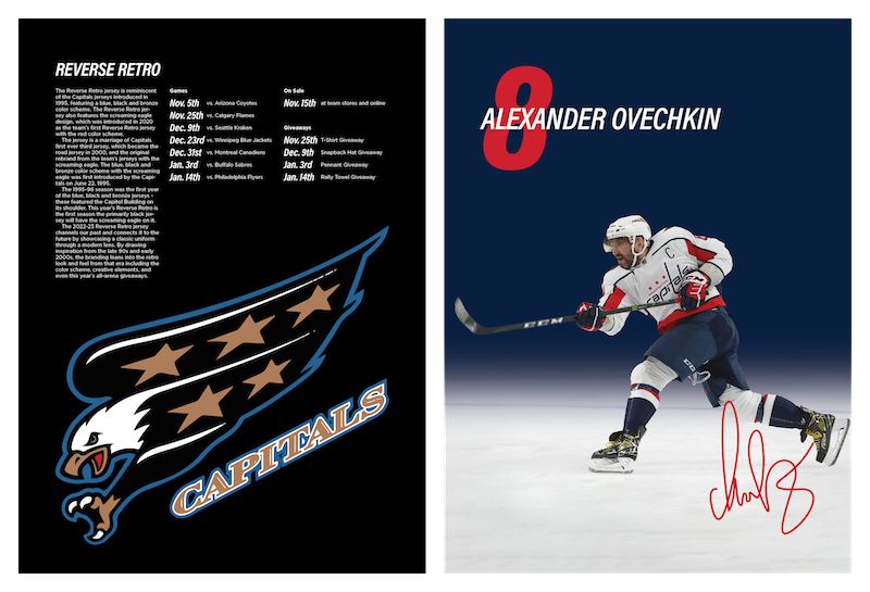
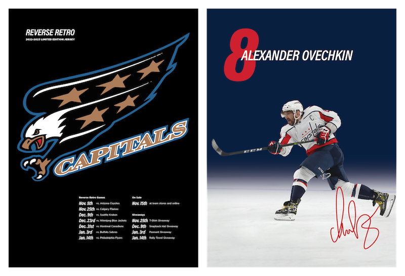
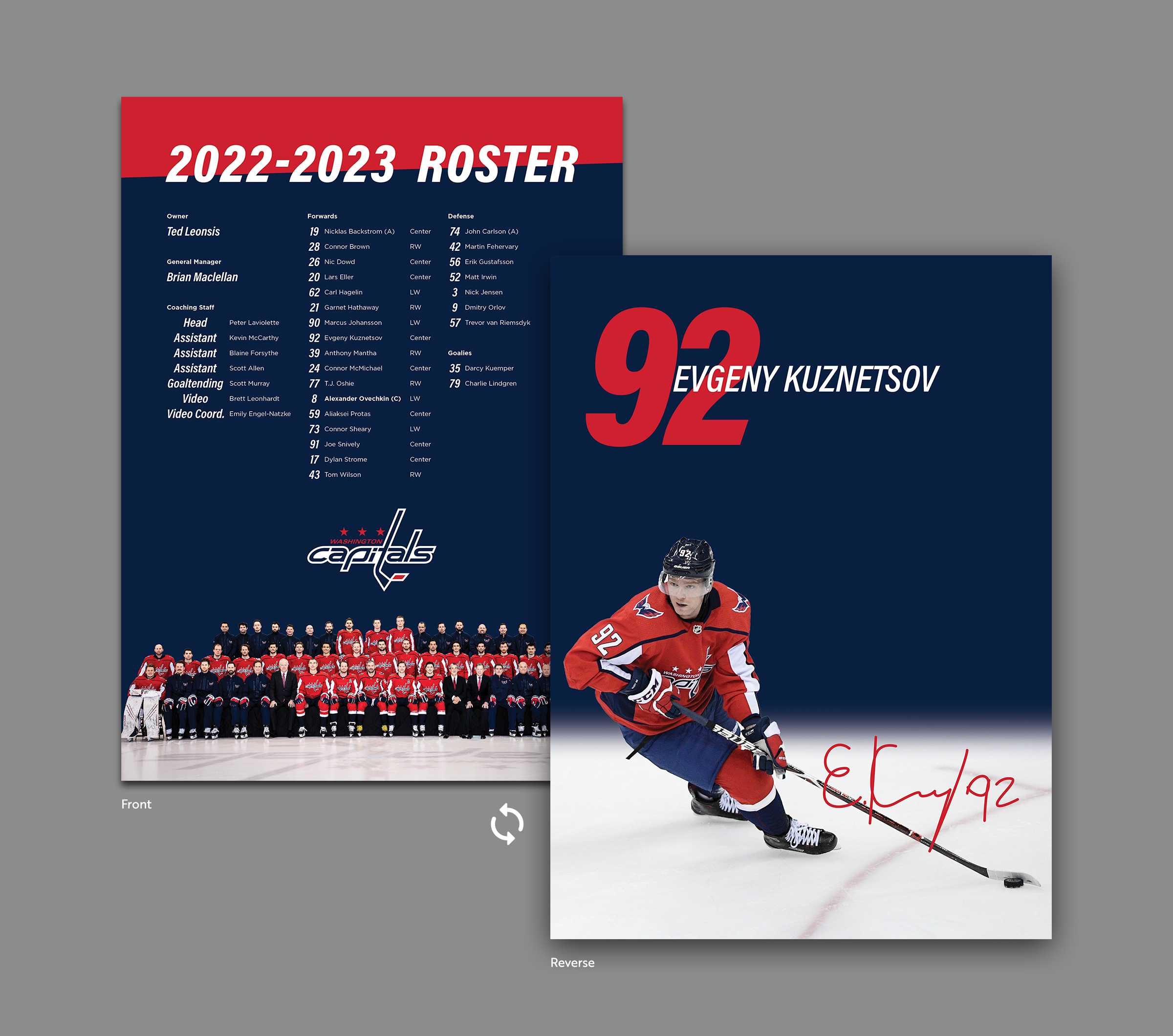
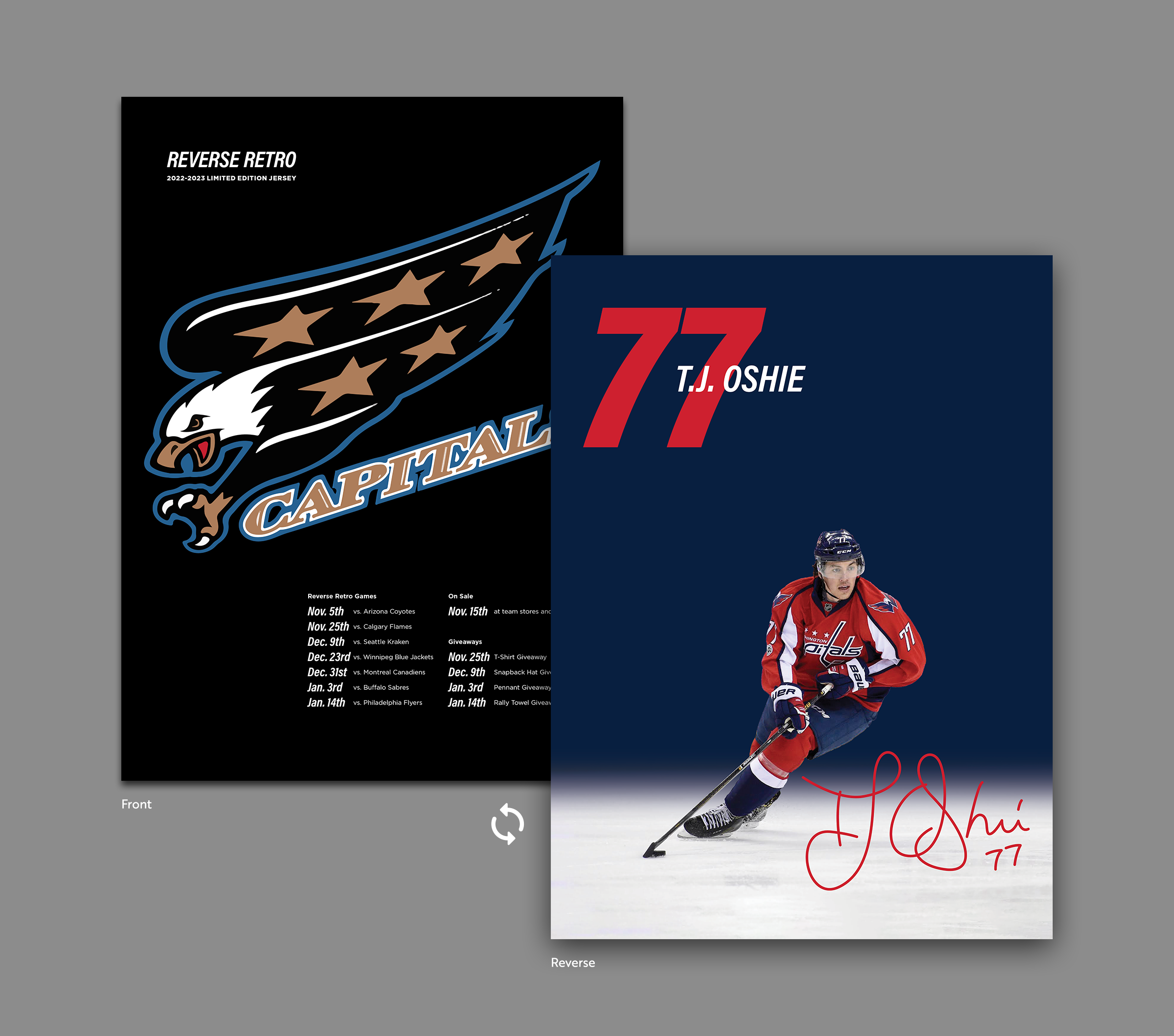
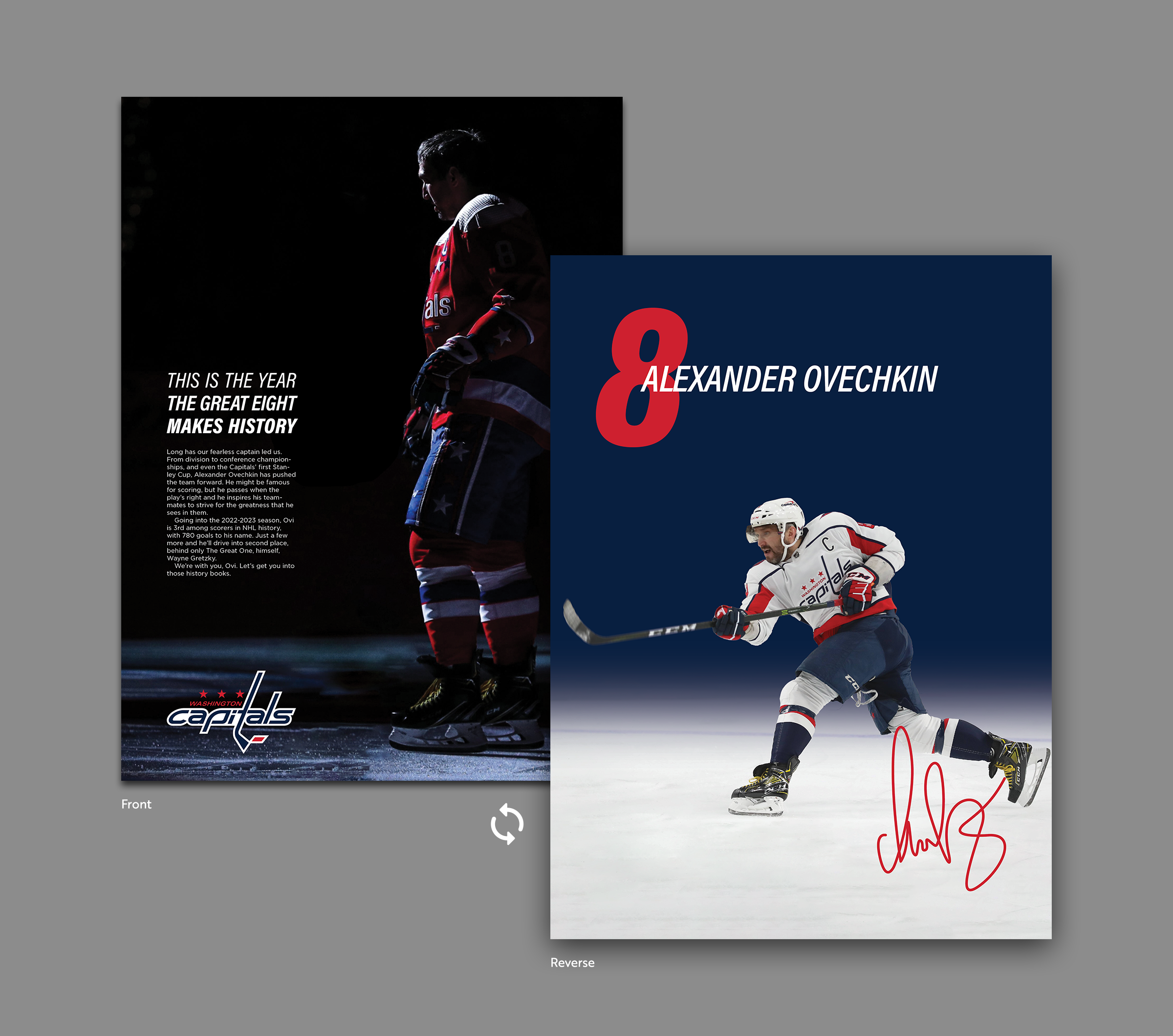
Posters are nothing new for sports teams, but when they're free I figure one side would be informative while the other remains a showcase.
- The visual hierarchy is a little confused here, and there's a little too much text. This is a poster so, even though it has to be informative, it doesn't have to be this formal. Let's rearrange the elements a little and take out that text block.
- Its a little detail, but when the name starts so far left its a little visually chaotic. Its worsened when the player's number don't have a clear left edge for the name to start on/near, like a 2 or a 7. If we move the starting point over a little, and increase the size of the number, then the number retains its visual and symbolic importance and is also a little easier to read. The center starting point is also a little more dynamic and fluid than the left-edge starting point.
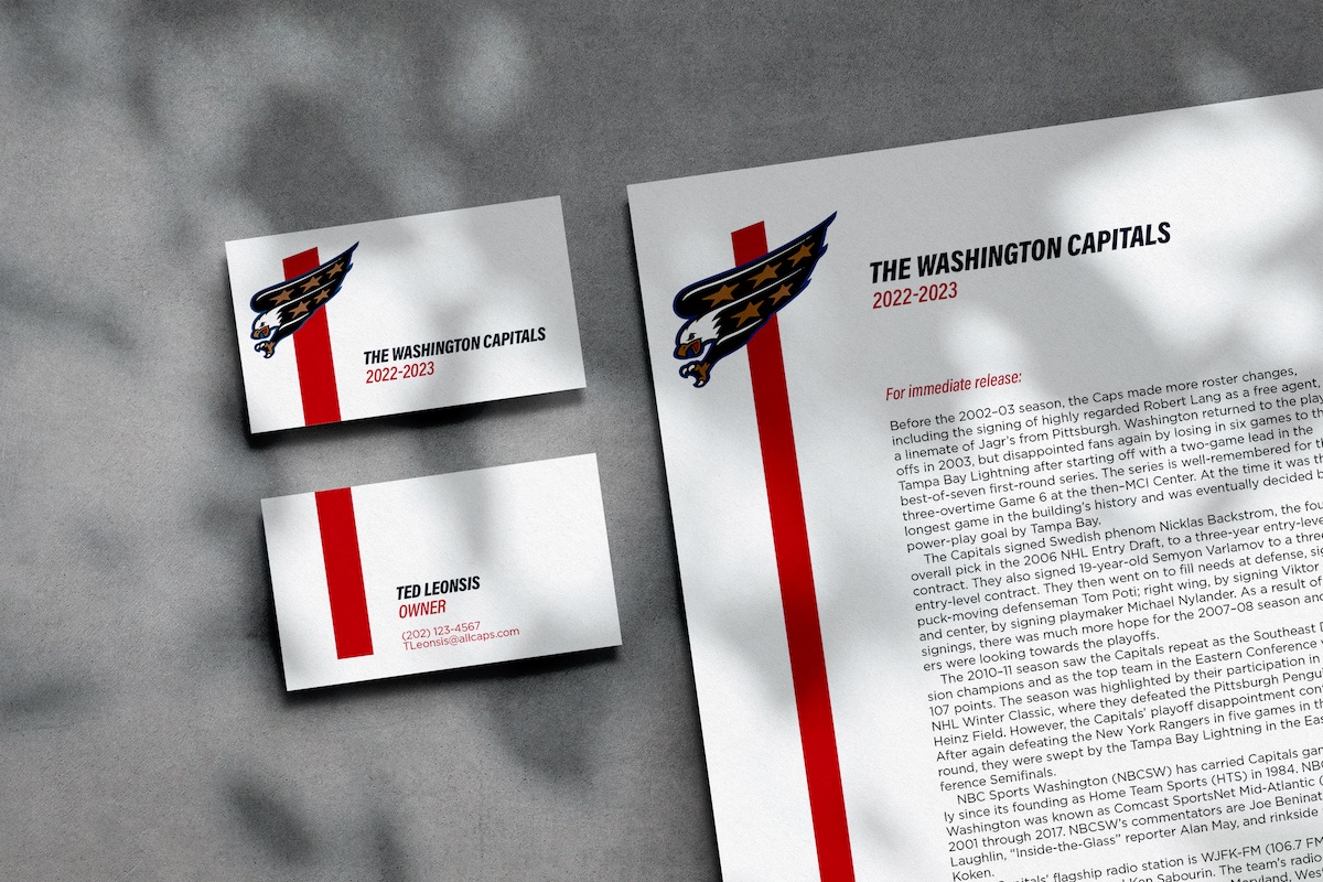
Business Cards
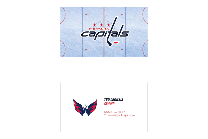
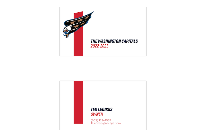
There's a million ways to make business cards.
- Neither side is utilizing the retro styling. (Most brands wouldn't want to use a logo which is being used temporarily, as a special promotion, but that was the whole point of this project.)
- This positioning limits the name length because the lines start near the center of the card. This is a big organization that includes a variety of cultures, so we should try to reposition elements to be more inclusive of different names.
3/3
Finalized Layouts
Final Thoughts
The challenge I faced was creating a consistent and reusable typographic system across a variety of print materials. I'd like to explore more and incorporate textures and motion across branded digital materials as well. Uses like Instagram Stories posts, photos for Twitter, or TV graphics have different but similar considerations that I'd love to spend more time with. Cheap, reusable templates like company letterhead or business cards are very different to something like motion graphics.
Nevertheless, typography is a hugely important part of branding and this project just goes to show that small adjustments can have a big effect.
