AI Inputs & Feedback in a Desktop Design App
- Figma
- RunwayML
- Desktop App
- Role: UX Researcher, Product Designer
- 14 Weeks
- May - August 2023
- Solo Project
The Problem
Most are too Focused on Creating Generative, Rather than Assistive, AI Tools
- Designing all of the glyphs of a typeface is a laborious and repetitive process that can drain creative energy.
- Ensuring consistency across letterforms is a time-intensive process and, the further into development you get, there are fewer opportunities to experiment, iterate, and refine your creative vision.
- Current integration of AI features is limited and strip the designer of their control in the process.
The Solution
Empower Designers with AI in the Background Along with Other Controls
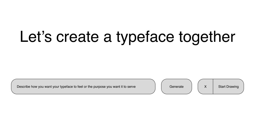
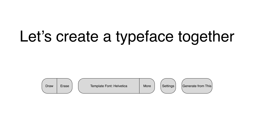
- Introduce a mode-based workflow, with selections like Sketch and Live Generation, to toggle between AI-driven automation and hands-on manual refinement.
- Provide feedback within the interface so designers can see how the AI interprets their inputs, understand changes made by AI generation, and confirm or deny AI suggestions.
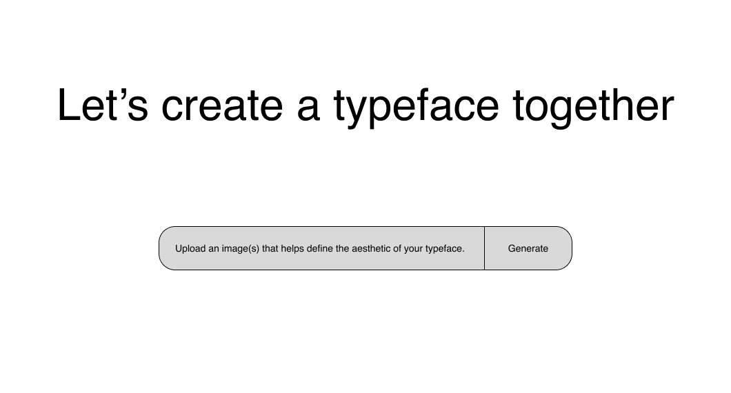
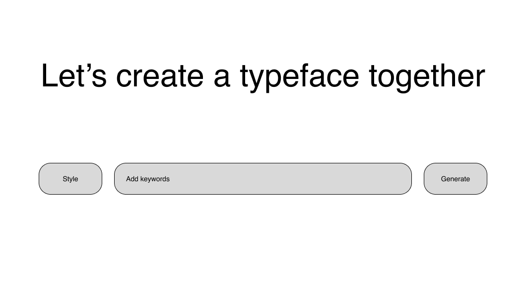
- Allow designers to input through flexible methods to guide the AI, ensuring the outcome aligns closely with their vision.
Discovery
Experimenting with Existing AI Generation
I created several training models to build up some observations and experience with existing AI generation to help inform my concept.

Preliminary Attempt(s)
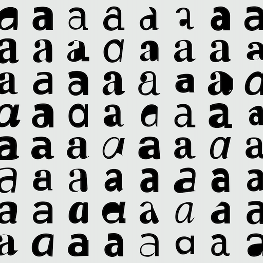
To get started, I created a few different training models using a variety of related photos.
Type-Specific
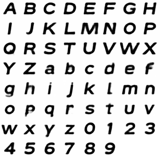
To test more basic shape creation, I made another model using jpgs of letters in an assortment of typefaces.

Current SVG Generation
As I narrowed down my concept to typography, I also narrowed it down to vector graphics, so I experimented with ChatGPT and Adobe's suite of beta tools for generating SVGs.
Existing Research in this Space
Since I’d been testing with basic letterforms, I searched for typeface generators and none existed at the time of this project. There were a lot of copy/text generators, but none for typeface design. In my search, I read through the work of Erik Bern, Måns Grebäck, and Jean Böhm, all of whom had conducted research and experiments into the capabilities of AI to generate letterforms.
Left: experiments from Erik Bern to generate whole typefaces; Right: in-depth and extensive experiment from Jean Böhm to generate letterforms as actual vector graphics.
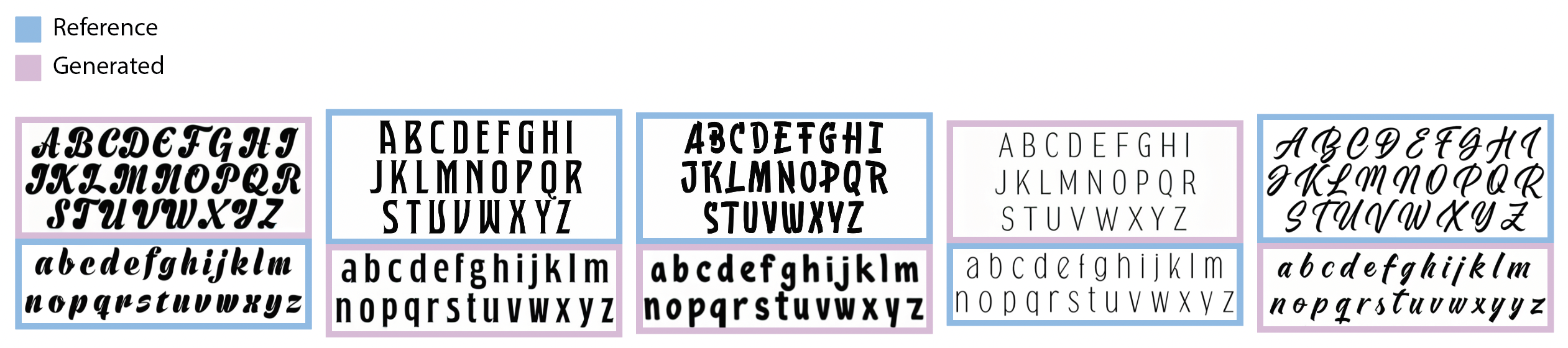
Above: Experiments from Måns Grebäck to see the abilities of AI to generate the lowercase of a typeface if given the uppercase, and vice versa.
Insights
Makers of AI systems prioritize their capabilities over user interaction, leading to basic input methods
AI lacks the ability to identify outliers without specific training.
The “magic” of AI comes from not knowing how input is being analyzed and processed, which can be confusing for designers. Transparent and understandable AI interactions will help enhance trust and comprehension.
For best results, users must go beyond data selection and make use of ongoing supervised learning and reinforcement of the model (which, for some AI systems, can be impossible for the user). This approach not only refines pattern recognition but also ensures consistent performance.
Exploring Low Fidelity
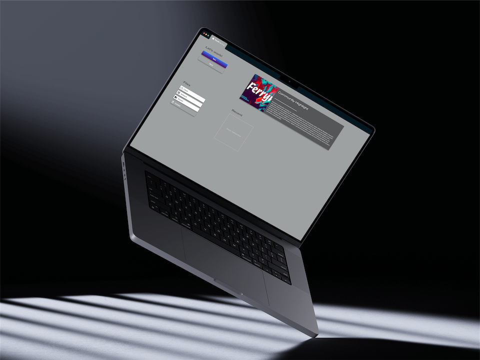
Low Fidelity Exploration
These explorations ignore the research
I quickly realized that I wasn’t designing with my insights in mind. I scrapped these ideas and started over by mapping the current workflow of typeface design. This would allow me to consider where AI could support the current process.
Mapping the Workflow to Understand Needed UI Affordances
The Visual Design Aspects are not Linear
The sketching and digitizing stages of typeface design are extensive and may require multiple passes. Depending on the designer, the entire set of characters (lowercase, uppercase, numbers... 26-70ish characters at minimum or in the hundreds depending on the needs of the typeface) may need to be sketched multiple times.
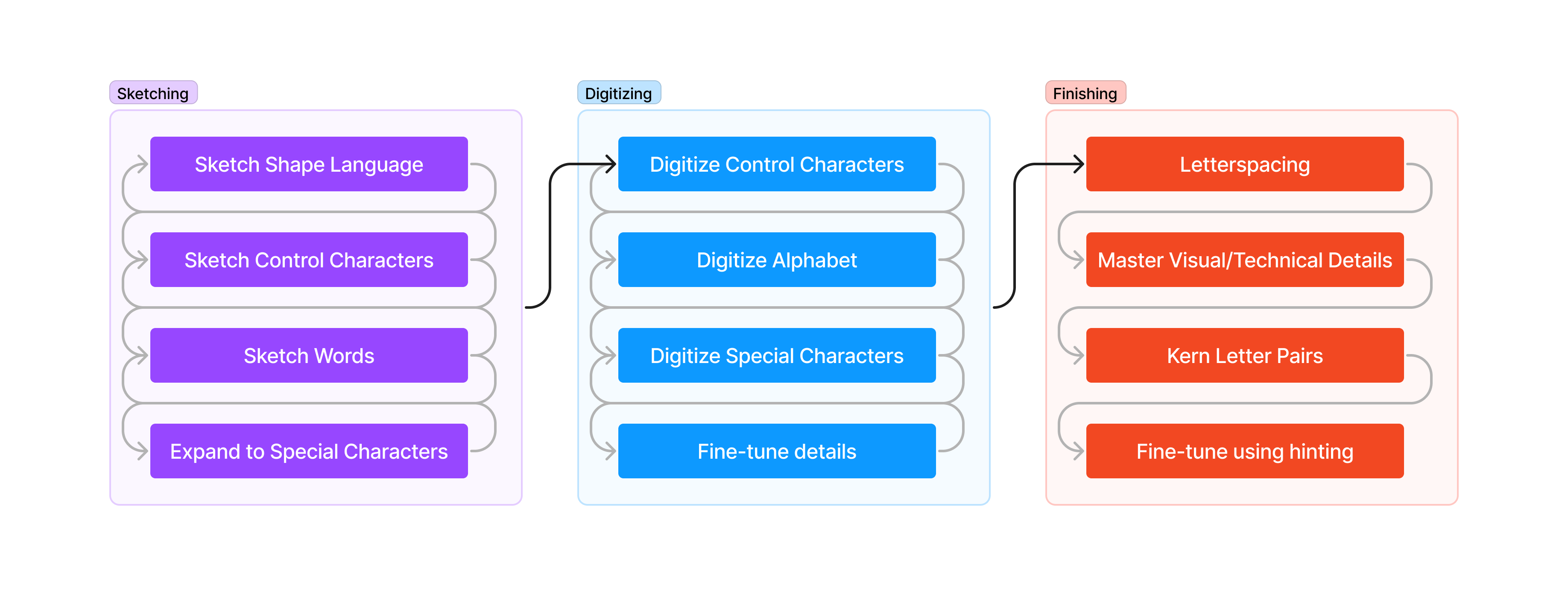
Repeating Visual Design Elements
Many typeface designers will start the sketching phase by working on control characters, the design of which will help define other characters.
For instance, you can take the pieces of the lowercase ‘n’ to then work out the i, l, h, m, u, r, t, and you’d also have the x-height for other lowercase letters. After working on the lowercase ‘o’ you’d then have the building blocks for b, p, d, q, c, and e. You’d have to work on some of the finer details, but just from those two, the lowercase ‘n’ and ‘o’, you’d have a lot of the major work done for 15 characters, with the pieces necessary to work on many others.
Back to Designing
Identifying the Concept
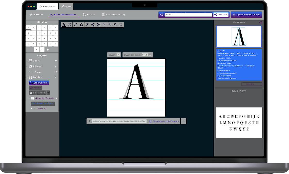
Since AI is fantastic at pattern recognition and reproduction, and the typeface design process is a back and forth dance of refining the consistency and visual design of the elements which will invariably end up repeated throughout a typeface, it was an almost natural leap to the refined concept behind the application: the AI can analyze the pattern of your design, while you design, and use that pattern to build out and make alterations to the rest of the character set.
More Detailed Iteration
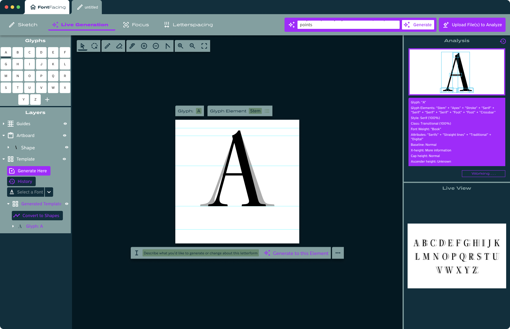
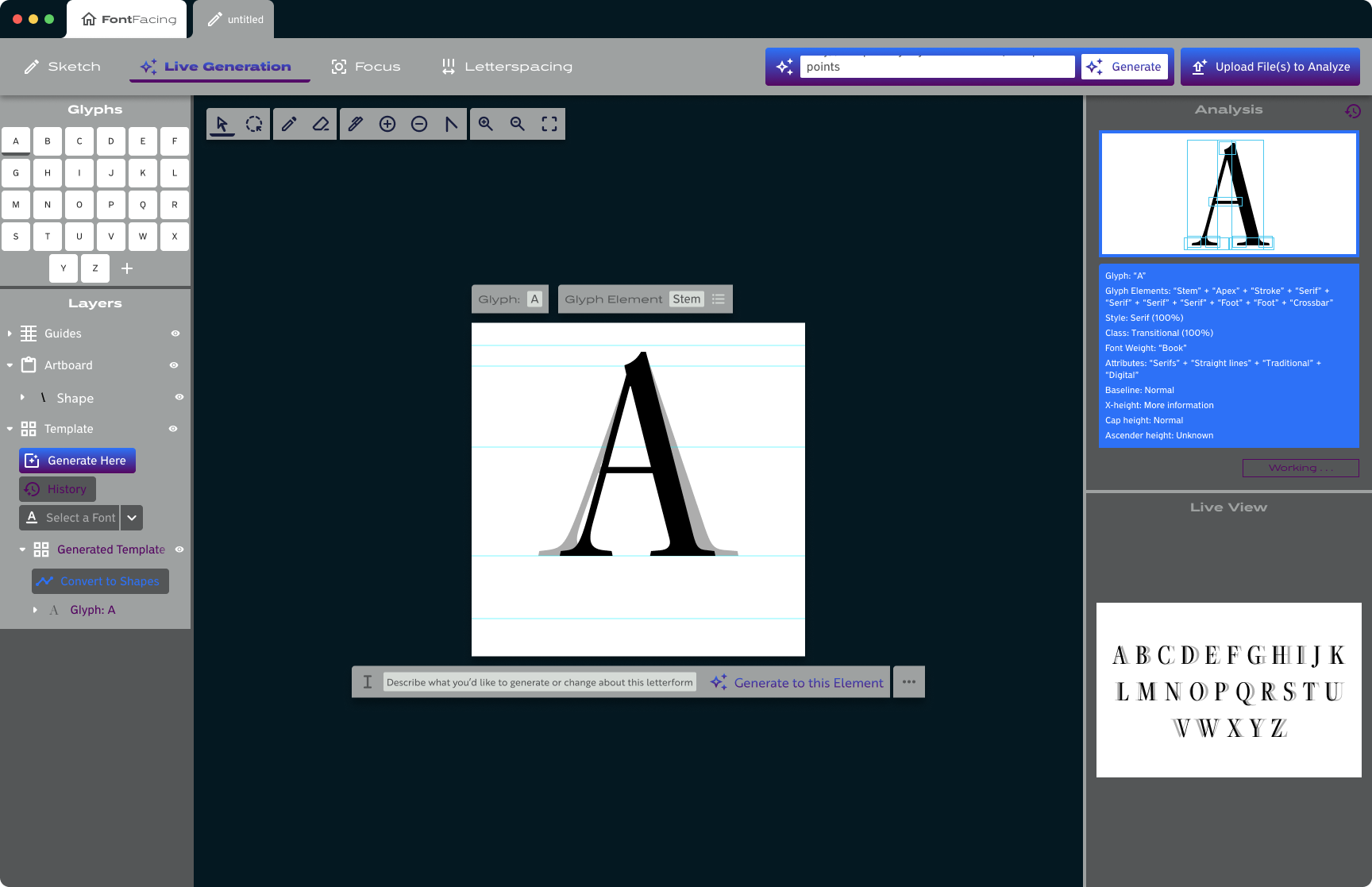
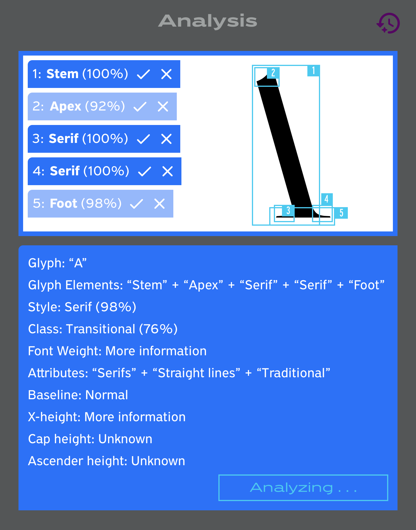
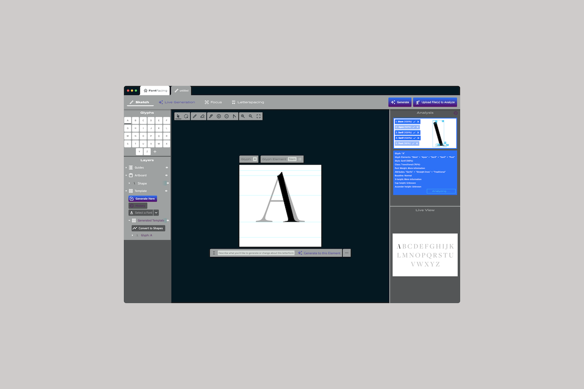
Moving towards medium fidelity, I introduced a sidebar to preview how the AI is interpreting data. It also allows designers to have manual input, allowing or disallowing interpretations of the data.
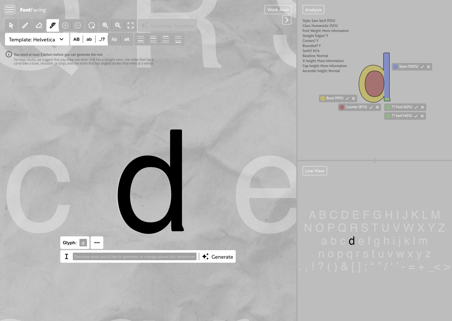
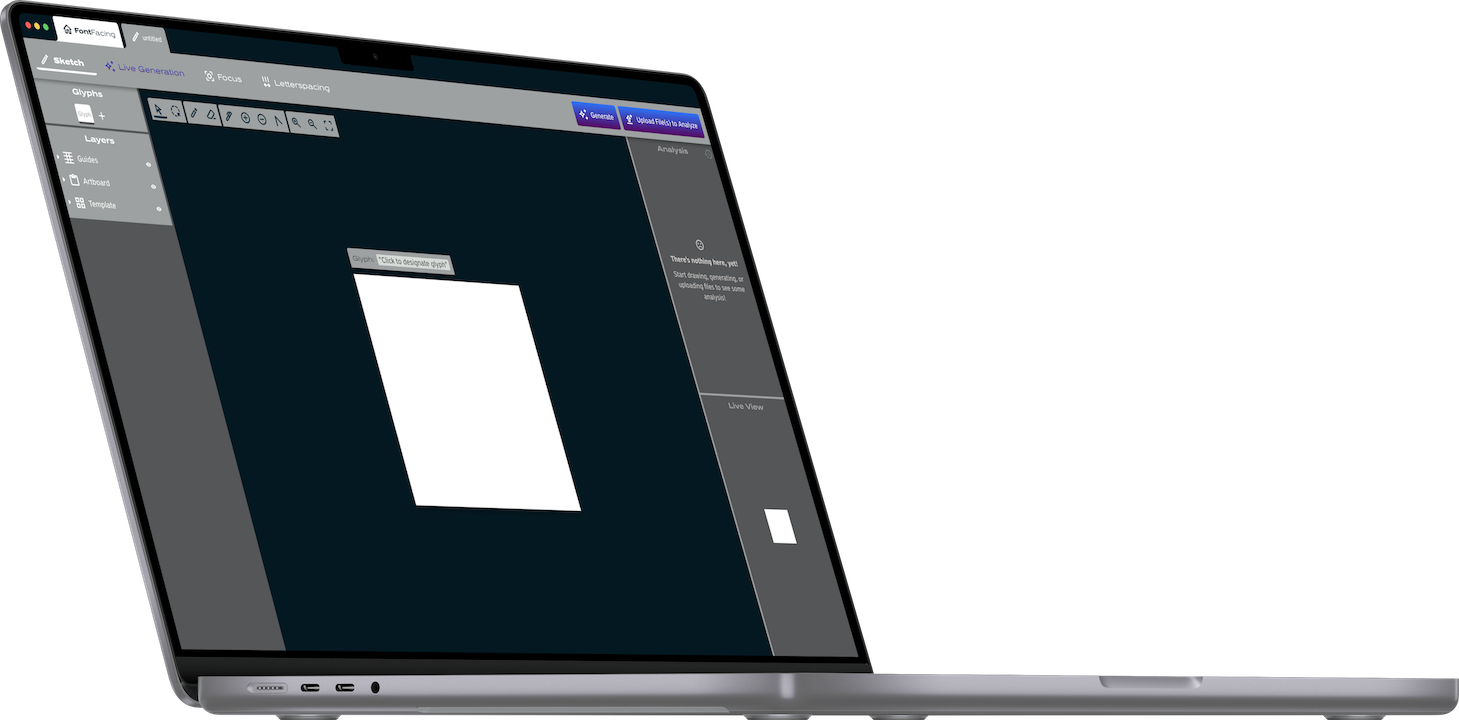
Moving from a Browser to the Desktop
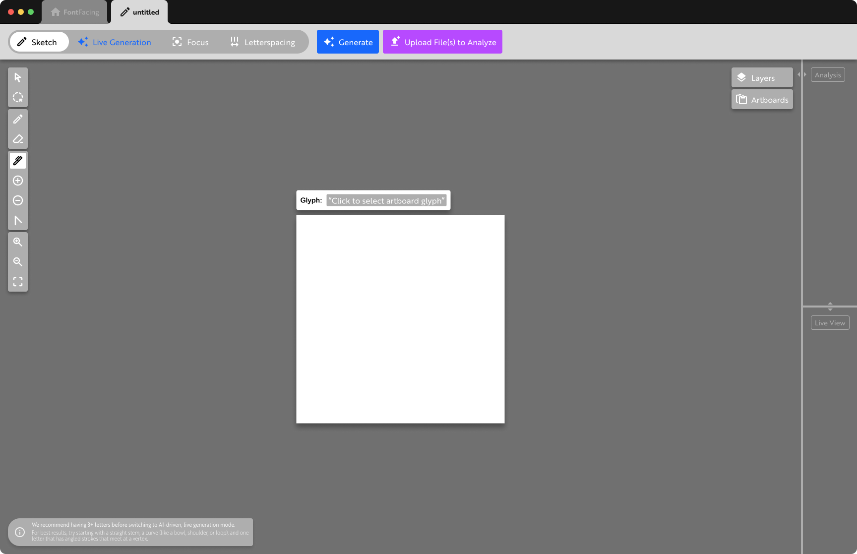
At this stage it’s necessary to iterate towards a desktop application instead of a webapp to allow designers to work offline.
This iteration also features the introduction of the “Stage” slider to tell the platform which stage of the process you’re in.
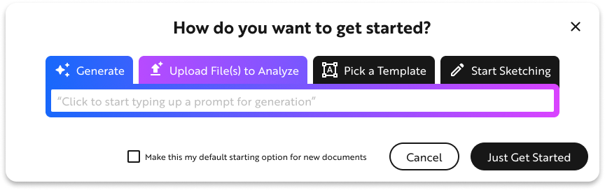
Starting Pop-Up
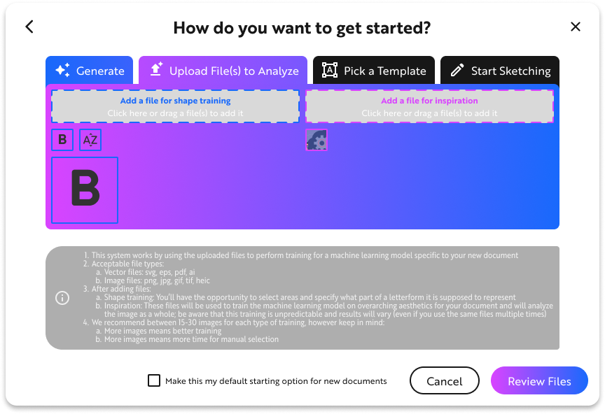
In an effort to highlight that there are AI features, I experimented with the idea of a pop-up modal which would appear whenever starting a new file. Unfortunately, this could lead them into thinking they can only select one particular way to work.
Although the modal wouldn’t end up staying, the use of color to indicate AI features ended up being an important feature.
Prototyping
Exploration & Iteration
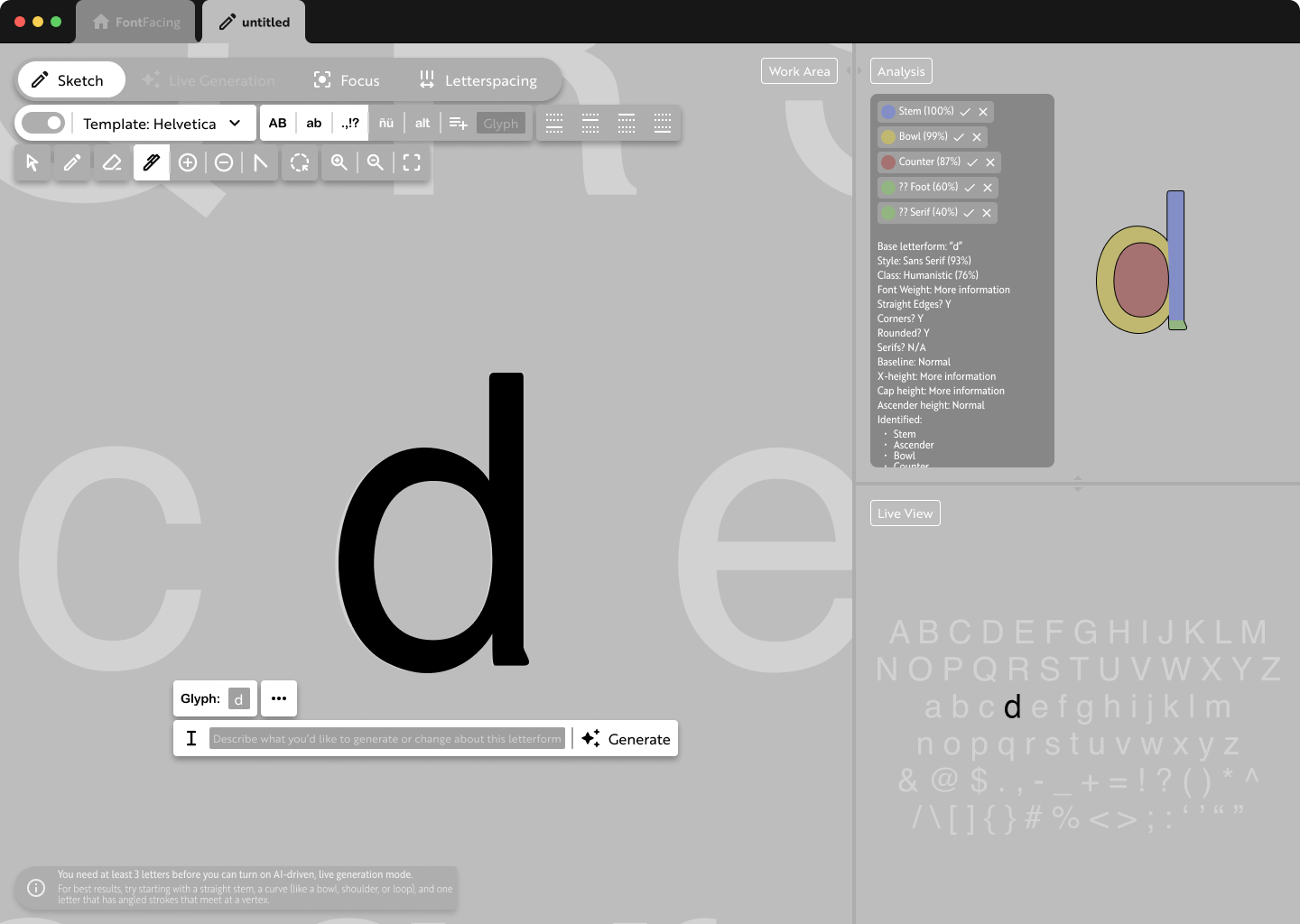
Finalized Layout
This exploration represents what would become the finalized layout of the interface. The previous buttons to access Layers and Character Set have become a separate sidebar on the left of the interface. I tried to depart from the primarily gray color palettes of most design platforms, but it’s overbearing here. There's too much color.
Finalized Interface
I pared back the use of color from the previous version and explored more ways to use the blue and purple to highlight the AI features.
Project Validation
After working on this project and developing the AI-related features, some interesting updates came to ChatGPT which helped to validate that, at least in part, I've explored aspects of AI features which the industry agrees are important.
ChatGPT-4 used to only have a 'Loading' animation
This is how ChatGPT worked at the time I conceived of FontFacing. You enter a prompt then see a small dot, like a "Loading" animation, then get your generated response. It didn't present any feedback related to your prompt.
Insights for FontFacing
This is a concept I'd come up with for FontFacing, from an insight about the lack of feedback and transparency in existing AI tools which often make AI seem like magical interactions. That lack of feedback and transparency makes it difficult to refine your prompts/interactions because there's no way to know how the previous interaction was analyzed.
After my exploration, a new ChatGPT-o1 Preview shows more direct feedback
Late in 2024 OpenAI released a preview of their newest model, ChatGPT-o1. After entering a prompt, there's a flash of text-based feedback as if to say, "This is what you asked for, let me think about it."
Final Thoughts & Next Steps
I firmly believe FontFacing and similarly designed tools could successfully empower designers. There would be some difficulty surrounding the base training sets, since the platform would need extensive training on typefaces to understand the anatomy and character sets. Typefaces are intellectual property and their use for AI training could be contentious.
I would love to continue exploring this concept. The opportunities to explore micro-interactions are endless. This is also, roughly, the bare minimum the application would require to be considered a serious design application. Professional typeface design has a plethora of functions which aren’t represented here that would need to be worked into the interface; not everything can be folded into a menu.