Seamless UX and HMI for Electric Vehicles
- Miro
- Figma
- SolidWorks
- KeyShot
- Adobe Premiere
- Adobe Audition
- ElevenLabs
- Automotive UX
- Role: UX Researcher, Product Designer
- 9 Weeks
- October - December 2023
- 5 Team Members
The Problem
Inconsistent Visual Design & Integration
- There isn't a single vehicle on the market with complete ownership of their digital UX, and often the meter design is visually different from the infotainment system, which means drivers may be juggling up to 3 different visual design languages.
- Even with advanced infotainment systems, users often face complicated interfaces with inconsistent visual designs that disrupt the mental models from their other digital devices.
The Solution
A Consistent Design Language and Experience
- Help drivers feel at home in their vehicle, their "third space". Enable a unified experience through a consistent design language which brings together the meter, infotainment screen, and other personal devices.
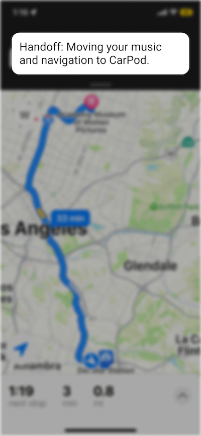
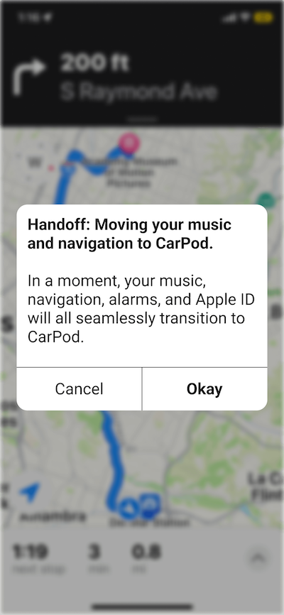
- Implement a seamless transition system that recognizes when the users enters or exits the vehicle and instantly hands off active apps, preserving continuity and enhancing the overall driving experience.
Disclaimer:
This project is a conceptual design exercise and is not officially affiliated with or endorsed by Apple Inc. Any images used are displayed for illustrative and/or research purposes.
Research Revealed Similar Problems with UI/HMI in Every Vehicle
After thorough analysis of 13 electric vehicles, we kept noticing that drivers experienced a disconnect between their car & personal devices, resulting in inconsistent handoffs and a broken mental model.
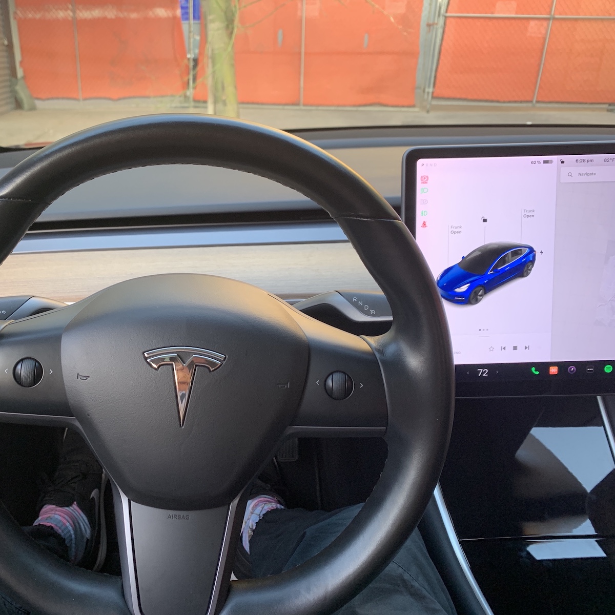
Drivers have been frustrated by the overabundance of touch screens but Tesla have condensed almost every single aspect of the dashboard into a single touch screen, getting rid of the gauge cluster entirely.
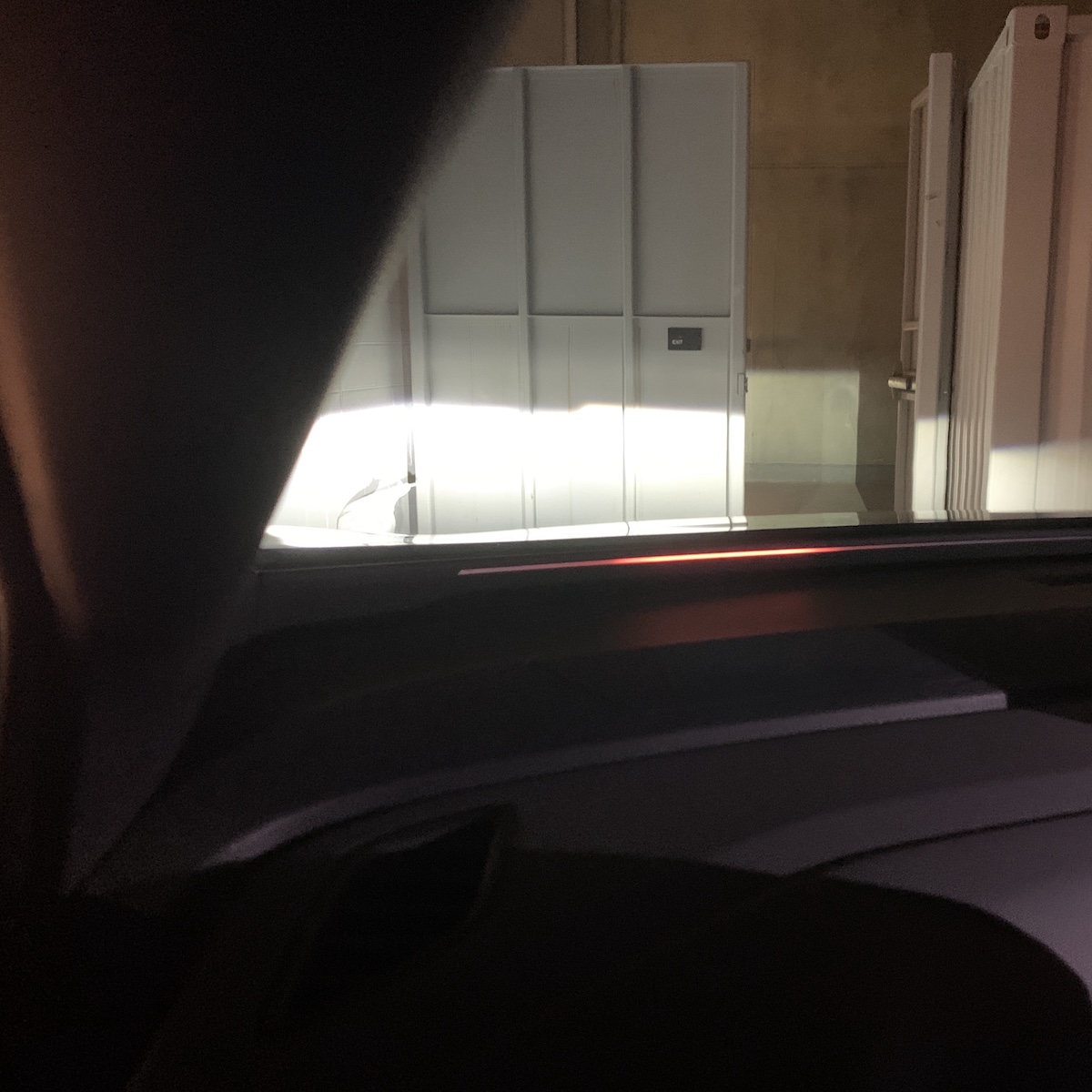
This light strip under the windshield is supposed to provide feedback to the driver but is too limited for any meaningful assistance.
How can we leverage existing tech ecosystems to create a familiar in-car experience?
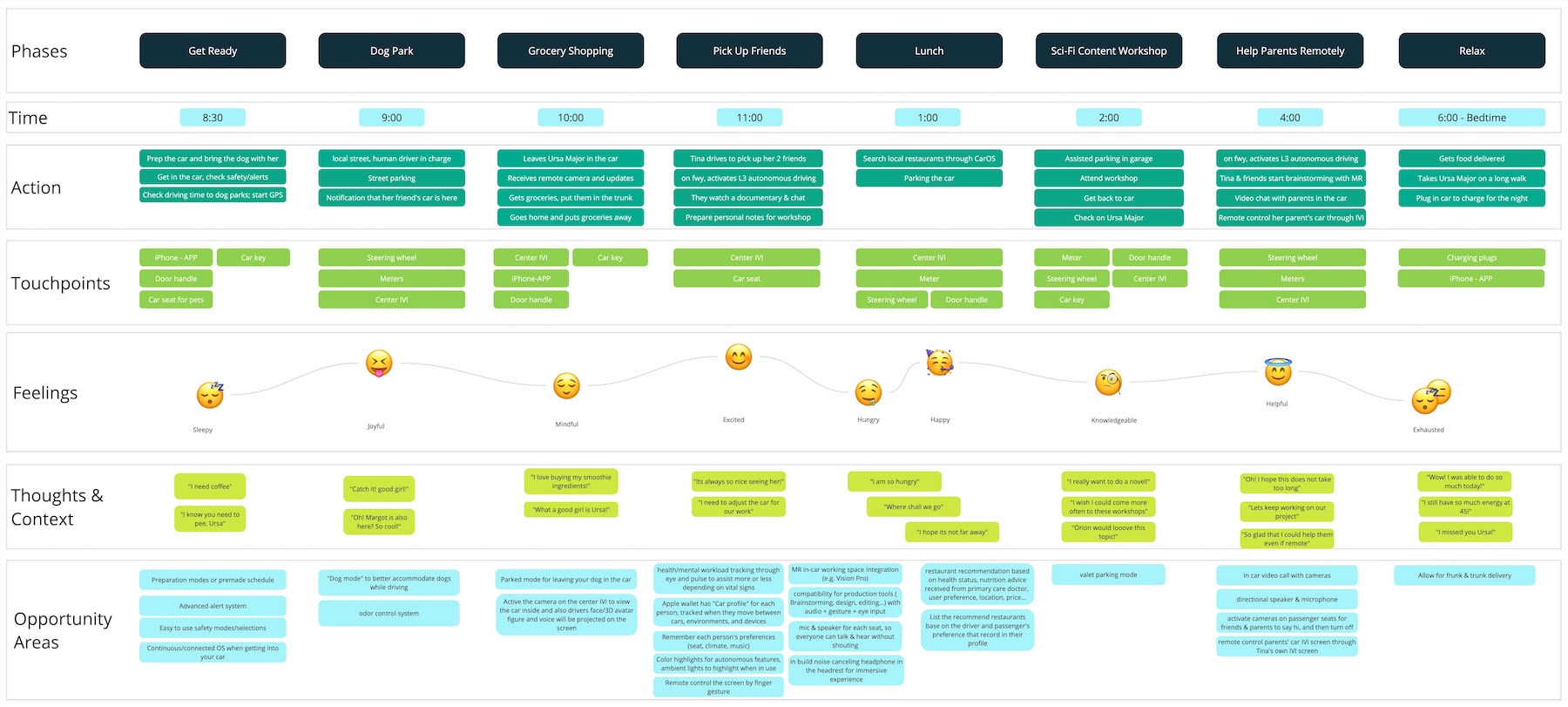
We Created an Ideal User Journey Map To Compare with the Existing Pain Points
Because the technology already exists to create a unified user experience between multiple devices (such as Apple's suite of "Handoff" features) it actually becomes relatively simple to create a seamless experience as long as there's complete ownership of the systems.
We Began Conceptualizing by Aligning with Apple's Brand
Clarifying Apple's Brand Value Priorities for Future Ecosystem Expansion
From the initial vehicle analysis, and noticing the broken mental model and disconnect between devices, I wanted to prioritize that feeling of using tech in a way that "just works".
If a major point of friction is the process of moving into and out of your car then, even with today's technology, we can introduce a seamless handoff when entering or exiting the vehicle.
Wireframing a Quick Proof of Concept
One of the major things that people are averse to is seeing “Settings” pages when talking about a feature. With that in mind, I made a quick proof of concept just to show what a user might encounter during the actual event.
Designing & Iterating a Realistic Visual Language
Figuring out how iOS would translate to an infotainment system
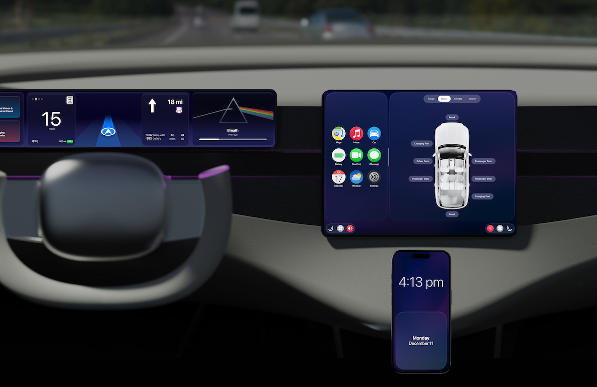
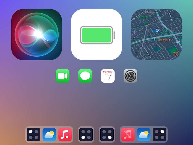
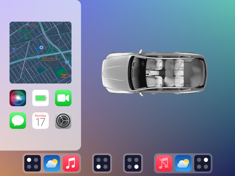
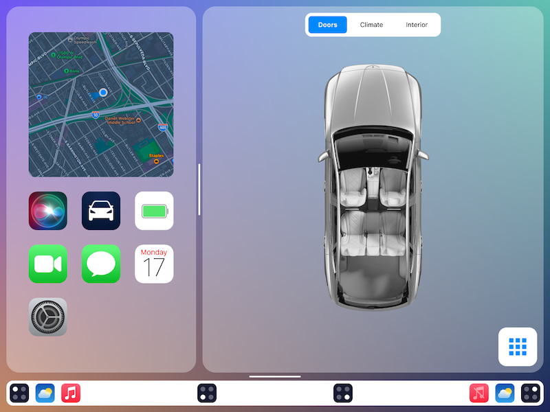
Talking with my team, I realized we would need a “home” for our concepts to work from, and we agreed on an iPad-sized screen for the center console, potentially utilizing MagSafe connections to use whatever sized screens the owner would prefer.
Revising Interaction
Up to this point I was too focused on designing to retain user agency. However, when you purposefully introduce friction to a process, by definition, you're not creating a seamless interaction.
Finalizing Seamless Interactions
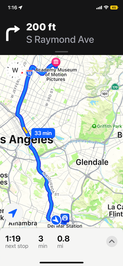
An Animated Prototype to Illustrate the Seamless Concept
Like many of Apple’s features (such as Apple ID and Continuity) the magic is happening behind the scenes, and adjustments have to be made in Settings and Profiles. Showing a Settings page is a boring way to promote a new concept, especially because it’s not the part that will be most interacted with. This prototype shows how the actual user experience will play out.
Separate Concepts Informing a Combined Vision (Teamwork)
Conceptual 2035 Apple EV
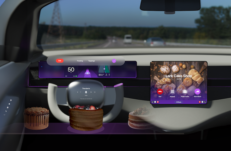
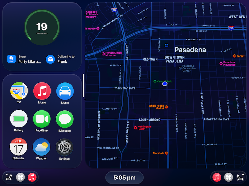
We worked as a team to conceptualize several connected driver experiences under the umbrella of an Apple-branded vehicle. We spent quite a bit of time researching the brand and coming up with a consistent design system, including shape language and colors.
This animated video highlights all of these features in the appropriate context of a driver's day.