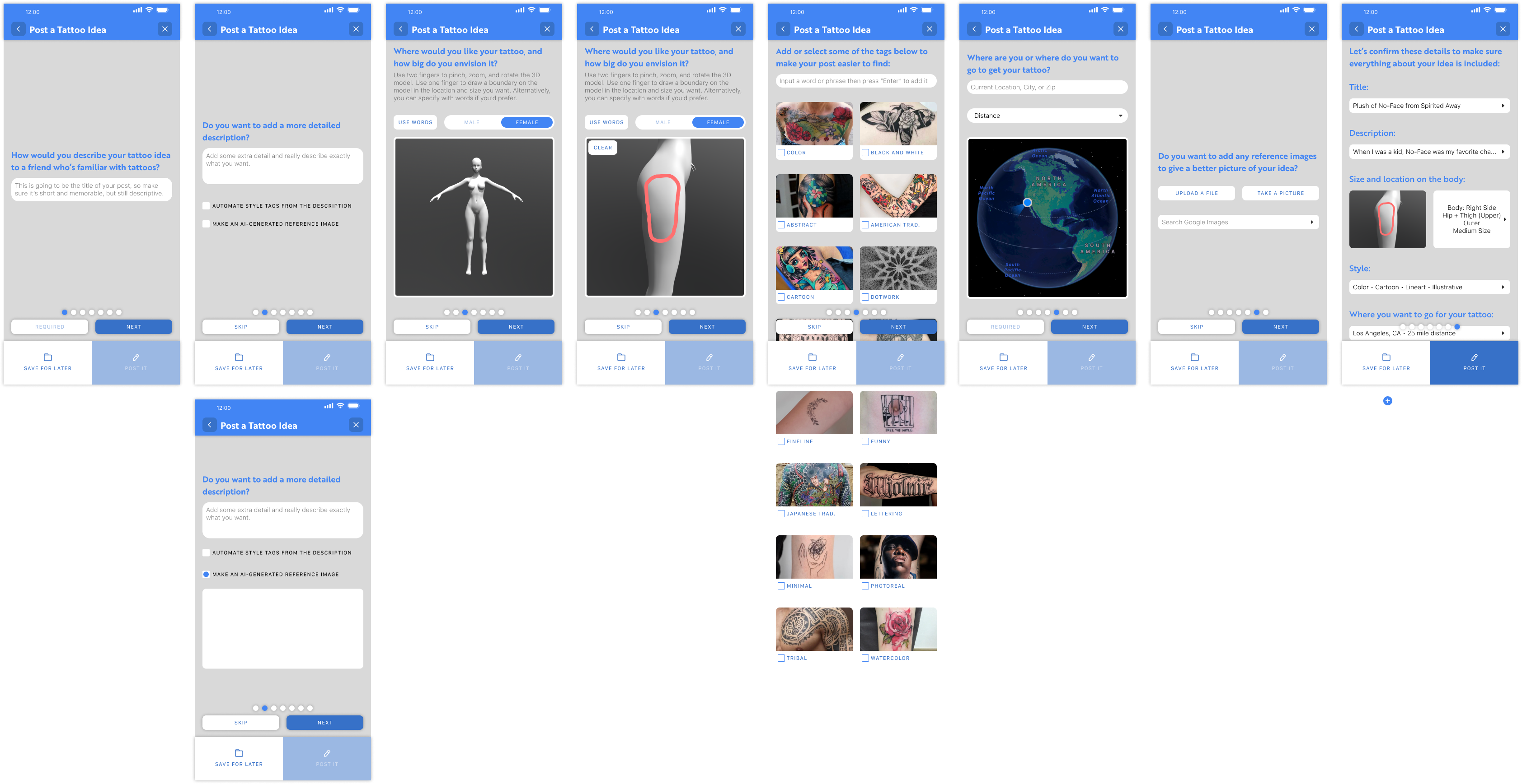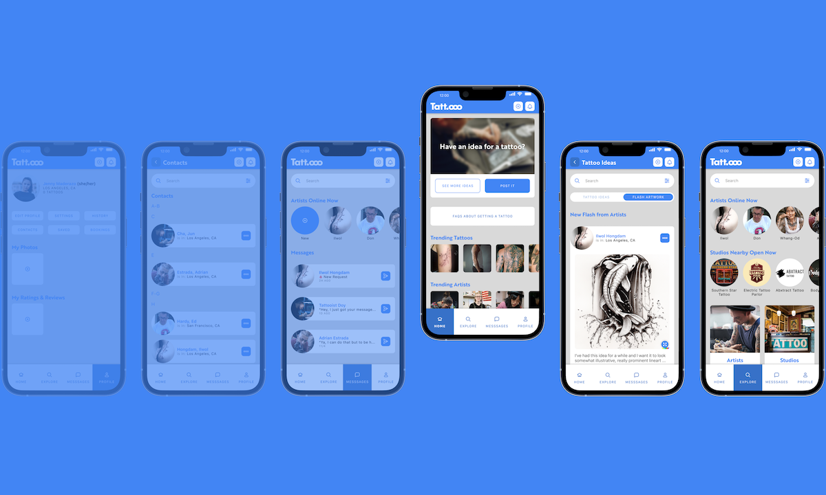
A series of mockups showing multiple iPhones. Each iPhone shows a different, high-fidelity screen of a mobile app. The mobile app shows pages like Home, Messages, and Contacts in a minimal palette of white and blue.

A Mobile Experience for Tattoo Enthusiasts —

Info

  • Mobile App
  • Role: UX Researcher, Product Designer
  • 14 Weeks
  • Sept - December 2022
  • Solo Project

Tools

  • Figma
  • Adobe Illustrator
  • Adobe AfterEffects

Overview

Tatt.ooo is a mobile app concept meant to make it easier to find tattoo artists/customers, start a conversation, and communicate your needs. Although there are features of social networks, that’s not necessarily the purpose of the platform. It’s a simplified, centralized platform for tattoo artists (rather than creating multiple social accounts in addition to maintaining a website, Yelp, etc.) and a way for their customers to find, message, schedule, and hold them accountable.

Problem

  • The process of planning a new tattoo has too many different touchpoints to figure out whether an artist is the right fit.
  • Pricing & other details are often not discussed until after a conversation has started, which can be a barrier to entry for many people.
  • Tattoo artists will often only show the work that they're most proud of and viewing an artist’s work doesn't indicate whether or not the process was worthwhile for the customer. Additionally, good, local artists can be overshadowed by more popular ones due to their social media presence.

Goals

  • Decrease the number of touchpoints that customers have to utilize and put more of the necessary information and tools in one place.
  • Make the process more comfortable and streamlined for customers to approach and build rapport/trust with a tattoo artist. Provide an avenue for tattoo artists to be more discoverable and responsible to their customers.

Solution

  • Centralize the various touchpoints so that customers can do their searching, viewing, and contacting in one place, while also giving artists an easier, singular platform to maintain.
  • Create a gallery and profile system that allows for artists and their customers to both post images in a way that's connected.
  • Incorporate features to increase responsibility and transparency.

The problem when trying to get a tattoo

Finding the right tattoo artist can be a daunting, time-consuming process.

Tattoo enthusiasts typically have to navigate through multiple platforms such as Google, Yelp, and Instagram, sifting through countless search results and social media profiles. This disjointed process can lead to frustration, insufficient information, and questionable quality. Tattoo artists, similarly, struggle with effectively showcasing their skills and managing client expectations across these varied channels.
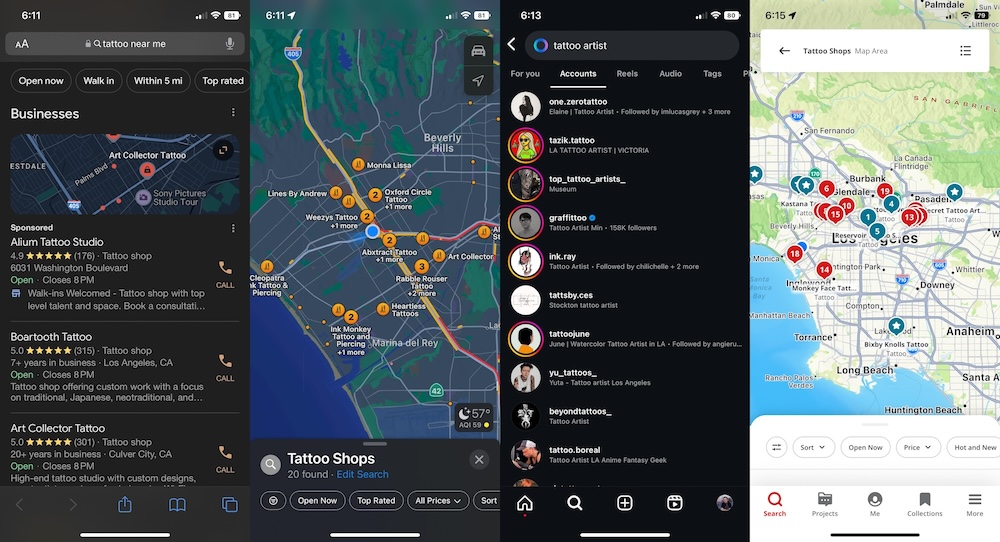
Screenshots showing different mobile touchpoints when researching tattoos: Google search results, Apple Maps search results, Instagram search results, and Yelp search results.

How can we make finding and working with tattoo artists easier and more trustworthy?

1/5

Foundational Research

User Interviews & Journey Maps

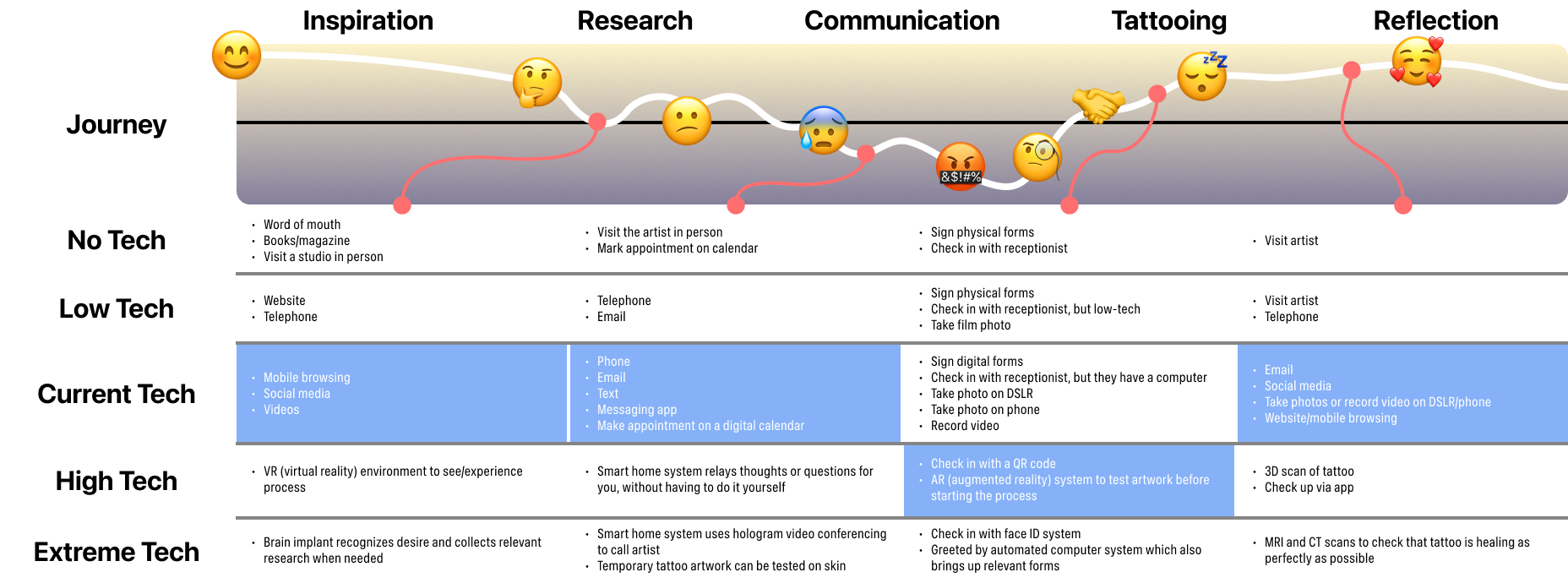
Based on some user interviews with people who've gone through the tattooing process, ranging from just once to several times, I was able to make some well-defined journey maps. The break came from looking at the journey touchpoints in terms of the different levels of technology available.

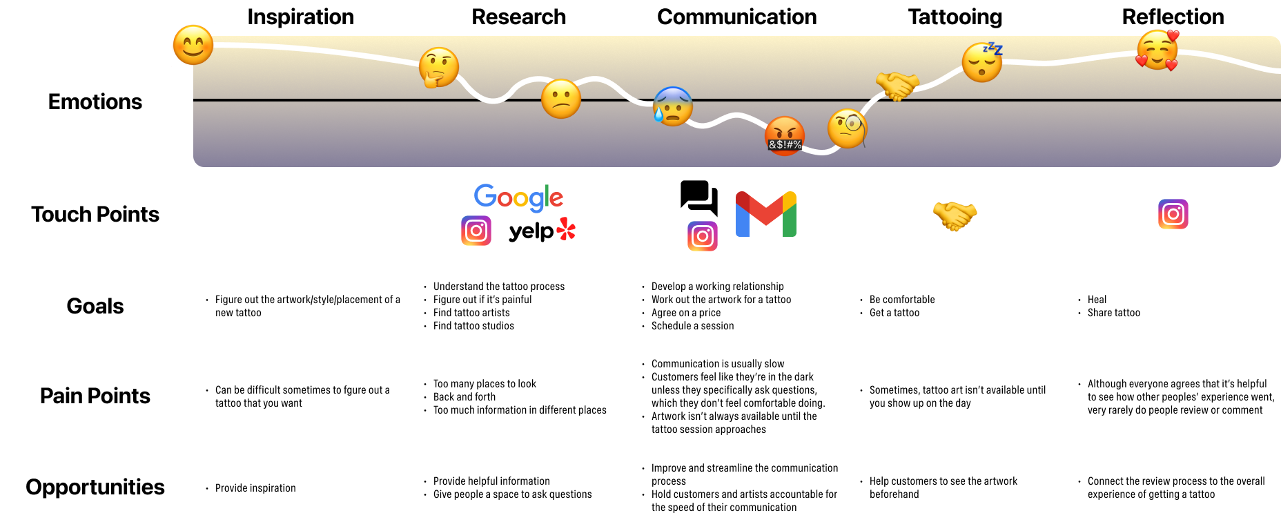
A complex graph showing the customer journey through the tattoo process and the user's thoughts, feelings, and actions.
A complex graph showing the customer journey through the tattoo process and the touchpoints, goals, pain points, and opportunities.
A complex graph showing the customer journey through the tattoo process and the different levels of technology available or possible at each juncture, including no tech, low tech, current tech, high tech, and extreme tech.

I've only ever seen my art the day that I show up.

An instrumental quote from one of my interviews. The participant who said this had several tattoos from multiple artists.

Opportunities

Improve and streamline the communication process

Provide helpful information and resources in a centralized platform

Help customers see the artwork early and the artists to get feedback

Provide helpful information and resources in a centralized platform

Persona

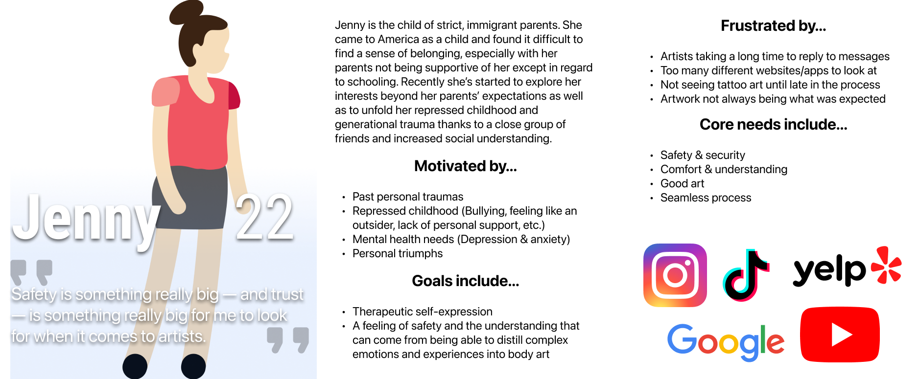
Jenny is the synthesis of all of my foundational research and journey maps. I was able to incorporate all of my insights and condense them down into some core needs:

  • Safety & security
  • Comfort & understanding
  • Good art
  • Seamless process
A visual called a persona, detailing a fictitious person named Jenny, a 22-year-old interested in getting tattoos. This visual includes a short bio and details her motivations, goals, frustrations, and needs.

2/5

Flows & Wireframing

Planning & Wireframes

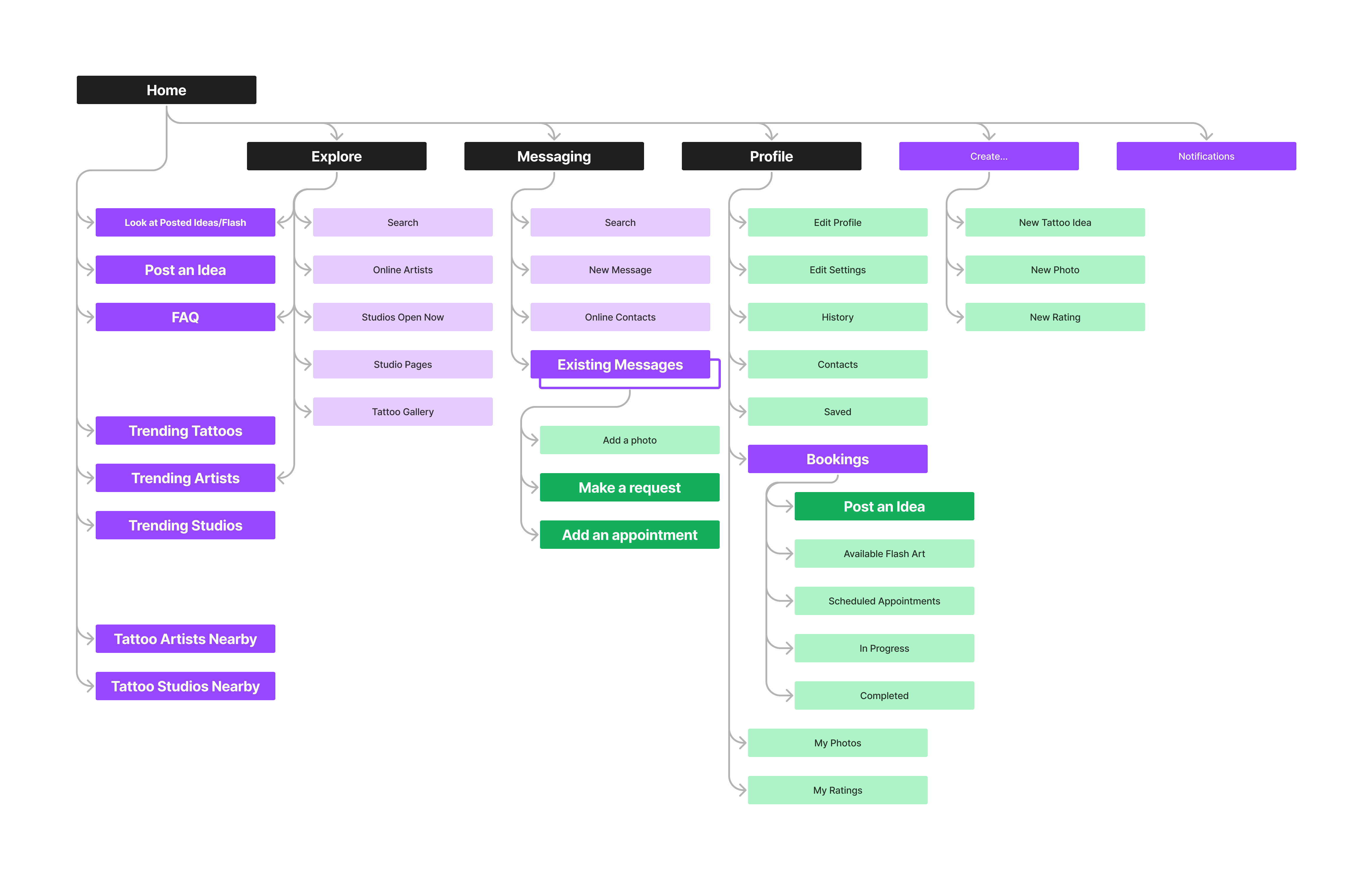
A sitemap of the app to start planning out layout, structures, and interactions.

Information Architecture (Final)

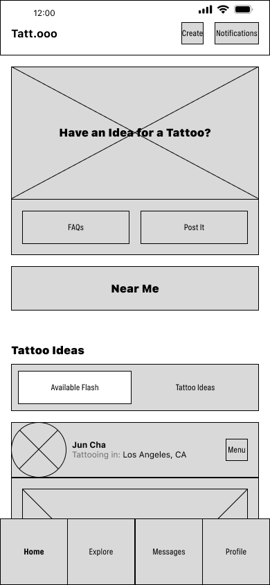
Low fidelity wireframe of a mobile app with a tab bar at the bottom, a content box for a hero image, and placeholder buttons below.
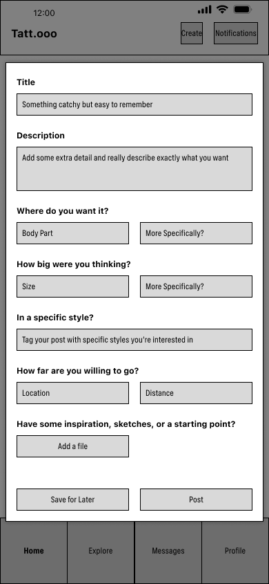
Low fidelity wireframe of a form which appears as a modal over the previous home page wireframe; its one page of text entry inputs.

Rough Wireframing

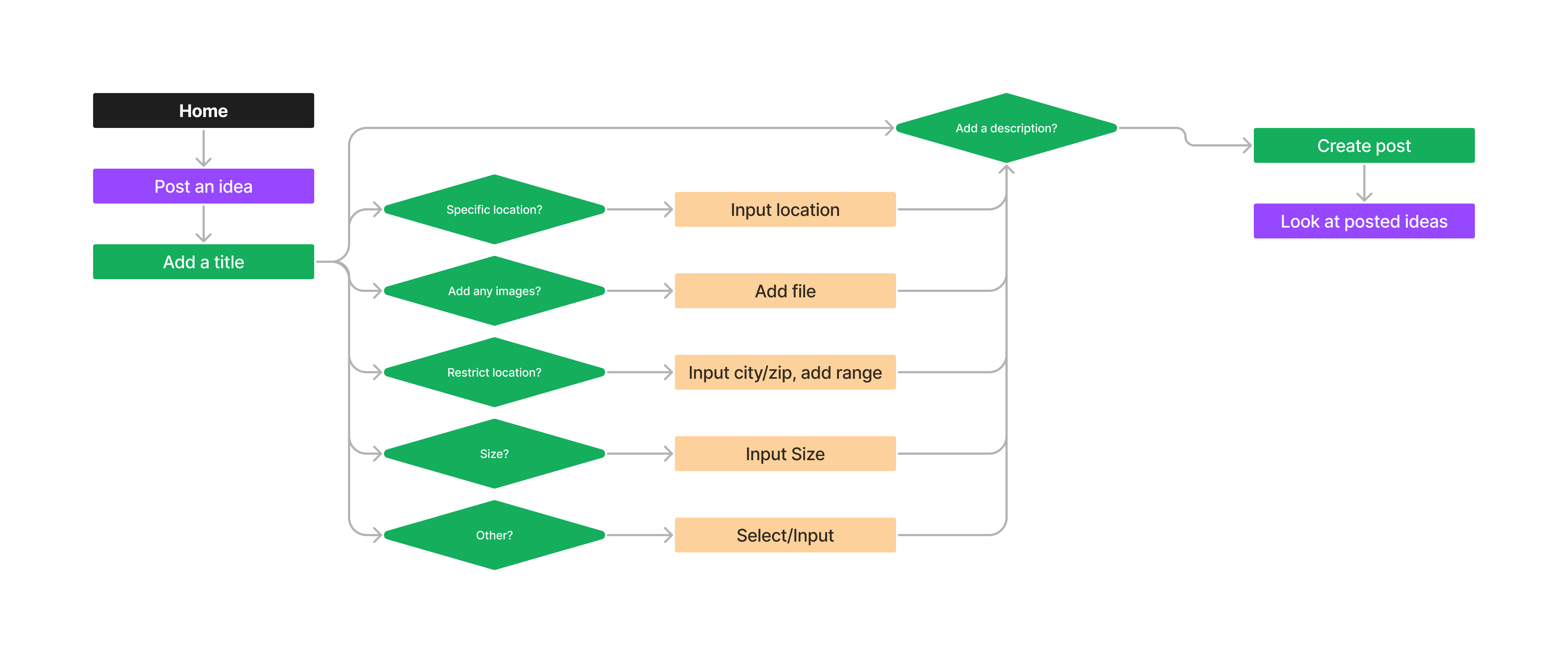
Based off of the sitemap structure, this user flow maps out the different tasks/interactions to complete a specific task.

User Flows

Based off of the sitemap structure, this user flow maps out the different tasks/interactions to complete a specific task.

Revised Wireframe of a Primary Form

3/5

Branding & Visual Design

Sketching Immediately

From the moment I decided to work on a tattoo-focused platform for searching and communication, I worked out a mind map and started sketching some vague shapes and ideas to get the ball rolling.
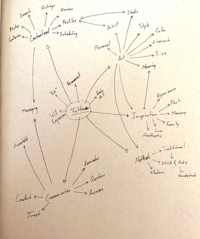
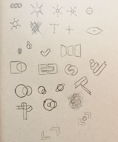
A notebook page with a rough mind map drawn on it. `Tattoo` is at the center with links arrayed outward to topics like Self-Expression, Art, Communication, Inspiration, Methods, and more, and more connections from each of those to further connections. A notebook page of rough sketches of abstract shapes, motifs like a ribbon and interlocking shapes, iconographic shapes like a starburst, and more.

Finalized Name & Logo

Simple, to-the-point, easy to remember, and with a tiny bit of design flair from the triple “o” resembling the dots of a tattoo line.

A form of logo lockup, showing the finalized, primary logotype `Tattooo` in a bold, geometric font, arranged with a dot before the triple `o` and the 3 `o`s overlapping slightly; there are also some smaller layouts, such as a small version for use as an app icon.

Visual Design Process

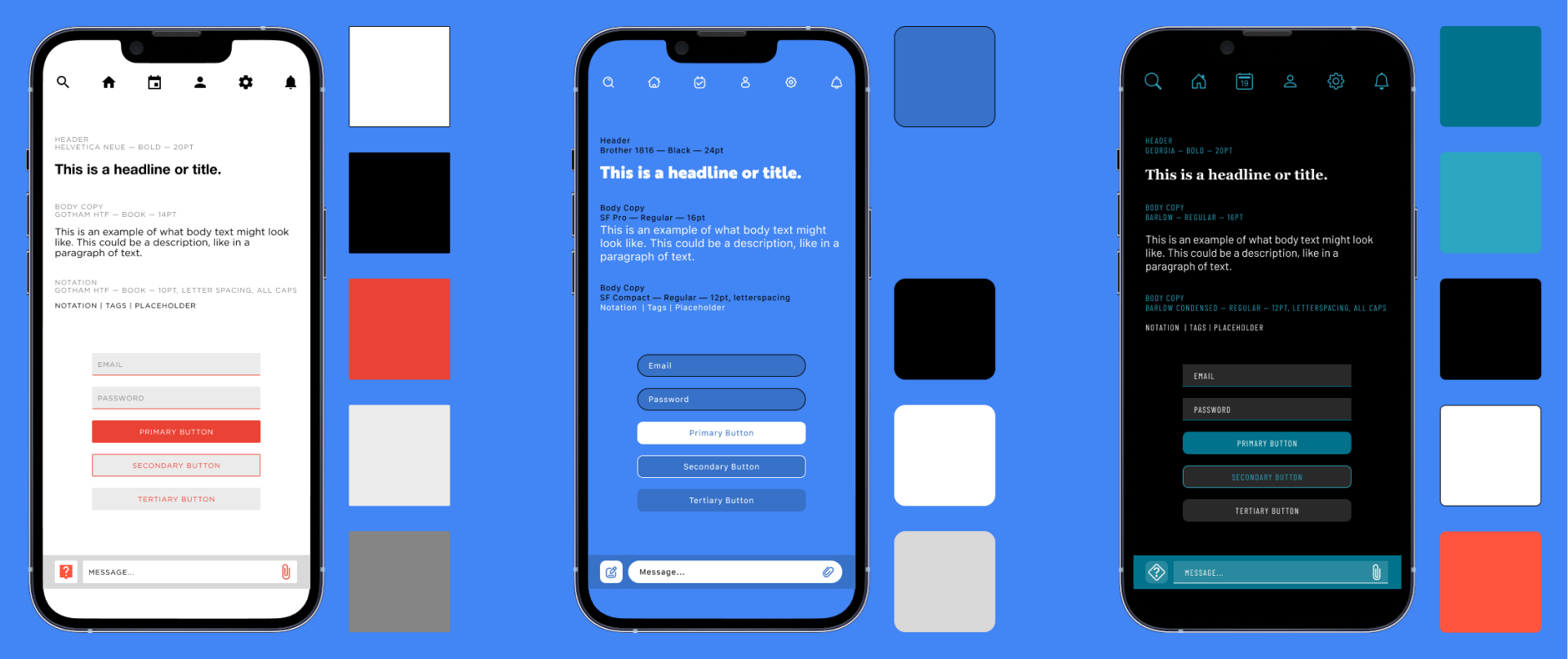
3 visual design explorations in a row, each one in the form of an iPhone mockup with several visual design elements, like buttons and text inputs, and typography explorations on the screen. Each phone is next to a color palette.

Style Tiles

I did 3 style explorations to test out different combinations of text, visual language, and color. Each one tries to relate to a different aspect of the platform.

An array showing the icons selected for the app. All of them are designed with simple lines, rather than purely solid shapes, with the overall appearance being more round and approachable, rather than having sharp edges and angles.

Iconography

I found Ankush Syal’s Xnix Icon Set on Figma’s Community pages and decided, for my purposes, the rounded shapes and line-based design are fitting and quite readable.

2 Color swatches, a calming blue and a darker blue, along with the cases where each color would be used. 2 Color swatches, pure black and white, along with the cases where each color would be used. 2 Color swatches, light grey and a coral red, along with the cases where each color would be used. 2 Color swatches, a light violet and a darker version, along with the cases where each color would be used.

Color Palette

4/5

Design System

Interface Elements

A title bar, which would go at the top of the app, containing the logotype on the left and 2 buttons, one to Create a Post and one for Notifications, on the right. A title bar, which would go at the top of the app, but the logo on the left has been replaced by a `Back` button and page title and on the right is now a `Close` button. A title bar, which would go at the top of the app, with the same `Back` button but a username instead of page title, and the `Create a Post` and `Notification` buttons are back. A title bar, which would go at the top of the app, that's similar to the previous, with a username at the top, but the right side now has a button to go to the current Project, and underneath the bar is a small, horizontal checklist with list items for Basics, Design, Schedule, and Complete, to track the current tattoo process. A title bar, which would go at the top of the app, containing the logotype on the left and 2 buttons, one to Create a Post and one for Notifications, on the right. A title bar, which would go at the top of the app, containing the logotype on the left and 2 buttons, one to Create a Post and one for Notifications, on the right.

Title & Tab Bars

A Search bar; contained inside, on the left, is a 'magnifying glass' icon and, on the right, is an icon of sliders to signify 'Filters'. A slider component with 2 options to choose between, Ideas and Available Art, with Ideas being currently selected. To the right of the sliders is a button for 'Filters' and another of a 'Magnifying Glass'. A Search bar; contained inside, on the left, is a 'magnifying glass' icon and, on the right, is an icon of sliders to signify 'Filters'. To the left of the Search bar is a 'Close' button.

Minor State Changes

A Messaging Bar, like would be in a texting or messaging app, with a text-entry field sandwiched between a 'Plus' button' and a 'Send' button. A Messaging Bar, like the previous one, but the 'Plus' button has changed to a 'Close' button and below the bar is a row of additional buttons, such as to add a link, image, etc. A Messaging Bar, like the previous ones but, above the bar is now an example, additional form labeled 'Budget Request' with 2 entry fields labeled 'Low end' and 'High end'.

Familiar Design

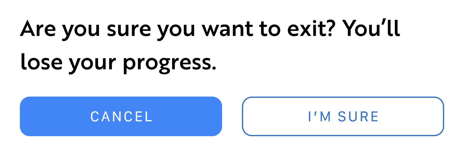
A pop-up modal with an example of basic buttons. Below the title of the modal are 2 different, simple buttons for 'Cancel' and 'I`m Sure', with one being the primary (filled in with color) and the other being secondary (only outlined). An expanded style button in the form of a full-width button, label on the left, with an 'arrow' on the right to continue to the labeled page. An expanded style button in the form of a full-width button, label on the left, with an 'arrow' on the right to continue to the labeled page. This version has additional space to the left of the button for a smaller icon, in this case a 'Notification' icon. A complex-style button, primarily for profile/social purposes, with a profile picture on the left, name and additional information next to it, complete with a 'Message' button on the right. A complex-style button, primarily for profile/social purposes, with a profile picture on the left, name and additional information next to it, complete with a 'More' button on the right.

Basic, Expanded, & Complex Buttons

An example of a hero card style, with an image at the top and two buttons underneath, one primary and one secondary. An example of a basic card style, with an image at the top and a Title/Label underneath. An example of a basic card style, with an image at the top and a checkbox and Label underneath.

Different Card Styles

Complex Cards

I realized that my concept would keep open the possibility of having posts without images. Therefore, I wanted the titles, text, and images to have similar levels of visual hierarchy.
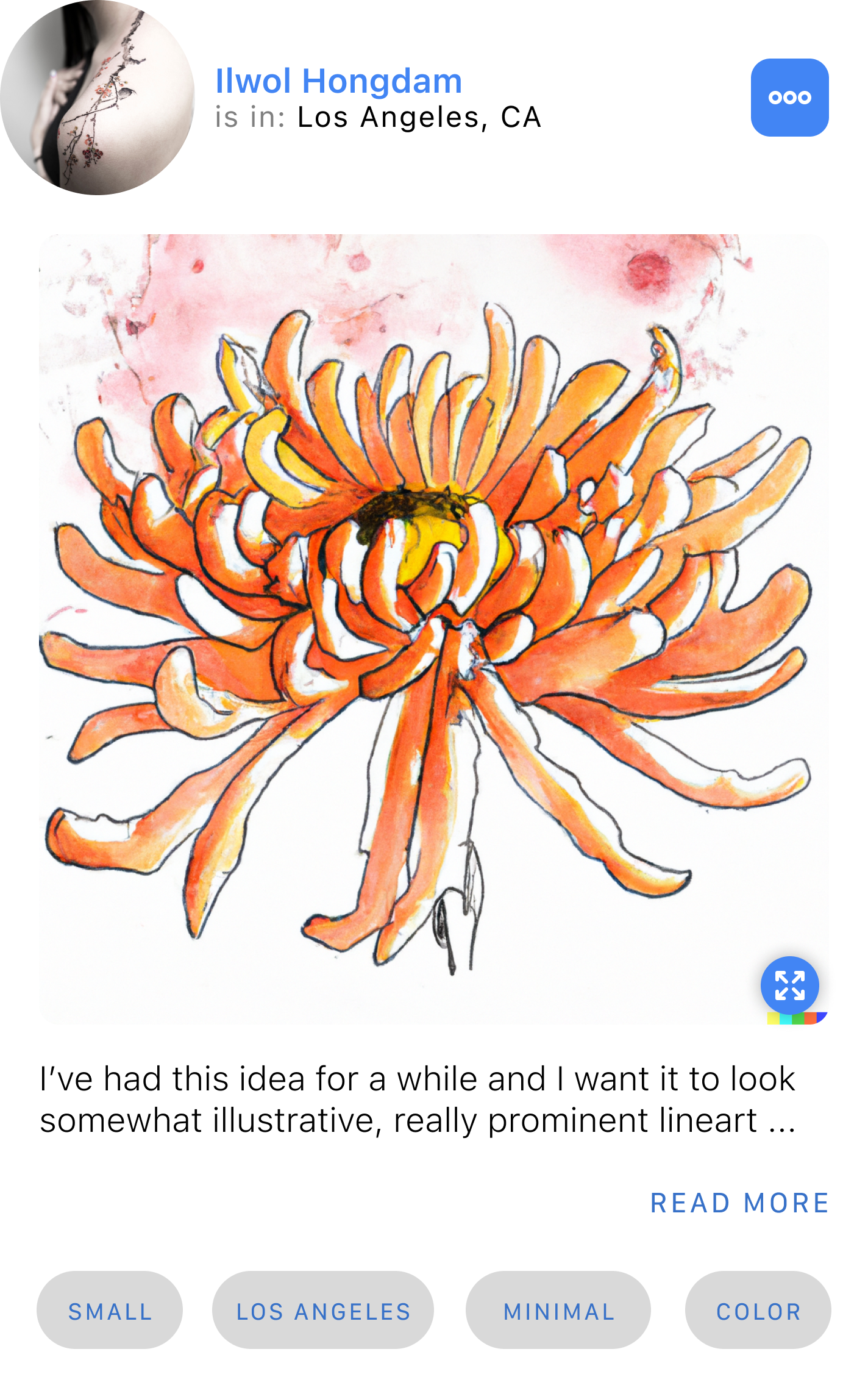
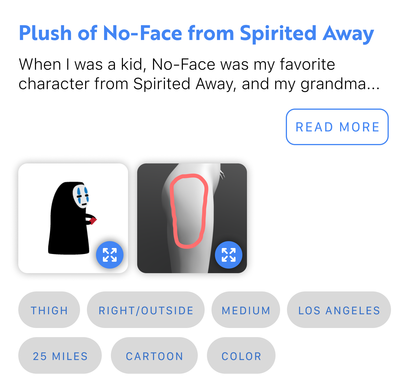
A mockup showing the visual design of `complex cards` which include a variety of different elements on them, such as a title, copy text, smaller buttons, images, and more. This complex card is a social style, which includes profile elements at the top, such as tattoo artist profile picture, name, and location at the top, with a hero image and description in the middle, then hashtag-style pills at the bottom. A mockup showing the visual design of `complex cards` which include a variety of different elements on them, such as a title, copy text, smaller buttons, images, and more. This complex card is a post style, with a title at the top followed by a description, then thumbnail images, and at the bottom are hashtag-style pills.

5/5

Prototyping

Iteration & High Fidelity

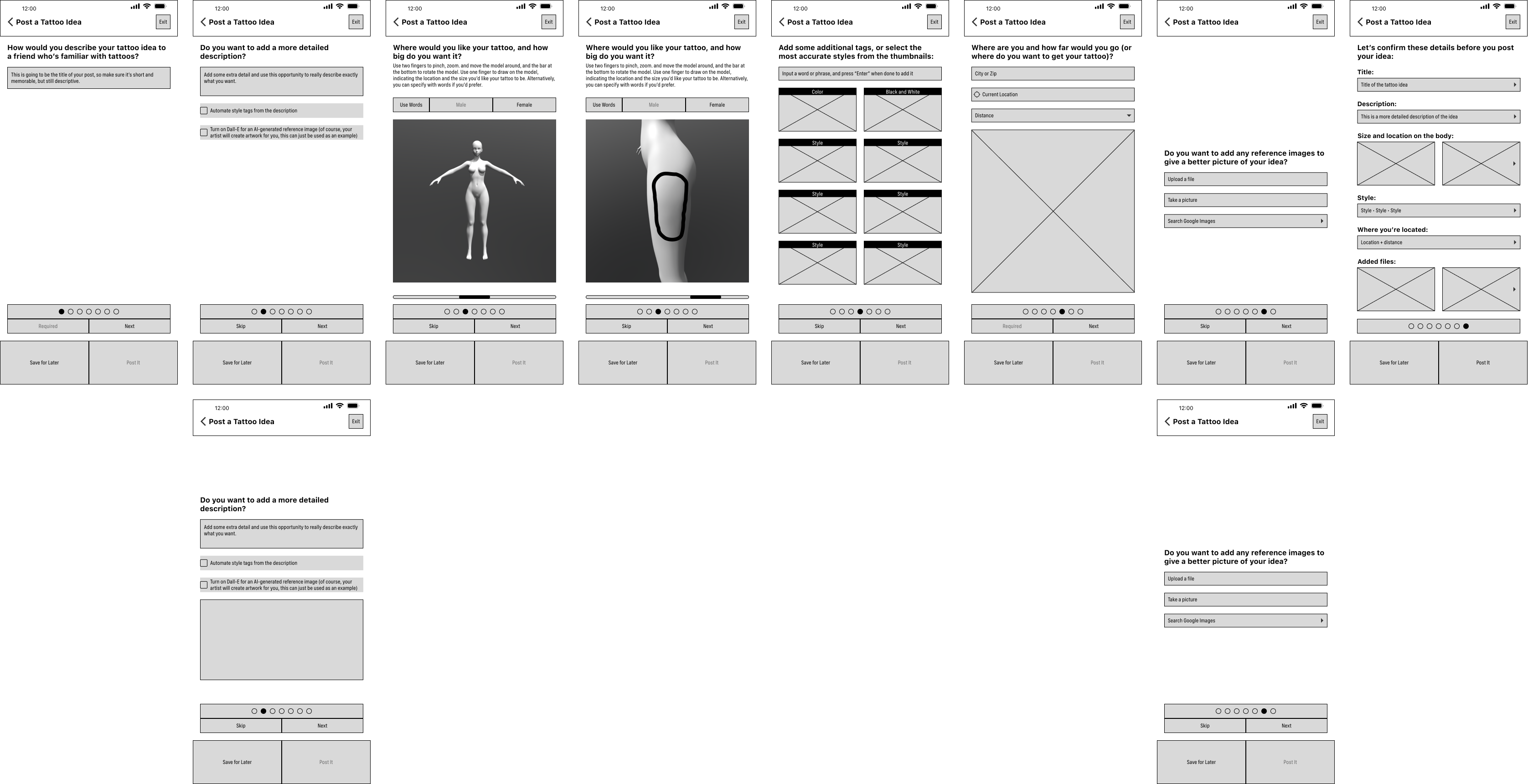
A series of low fidelity wireframes going page by page through a multi-page form. Everything is filler content, with gray rectangles instead of buttons, words in place of icons, and a black 'X' in place of each image. A series of high fidelity wireframes going page by page through a multi-page form. The grays have all been filled in with the white, blue, and gray color palette, icons have been put in place, and image spaces have been filled in.

Bringing Wireframes into High Fidelity

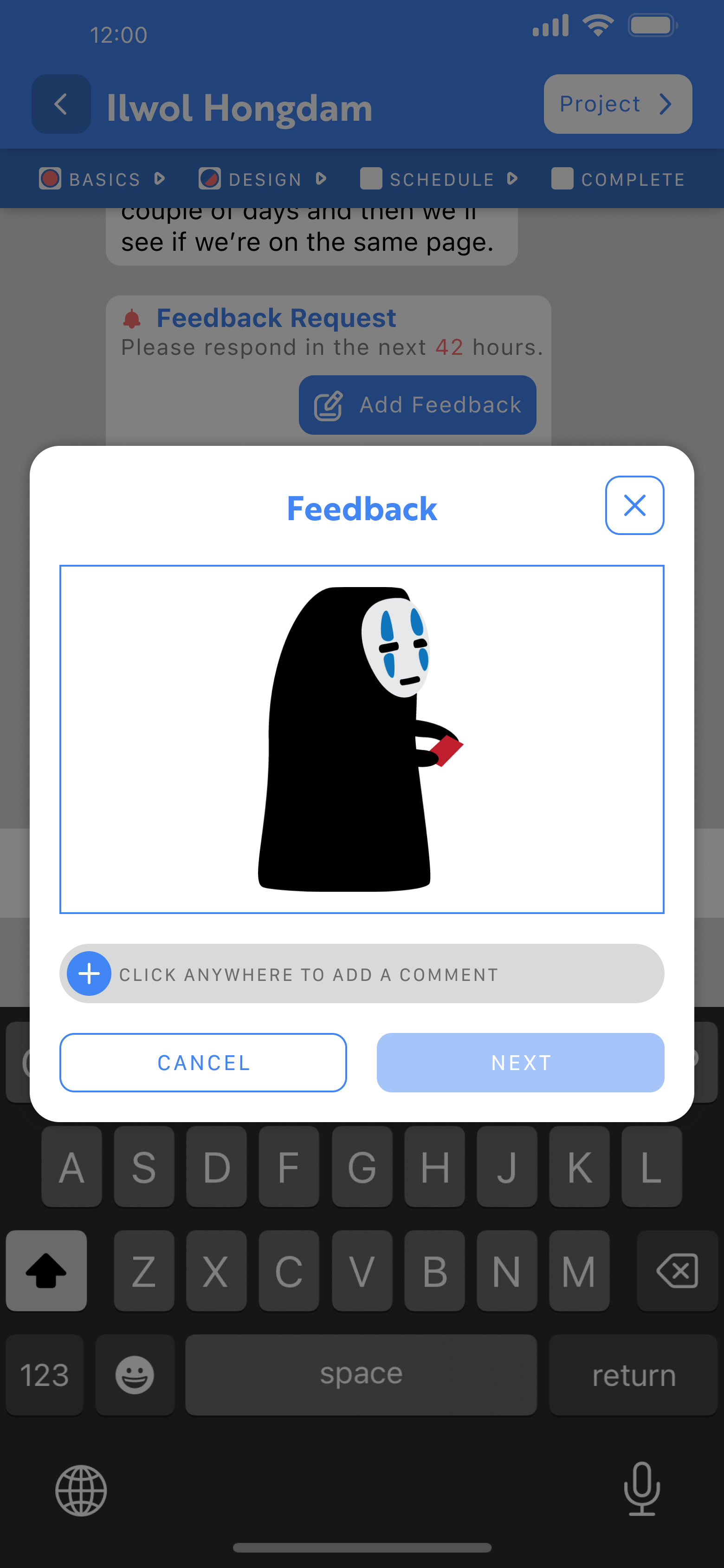
A page showing the beginning of the 'Artwork Feedback' Request process. In the messaging space, the screen has been grayed out and a pop-up modal is above everything. The title on the pop-up says 'Feedback', an image is below it, and there's a text entry field under that.

Restricted Space

Clunky Interaction

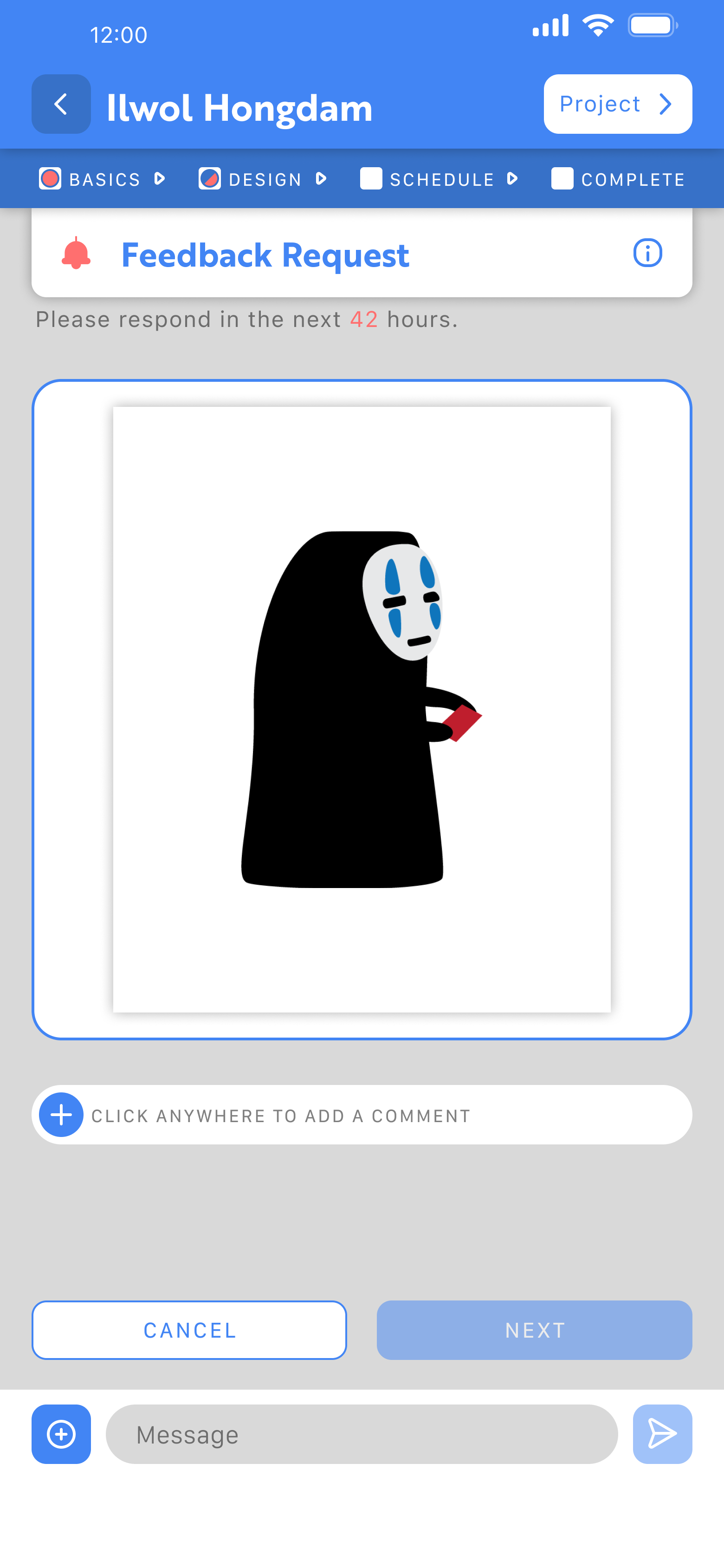
A page showing the beginning of the 'Artwork Feedback' Request process. Instead of a pop-up modal, the keyboard and messages have disappeared and the title 'Feedback Request' is now at the top of the screen, under the username being messaged, and the image takes up most of the space on the page, with the text entry box  below it still.

Enhanced Visibility

Improved Workflow

Some designs continued to be worked on after this video was rendered so they may not be an exact match for some of the images you see elsewhere on the page.

Final Thoughts & Next Steps

Tatt.ooo wasn’t designed for people who go and get tattoos on a whim; it was designed around tattoo enthusiasts and first timers who need some time to think about it beforehand. (That’s not to say there’s anything wrong with people who just want to go to a shop and pick a cute flash tattoo, this app just wasn't designed around those needs.)

To truly refine this concept I would need to do additional research with tattoo artists. It's a good lesson that just solving around one group's need doesn't always mean a service will succeed.
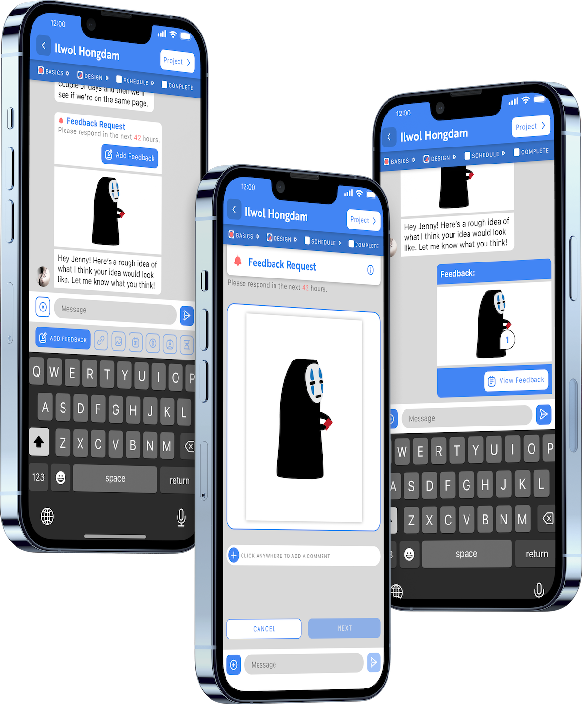
A mockup of 3 different screens in the Messaging process, while proofing artwork from an artist, side by side.

Copyright © 2016-2025

Designed in Figma & Built with Vue.js by Max Wright