Rethinking Physical Car Controls —
Info
- Automotive UX
- Role: UX Designer
- 2 Weeks
- October 2023
- Solo Project
Tools
- ProCreate
- Figma
Overview
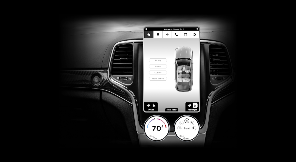
A brief project exploring how to improve the relationship that drivers have with their car through a combination of both touchscreen and physical controls, rather than the preferred method of replacing physical controls as much as possible by housing everything in a touchscreen.
Problem
Many car owners are frustrated by the lack of physical controls, like knobs and buttons, that have been replaced by touchscreens which can be slow, inconvenient, unresponsive, and even unsafe to use.
Goals
Maintain cost-savings while reintroducing a physical control system of some kind.
Solution
Combine touchscreen and physical controls into some kind of cheap but multifunctional interaction.
The problem with touchscreens
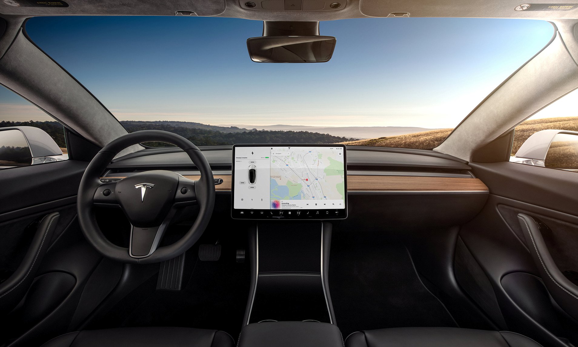
A growing number of vehicles have looked for ways to reduce costs, understandably. One such ethos reduces the complexity of a typical dashboard as much as possible by removing all of the physical controls; some manufacturers have even gone as far as removing the entire gauge cluster from behind the steering wheel. All of those controls and displays are then housed in one or more touchscreens.
Not only can this be dangerous, its also slower to navigate through layers of controls, even more so while driving, and introduces other problems. Some touchscreens have issues with multi-touch interactions, and designing singular screens to be interactive for 2 people at once (like a driver and passenger) introduces even more room for mistakes.
©Reuters 2017
Goal: explore ways that physical controls can be combined with touchscreens to consolidate and centralize interactions
1/2
Concept & Feedback
Initial Sketch
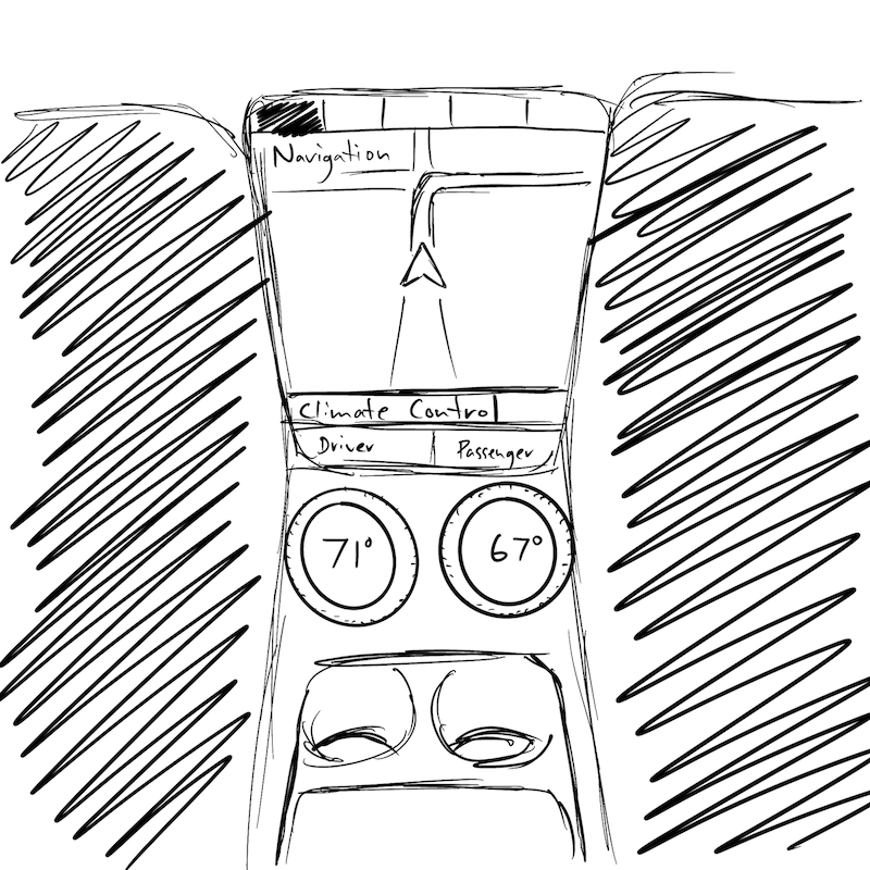
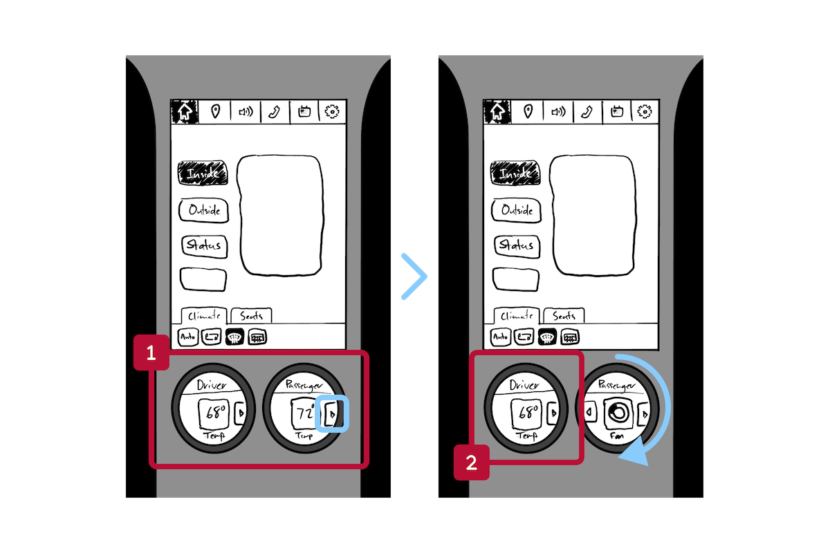
The first sketch that seemed interesting was to use 1-2 multi-use dials next to the screen, the idea being that you would select a parameter, such as temperature or seat inclination, from the main touch screen and then use the dial to adjust the setting.
Wireframing Feedback
“Are these touch screen or will they be controlled only by rotating and clicking the dial?”
“The dials should have a preview of all of the available options, instead of focusing on one at a time, so its easier for users to get to the one they want to change.”
2/2
Prototyping
Testing Feedback
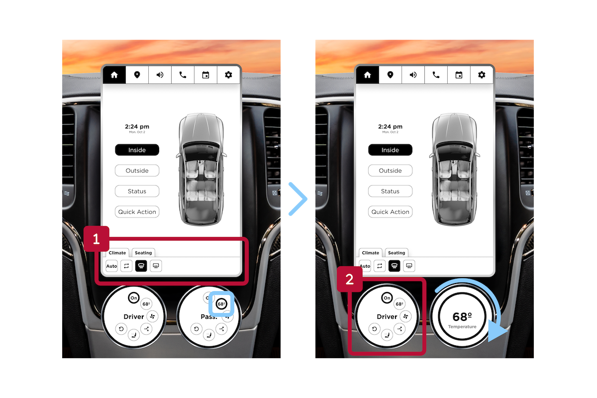
“Does the selected category have to apply to both dials? If one person selects “Seating” then the other person can’t adjust their A/C. Would it be better to have individual controls?”
“Is this the default screen, with multiple options? It might be better to have one default setting, like temperature, so you don’t have to always go through multiple steps to change it when you get in the car.”
Refined
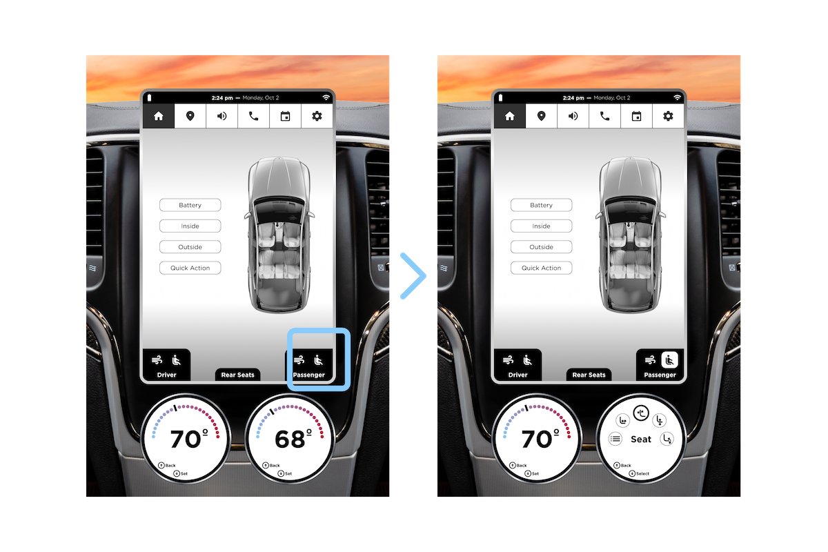
I created a default screen with the idea that your preferred default would be selectable in Settings. There’s also individual controls for each seat so that each knob can be in different categories, unlike the previous prototype.
Since the turning ring of the knob can be pressed inward to make selections, I realized it shouldn’t be too difficult (hardware-wise) to pull it outward for another control. This provides more navigation opportunities to go forward and backward through layers.
Final Thoughts & Next Steps
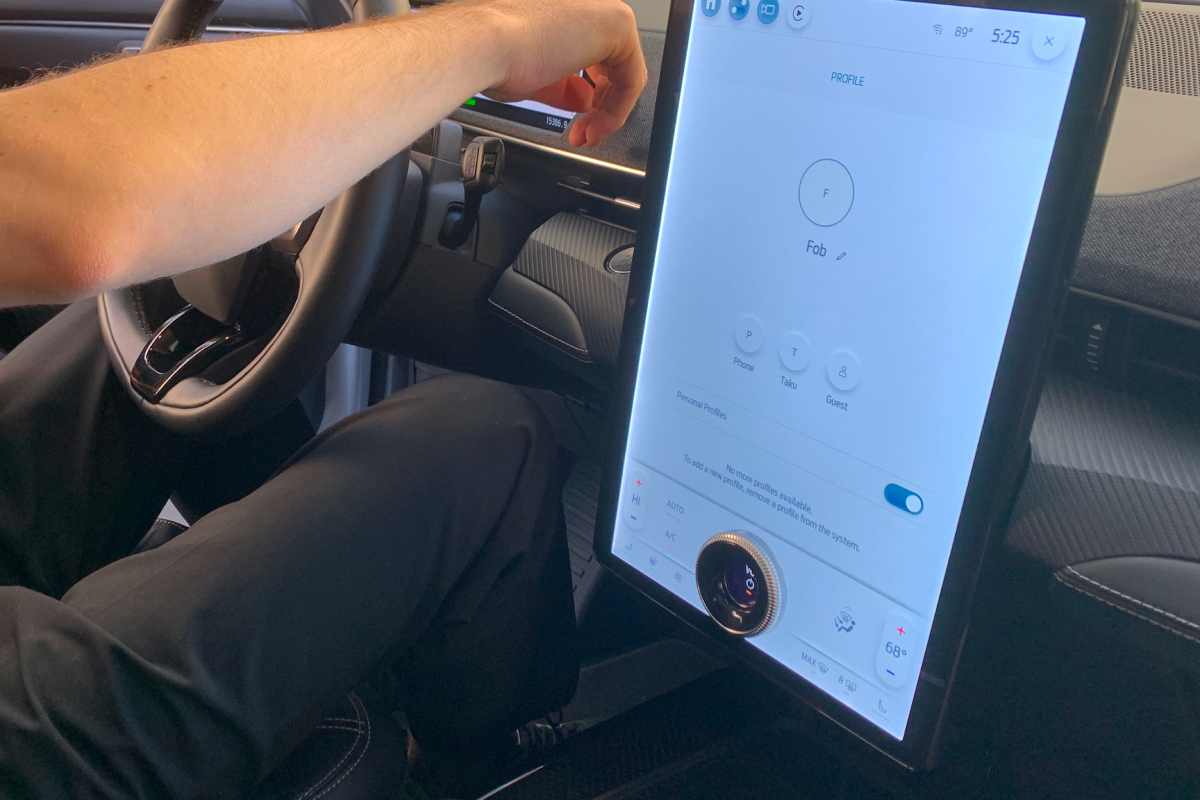
There needs to be a medium between the two extremes of all touchscreen and all physical. Ford, for instance, introduced this IVI system in the Mach E. It has a physical knob embedded near the bottom edge of the screen, which is similar to the solution I explored but with the added expenses of a massive, complex, custom-shaped screen with integrated knob and additional, small screen.
This entire project got me extremely intrigued by HMI and the complexities of working within massive organizations and I would be very happy to continue exploring HMI solutions.
