User Research for Product Packaging —
Info
- Product Packaging
- Role: Graphic Designer
- Ongoing
- Solo Project
Tools
- Google Forms
- Adobe Illustrator
Overview
I needed something to do in my free time and I tend to watch a lot of movies. I created a fictional brewery, called Hyperbole, then tested some packaging design so I could make digital illustrations based on the movies I was watching, and keep my Adobe Illustrator skills nice and polished.
Craft Beer Today
We have somewhere around 10,000 breweries in the United States [in 2024], up exponentially from ~3,500 in 2014. (Even at the time I started planning this project in 2021 there were ~9,300 compared to ~2,000 in 2011.) With such an explosion of breweries it means that the available options for consumers have likewise grown. To stand out on the shelf, you need more than just bright colors or great graphics.
©Trong Nguyen * Brewers Association 2017, via EGC Group 2023
Goal: explore consumer-friendly packaging as a way to practice digital illustration skills
1/3
Research & Observations
Observations
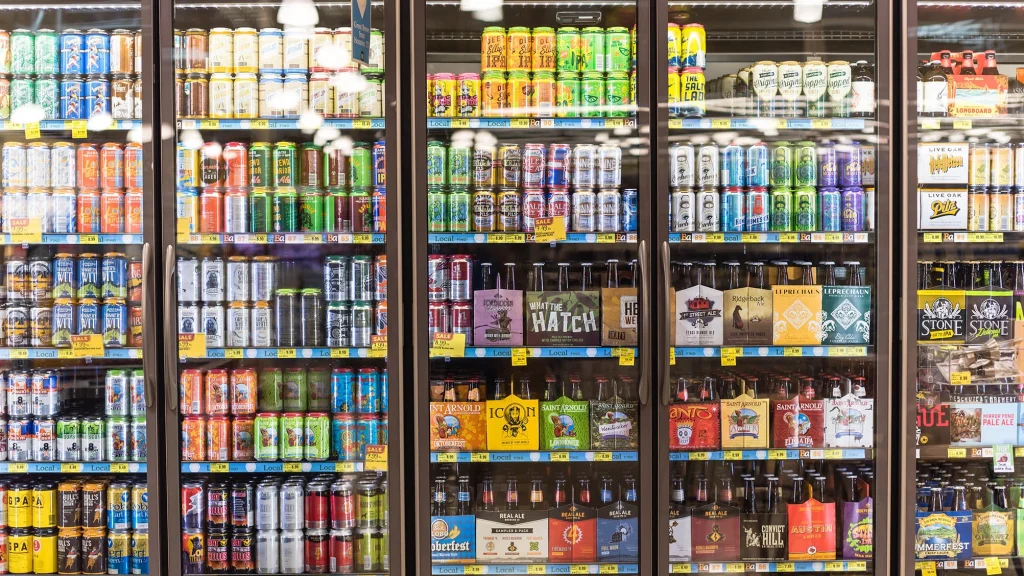
Good designs (above): The bestselling beers are either well-known or well-designed. And, from working in liquor sales for 6 years, I can verify that the the most well-designed beers have the brand name/logo and beer style on the same side of the packaging, and all other details are incredibly easy to find. The very best-selling put the logo, style, name, and ABV all in one place.
Bad design (below): Many beers that you'd expect to sell well, because they come from a known brewery or trending style, are so poorly designed that they hardly sell at all.
Takeaway —
Make your information easy to find.


Public Survey
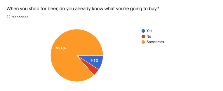
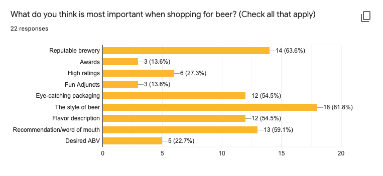
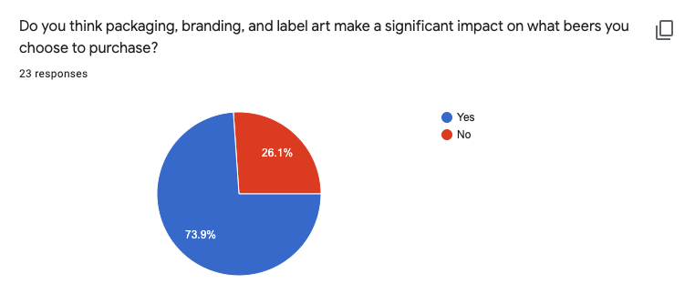
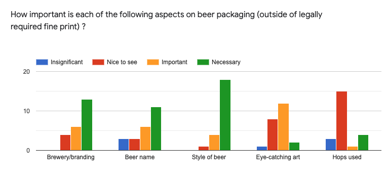
I posted a survey on Reddit and asked some questions about beer packaging to see if there was any kind of consensus about the info that people need when they're buying beer.
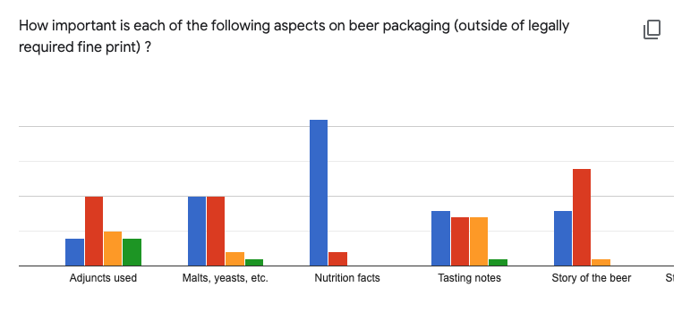
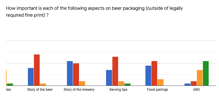
What Customers Need to See
Brewery Name/Logo
Style of Beer
ABV
Beer Name
2/3
Testing
Version 1 of a Layout
I wanted to ensure that my fictitious designs would work in the real world so I created a rough layout to print and test.
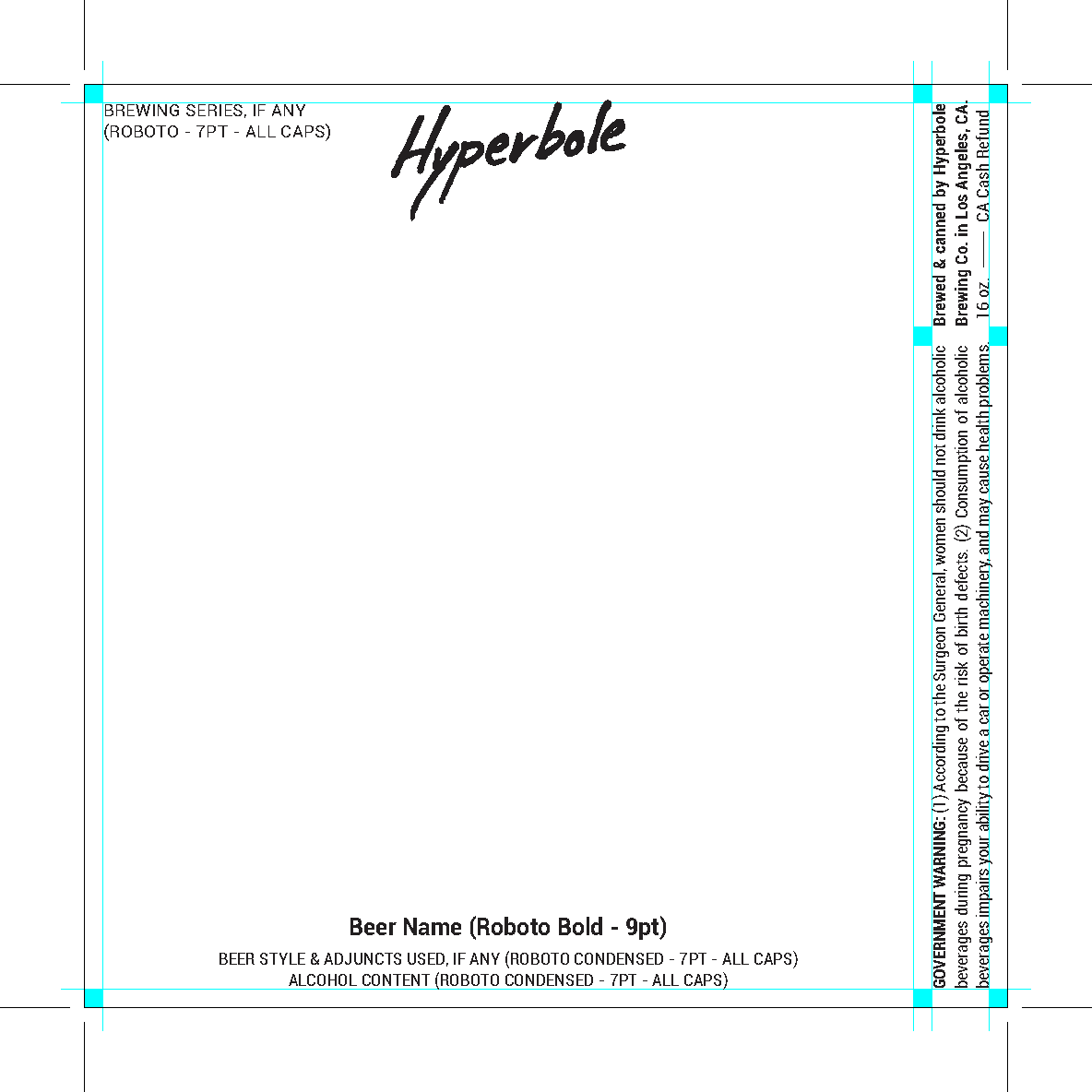
First Layout
I tried to apply my knowledge in my first layout: brewery name/logo, beer style, beer name, and ABV on on vertical face of the label. (Alcohol layouts also require a surgeon general's warning, origin, size, and notation of recycling refund.)
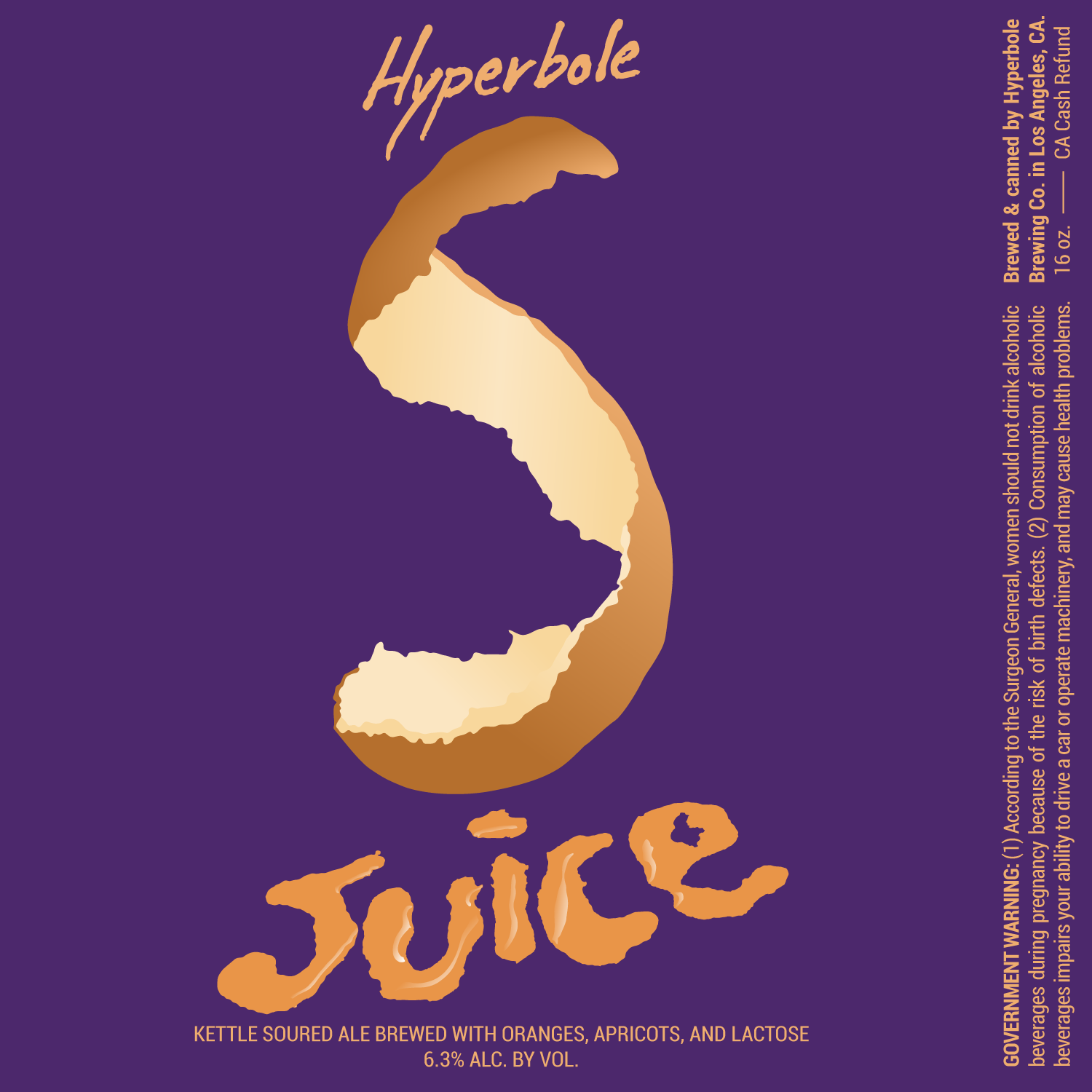
Digital Test
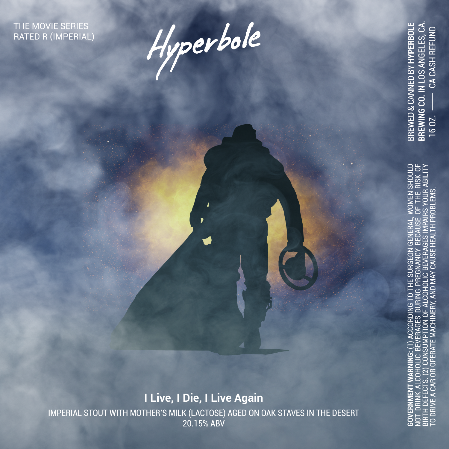
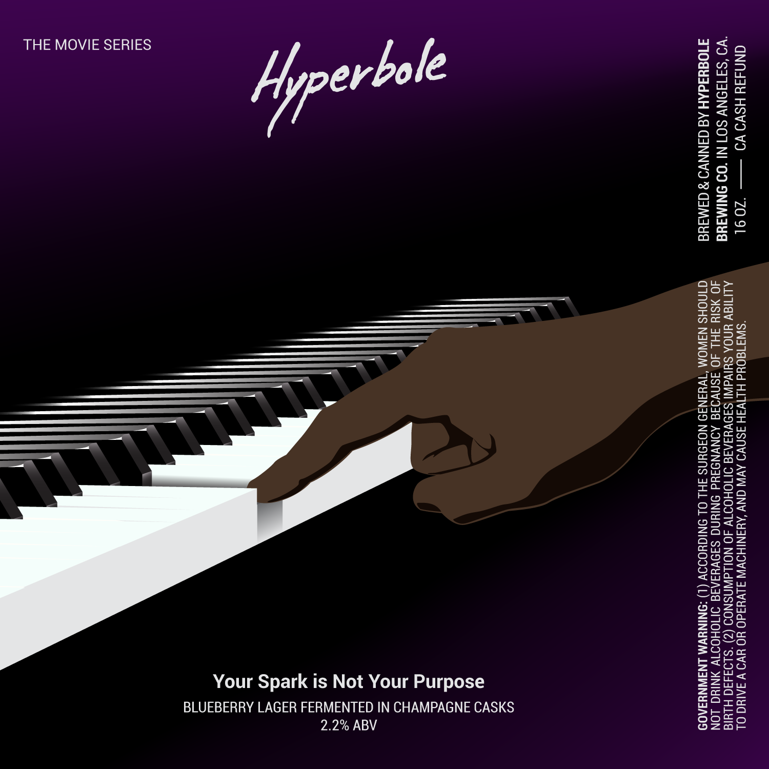
I created a quick digital illustration and filled out the text fields to get a sense for how well the layout could be used.
Physical Test
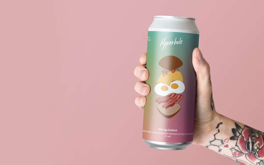
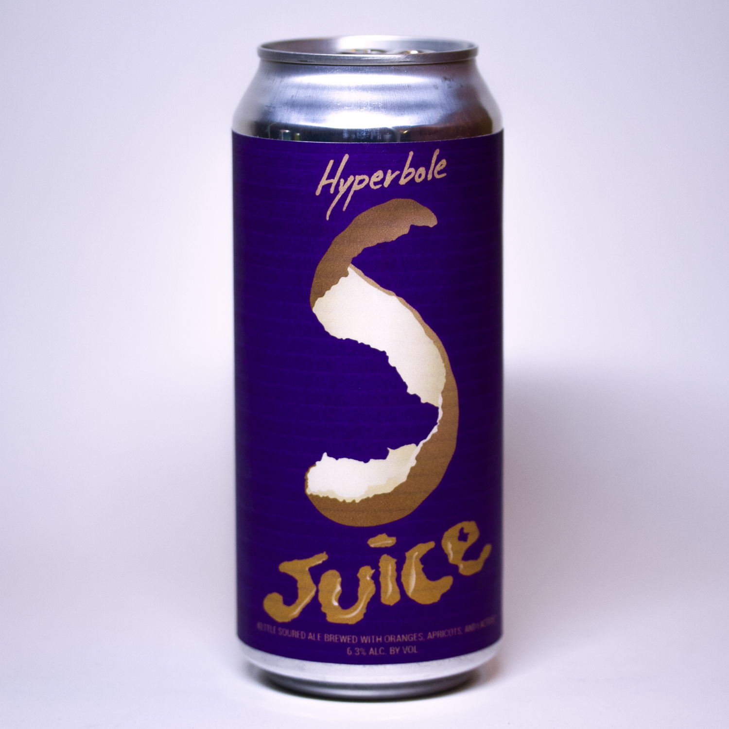
Of course if we're talking about reality I had to test the label on a real can. What good would a test be, otherwise? You can see that that the text needs a little more breathing room at the top and bottom of the label.
Refined Layout
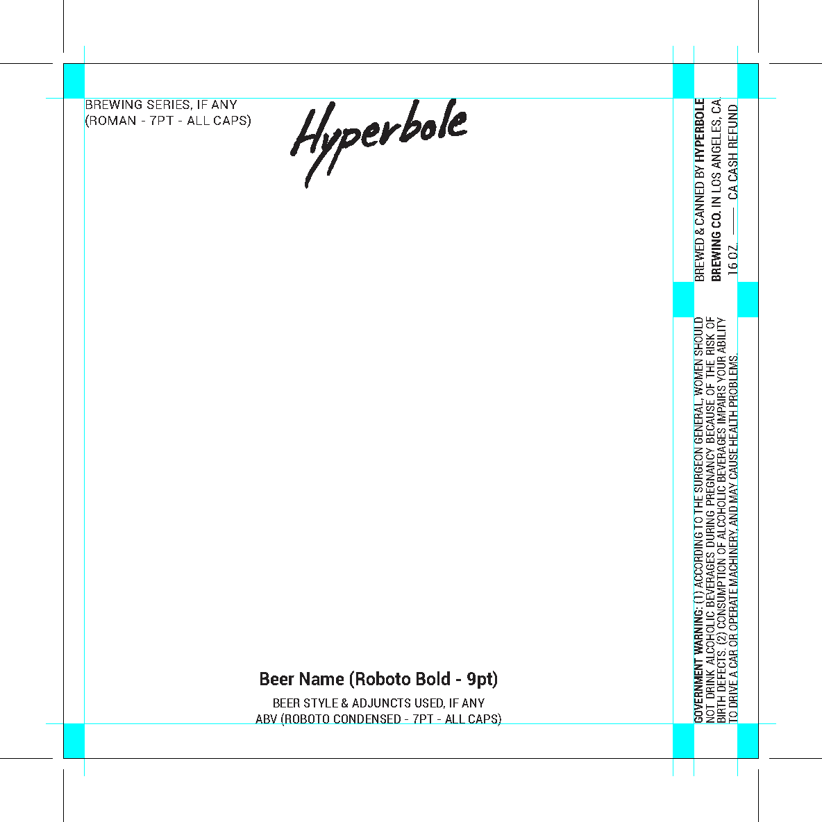
From that quick test I refined the layout a bit and gave some of the text more breathing room, also adjusting the styles a little.
3/3
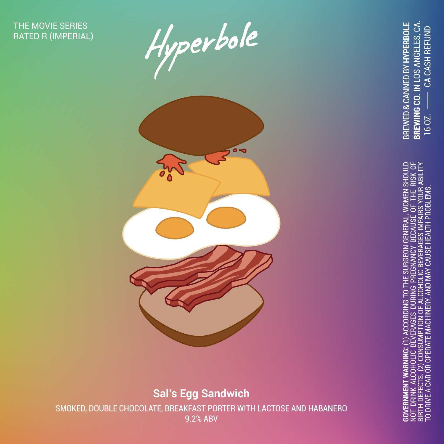
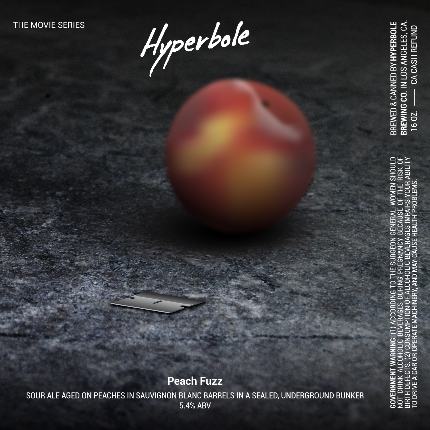
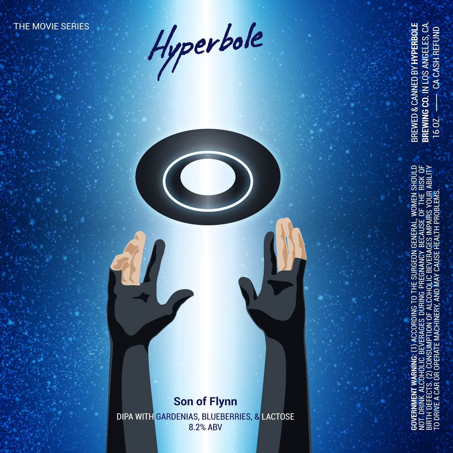
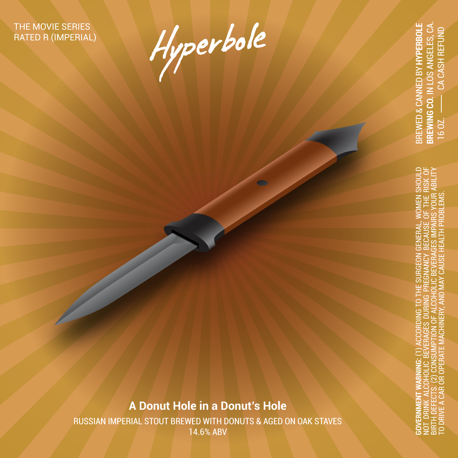
Finished Labels
