A Design System for Dense Desktop Workflows
- Figma
- Design System
- Platform: Desktop
- Role: Sole Designer
- Org: Arrakeen Labs
- In Development
The Approach
A component-based system built for density. Instead of constantly building new components, they should be configurable via slots, toggleable elements, and adjustable sizing/spacing. Each component should cover many contexts. Tokens include one typeface, five neutrals, dark by default, and brand colors.
The Outcome
As the design system grows, new component groups and screens now take hours instead of days. The cost was front-loaded: early on it was slow, with a lot of back and forth and decision-making inflection points. However, the decisions that made it slow in the beginning are what make it fast now.
Why Build a Design System?
Arrakeen Guild is a desktop app combining document editing, job tracking, and ATS analysis.
Three distinct workflows need to feel like one cohesive product, no matter where in the system you are or how you use it.
Design Selvage alongside Guild rather than each screen as its own product.
Still evolving alongside development.
Why not use an existing system?
I'd only worked with pieces of existing systems. Learning an enterprise system deeply enough to use it well and quickly, versus building only what Guild actually needed, looked like similar amounts of time either way. Building my own meant no risk of misusing components I didn't fully understand, kept my skills sharp, and allowed me to gain an intimate understanding of the design system.
Design Foundations
One Typeface for Multiple Jobs
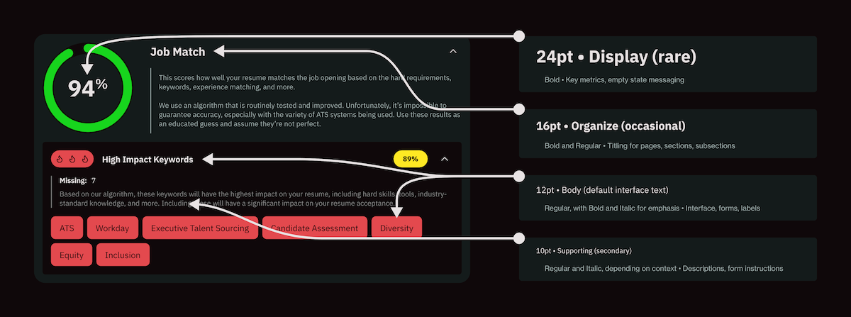
IBM Plex Sans covers everything from dense data tables to section headers. A single system typeface keeps the whole app efficient; weight and size do the work to enforce hierarchy without adding a second typeface to manage. (Iconography follows a similar logic. Lucide was used from the beginning and was supplemented with custom icons.)
Requiring Certain Colors Means a Restricted Palette
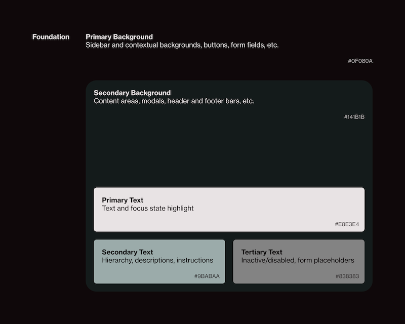
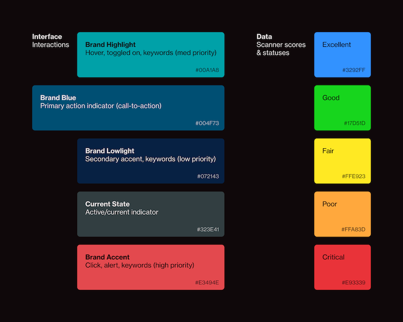
With the basic features known beforehand, a set of colors would have to be set aside for use in the scanner and anything data/score related, including red, orange, yellow, green, and a blue. That means most of the system would have to be defined with a neutral palette: black, white, shades of gray.
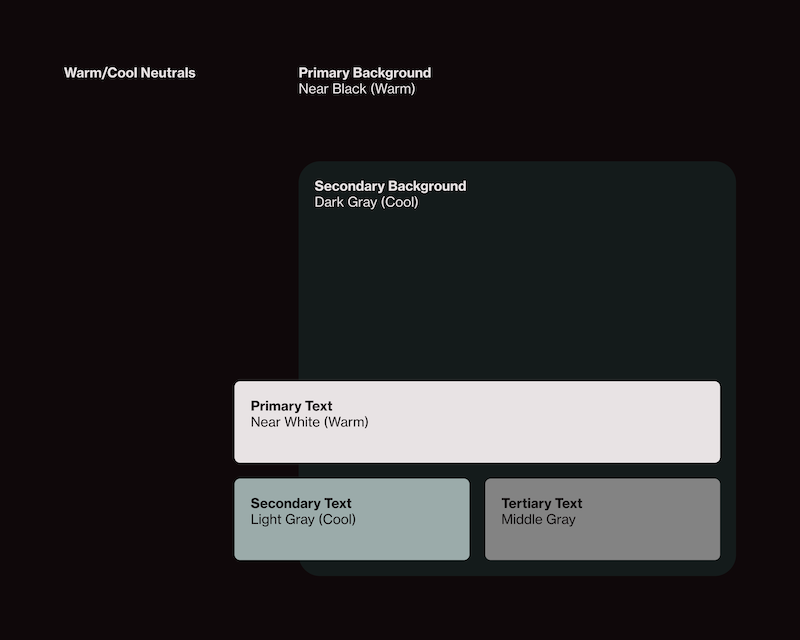
Using Warm/Cool Separation to Increase Visual Contrast Between Neutrals
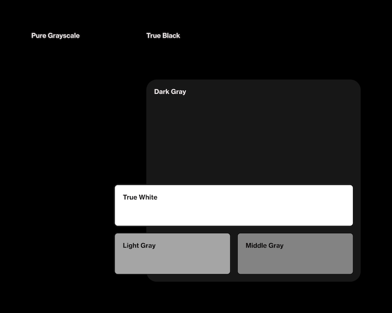
Pure black can create harsh edges that can tire eyes over time. Our colors are pulled back a little, while also tinting them slightly apart (either warm/red or cool/blue) to create more visual separation. This helps keep layered areas distinguishable, even at low contrast, instead of them bleeding into each other.
Design System Decisions
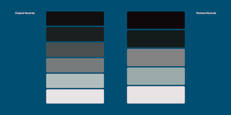
Starting with 6 Neutrals Seemed Like More Possible Range, but Too Many Combos Failed Contrast Checks
Early accessibility audits only checked the near-blacks and near-whites. Once the middle grays were being used for more hierarchy, for instance, a middle gray on a dark gray turned out to be failing contrast checks. To fix it, I merged the two middle grays into one, and slightly pulled apart the dark and light colors.
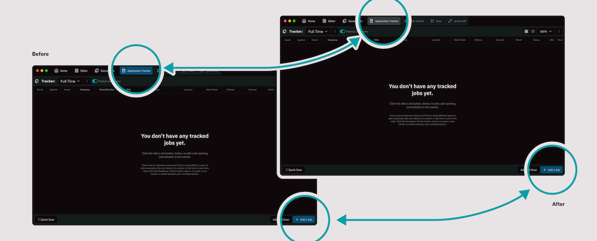
The Brand Blue was Doing 2 Jobs, so Another Color was Needed
Through a series of color changes, CTAs and active/selected states ended up sharing the same blue. This wasn't caught at first and became a problem as the greater prototyping stages expanded and the "this is where you are" and "this is an action you can take" showed up together. A separate neutral, a gray-green, was introduced to handle active/current state and leaving the blue for CTAs.
Built for Flexibility and Maximum Reusability
Increasing Flexibility by Toggling Elements Instead of Building New Components
Rather than creating separate button components for icons, loading states, badges, or supporting text, optional elements can be enabled as needed. New requirements usually expand an existing component instead of introducing another one.
Size Customization Allows One Field to Fit Every Context and Combine Into New Ones
A single text entry field carries multiple styling variants/options (different heights, padding, gaps, and corner radii) with elements toggling on or off depending on context. Taken further, two of the same field pair up to form a combobox, a more complex interaction coming from the same base component.
Shells with Slots for Flexible Content
Menus, pop-ups, and other components are built as shells with a defined slot for content, along with elements toggling on or off and its size adjusting depending on the context and needs. All of this ease of variation makes it very fast and easy to iterate, build, and expand prototypes.
How a Screen Comes Together
All of the mechanisms (toggling, sizing, slots) from the above components/ideas come together to make interfaces possible
The System in Production
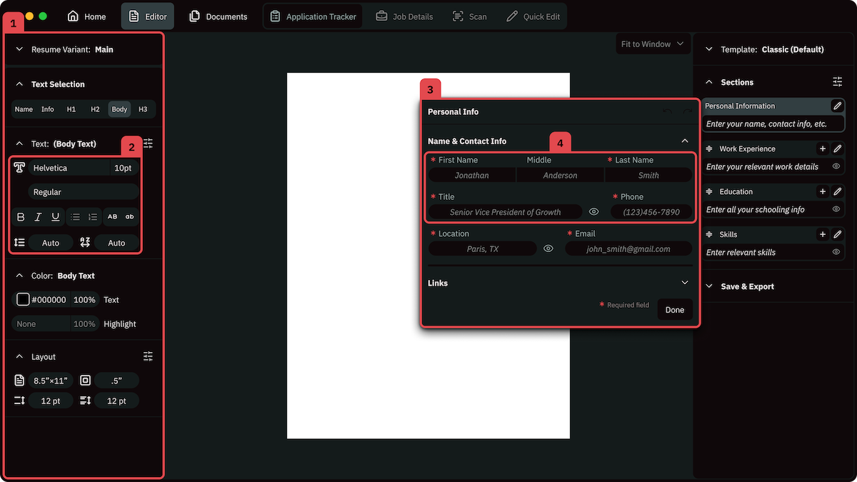
The sidebar is a large-scale slot, holding whatever menu the context calls for.
Buttons and fields combine and toggle to form tight control groups, like this formatting toolbar.
The pop-up shell resizes, with customizable header and footer, and its body is an independent slot that is filled with any contextual needs.
The same combination can scale up: text fields and buttons assembling into a full, multi-field form instead of a small toolbar.
Where it Stands Now
New screens are assembled instead of built from scratch. New features don't start with a blank canvas. Instead, they start with the question of which components can already do most of the job.
Early costs improved design velocity. Some decisions took time to figure out, or even find, like the color palette and accessibility concerns. Each one only had to be solved once, and every screen built since then has inherited the improvements.
Guild is still in development, and so is Selvage. New features will keep testing whether the system's existing components are enough or whether they need to grow. However, that's exactly how the system is supposed to keep working and growing.